| Author | Thread |
|
|
07/29/2002 10:37:00 PM |
|
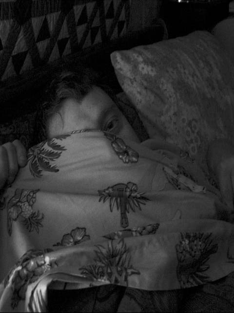
too muvh light. needs to be darker. |
|
Comments Made During the Challenge  |
|
|
07/28/2002 06:45:00 PM |
|
too dark really, though I think I understand why.. |
|
|
|
07/27/2002 10:29:00 PM |
|
On my monitor this is a little dark. I like the subject matter, but the texture isn't featured really. |
|
|
|
07/27/2002 10:22:00 PM |
|
too gray; texture is lost |
|
|
|
07/26/2002 02:29:00 PM |
|
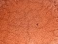
The file size of this photo is only 27K! The rules allow for up to 150K. You have lost a lot of detail and sharpness due to the JPEG compression artifacts. In my opinion, I don't think texture is a primary element of this photograph. I hope my comments have provided some useful information, and keep trying! *3* -balynch |
|
|
|
07/25/2002 06:35:00 PM |
|
I hope your "model" agreed to this, 'cause s/he doesn't look too happy! I think it needs more light to really show the textures well. karmat |
|
|
|
07/25/2002 05:10:00 AM |
|
|
|
07/25/2002 03:28:00 AM |
|
I wish the quilt were better-lit. |
|
|
|
07/25/2002 01:58:00 AM |
|
Your image lots of its intrigue with the combination of black & white and such a dark image. I'm a sucker for bright, vivid pictures... I can't help but imagine this one with very bright sheets and light streaking across part of the image, though I'm probably missing the point of the shot. A boy can dream... |
|
|
|
07/24/2002 11:08:00 PM |
|
This could be an interesting picture, but it's way too dark. |
|
|
|
07/24/2002 08:45:00 PM |
|
This is far too dark to really show texture. |
|
|
|
07/24/2002 05:01:00 PM |
|
|
|
07/24/2002 01:10:00 PM |
|
This picture could be improved if it was lighter. Because of the darkness, it is hard to focus on. (4) AquaGoddess12880 |
|
|
|
07/24/2002 12:29:00 PM |
|
I love the feeling of a warm bed on a cold winter morning also, but for me to find texture in this image is a strech. |
|
|
|
07/24/2002 08:05:00 AM |
|
the eye creeps me out. The overall photo doesn't have sufficient contrast for me to feel a desire to return to the warm bed "advertised" in the title or shown in the photograph. |
|
|
|
07/24/2002 03:02:00 AM |
|
This is way too dark. There is so much texture potential in this, Bright color might have helped to bring it out. |
|
|
|
07/23/2002 07:12:00 PM |
|
Soo dark and gloomy, especially in B&W, seems awkward with the title. When I think of warm, I think of colors like red and yellow. I started by grading this shot as a 5, the I don't understand vote for me. I don't see much sense of texture. If you would be so kind as to send me a note after the challenge week, I would like to understand this photo better. (see my profile for e-mail info) 3 Swash |
|
|
|
07/23/2002 05:14:00 PM |
|
Too dark and grey. Boost the levels and contrast- better lighting when shooting to begin with would help in this as well. |
|
|
|
07/23/2002 04:15:00 AM |
|
very underexposed? I can't see anything.. |
|
|
|
07/22/2002 08:04:00 PM |
|
I really like the composition, the subject, and the concept. I very much like the creativity in the shot. However, I had to search around to find the subject because of the lack of contrast. |
|
|
|
07/22/2002 04:16:00 PM |
|
i see texture, bu there is texture in everything... I would have liked to see a stronger interpretation... = 4 - jmsetzler |
|
|
|
07/22/2002 03:18:00 PM |
|
i would almost consider this one patterns more than texture, but i can see your pow and i can go with it. however, the shot is very much gray on gray, some more contrast would've helped this a lot, i think. -- gr8photos (2) |
|
|
|
07/22/2002 02:10:00 PM |
|
nice composition but too dark |
|
|
|
07/22/2002 01:04:00 PM |
|
looks too dark to me and the black and white doesn't exactly make this look warm. I also miss the texture in this. 3 beegee |
|
|
|
07/22/2002 10:10:00 AM |
|
|
|
07/22/2002 08:46:00 AM |
|
Very dark and hard to make out anything other than what is right in the foreground. |
|
|
|
07/22/2002 06:21:00 AM |
|
Far too dark and indistinct |
|
Home -
Challenges -
Community -
League -
Photos -
Cameras -
Lenses -
Learn -
Help -
Terms of Use -
Privacy -
Top ^
DPChallenge, and website content and design, Copyright © 2001-2026 Challenging Technologies, LLC.
All digital photo copyrights belong to the photographers and may not be used without permission.
Current Server Time: 07/02/2026 04:51:53 AM EDT.