| Author | Thread |
Comments Made During the Challenge  |
|
|
07/21/2002 12:21:00 PM |
|
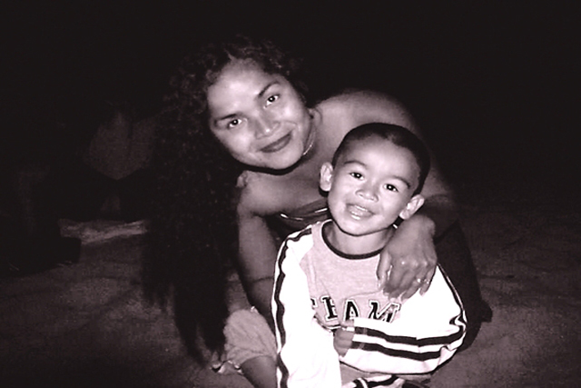
Cut photograph, but a lot of dead space on either side. A tighter crop might have improved this. 5-ClubJuggle |
|
|
|
07/21/2002 09:12:00 AM |
|
|
|
07/20/2002 05:28:00 PM |
|
|
|
07/20/2002 05:04:00 PM |
I you wanted the photo to seem happy, you probably shouldn't have made it a black and white picture.
Pretty good-8 |
|
|
|
07/19/2002 05:12:00 AM |
|
Faces are good, background could be cropped. |
|
|
|
07/18/2002 10:49:00 PM |
|
The background is a bit to dark, her hair gets lost in the shot. |
|
|
|
07/17/2002 03:58:00 PM |
|
cute shot, interesting lighting. |
|
|
|
07/17/2002 12:52:00 AM |
|
the white shirt is too glaring if u're aiming for a low key shot |
|
|
|
07/15/2002 11:43:00 PM |
|
|
|
07/15/2002 10:54:00 PM |
|
I think this image may have worked better done in a vertical orientation and a little less darkness around the edges... = 5 - jmsetzler |
|
|
|
07/15/2002 09:14:00 PM |
|
Very nice posing and great smiles. This photo could be even better with some improvements in lighting. The light source appears to be very close so that the boy is lit a bit hot, mom is lit about right. The light falls off very quickly, but not enough to prevent illuminating some background objects. You might try a black sheet behind the subjects if you desire a black background. I also suggest a little bit of fill light and keep the main back a bit more. Nice catch light in the eyes, which is something to look for when using multiple lights (it can be hard to get just right). |
|
|
|
07/15/2002 07:09:00 PM |
|
wasn't he on the slide last week? It's a beautiful self-portrait. What a handsome couple you are. Nicely done. My only suggestion is to take those two items out of the background. Well lit, nicely composed. |
|
|
|
07/15/2002 04:24:00 PM |
|
A vertical orientation would have looked better, as there is nothing interesting on either side of the subject. More lighting on the hair would have been good too. Nice pose though, cute kid :) |
|
|
|
07/15/2002 04:10:00 PM |
|
Nice shot. Maybe a bit dark, or background too dark, but really nice. 8 Swash |
|
|
|
07/15/2002 02:42:00 PM |
|
Beautiful people, love the tones. His shirt is too bright and her face is a bit dark. Still nice job. Kee |
|
|
|
07/15/2002 01:22:00 PM |
|
he looks just like u! like u didn't know... |
|
|
|
07/15/2002 02:12:00 AM |
|
|
|
07/15/2002 12:24:00 AM |
|
A cute family photo, sort of dark though. |
|
Home -
Challenges -
Community -
League -
Photos -
Cameras -
Lenses -
Learn -
Help -
Terms of Use -
Privacy -
Top ^
DPChallenge, and website content and design, Copyright © 2001-2026 Challenging Technologies, LLC.
All digital photo copyrights belong to the photographers and may not be used without permission.
Current Server Time: 06/28/2026 11:47:26 AM EDT.