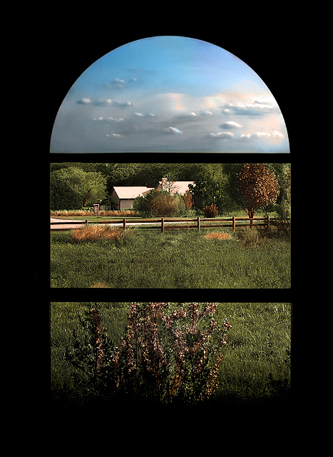
The top part is not a painting but the actual sky. It looks like a painting because I exposed for the foreground to get as much high quality detail out of it as possible. That made the sky very bright so I burned that part and also used neatimage to give it that smooth look. It was mentioned that a tighter crop would have made this better. My first shot of this had a tighter crop however it just didn't look right at the top so I opted for a zoomed out composition. Had I thought about it more I probably would have went with the tighter crop because I didn't think some might see this version as having a thick border when no border was added.
Statistics
Place: 12 out of 180 Avg (all users): 6.5926 Avg (commenters): 7.5714 Avg (participants): 6.3908 Avg (non-participants): 6.7051 Views since voting: 2378 Views during voting: 359 Votes: 243 Comments: 44 Favorites: 3 (view)
First Impression: Niiice. 7 or 8.
Composition: 9. A tighter crop wouldn't've worked for me as much as this one. It's fine as it is.
Subject: 10. As far as I'm concerned, it rocks in this department.
Technical: 8. A little more saturation, I guess. Then again, maybe not.
Improvement: Sorry. Don't think there's something that could be added in this regard. At least not from me.;p
Summary: It's not a photo that can be appreciated in one glance. One has to linger for a bit to really see this photo's merits. Congrats on your personal best.
Disclaimer:The following crits are personal opinions, not photographic dogmas. Please see them as suggestions, not claims of mastery nor a show of hauteur.;p
First Impression WOW.
Composition: Very good composition. I would have like little tighter crop on this.
Subject: I really like the subject. Nice take on the challenge.
Technical (Colour and light):
The color and lighting is perfect. PP is good except the could part. It looks like too much NI, flat. Almost loos like part of the window and not the BG.
Improvement: Tighter crop, different PP for the cloud part.
Summary: Nice picture over all. I did not vote in this challenge, but would have scores this 8.
nice, overall shaperning seems stronger than it need be....really pretty scean framed in the window or not i think you should get a shot of the house and fence just pos it up after would love to see more of it. pretty sky also.
Cool shot, like how the window separates the sky from the middle ground from the flowers at the bottom, one of the strongest entries in here, gave it a 9.
This is a great view from a great window but it is my personal opinion that it would have been better with the regular view instead of the portion that is now in the top piece of the window. It doesn't really enhance the photo. However, as everything else in photography that is only one person's viewpoint.
Good choice of window. Interesting how the 3 panes have no overlap. Those sure are some funky-looking clouds - is the glass distorting them or is that post-processing?
I think this photo really answers the challenge theme well. The frame itself not only divides the subject into parts, but also draws the eye upwards through the shot to follow those parts. I think the outer edges of the frame appear a bit overbearing and could have been shot/cropped a bit tighter to emphasize what's outside the window more. nice shot nonetheless... I vote 7
Oooh - this is nice. Beautiful view nicely framed by the silhouette of the window. My only desire would be to either see a little bit of the tree line in the upper frame or a little bit of the sky in the middle frame. It's a bit too much like individual pictures - a little cross over would be nice (in my lowly opinion). Otherwise a great shot.





 Add photograph to your favorites
 Add photographer to your favorites

 Photographer found comment helpful.


