| Author | Thread |
|
|
12/04/2003 11:54:09 PM |
Originally posted by pcody:
I like this. It reminds me of the old days. |
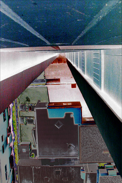
Thanks, me too! I too this opportunity to review all those comments -- seems more poeple liked this than I seem to remember ... I flipped it to try and give the impression of taking the photo while suspended out in midair away from the wall.
For everyone who wanted to know why I messed with the color so much, here's the bland original (linked from pBase):
 |
|
|
|
12/04/2003 07:37:27 PM |
|
I like this. It reminds me of the old days. |
|
 Photographer found comment helpful. Photographer found comment helpful. |
Comments Made During the Challenge  |
|
|
07/14/2002 06:34:00 PM |
|
|
|
07/14/2002 05:35:00 PM |
|
don't do it! - good concept, I like the polarisation effect - 7 |
|
| Photographer found comment helpful. |
|
|
07/14/2002 12:19:00 PM |
|
|
|
07/13/2002 02:50:00 PM |
|
nice abstract quality - like the negative aspect |
|
| Photographer found comment helpful. |
|
|
07/13/2002 01:42:00 AM |
|
|
|
07/12/2002 01:41:00 PM |
|
creative 6 interesting 9 focus 6 framing 8 = 7 |
|
| Photographer found comment helpful. |
|
|
07/12/2002 12:23:00 PM |
|
The color adjustments were too much for me. they successfully obscured the subject matter to such a point that it's taken me 5 days to figure out the viewer is up high looking down the side of a building to a parking lot. Sorry. Guess I lack vision. |
|
| Photographer found comment helpful. |
|
|
07/11/2002 10:23:00 AM |
|
super abstract. i get it but i dont think the invert adds to it. takes me out of feeling the fear of the height and puts me more into a painting ort a surreal reality. then again,i rarely like the look of 'invert'. mag 99 |
|
| Photographer found comment helpful. |
|
|
07/10/2002 10:38:00 PM |
|
This image is very confusing to me. I think I am looking down I see the tops of parked cars, woow, vertigo, I cant look any more. You are going to explain this photo at the end of the week, arn't you? One of my top picks this week, I think, if my mind will ever stop spinning :-) |
|
| Photographer found comment helpful. |
|
|
07/10/2002 02:33:00 PM |
|
is this a photo or an art print photographed? |
|
|
|
07/10/2002 01:24:00 PM |
|
| Photographer found comment helpful. |
|
|
07/10/2002 12:44:00 PM |
|
subject 10 lighting 8 composition 9 focus 9 total 9 |
|
| Photographer found comment helpful. |
|
|
07/10/2002 09:34:00 AM |
|
Interesting abstract. A bit busy at the bottom...this is supposed to convey 'fear of heights', right? Curious as to what the photo would have looked like without the color manipulation, but I don't know if it would be better or worse. |
|
| Photographer found comment helpful. |
|
|
07/09/2002 10:36:00 PM |
|
Your use of color and effects really increases the feeling of vertigo here. Shey. |
|
| Photographer found comment helpful. |
|
|
07/09/2002 05:10:00 PM |
|
I'm not a real fan of the neon or solarization effect in this image. Since I can't see the original, I don't know if it adds or detracts from it... = 5 - jmsetzler |
|
| Photographer found comment helpful. |
|
|
07/09/2002 07:58:00 AM |
|
Great idea. Makes me feel like the title. |
|
|
|
07/08/2002 10:20:00 PM |
|
This image kinda makes me swimmy-headed. Of course I am terrified of heights so I guess your picture did what it was supposed to. The colors are interesting indeed. karmat |
|
| Photographer found comment helpful. |
|
|
07/08/2002 08:11:00 PM |
|
| Photographer found comment helpful. |
|
|
07/08/2002 08:08:00 PM |
|
I'd have been too scared to take this photo. |
|
| Photographer found comment helpful. |
|
|
07/08/2002 03:09:00 PM |
One of the better photos this week. I do like the filter/level or which ever effect it is (you'll have to let me know). I thought of doing something similar - no time though. There is a lot to this image. Great work!!
Ruthann |
|
| Photographer found comment helpful. |
|
|
07/08/2002 02:33:00 PM |
|
Bizarre coloration, hard to "see" at first. Excellent composition, I hope others take the time to "figure this one out". 8 Swash |
|
| Photographer found comment helpful. |
Home -
Challenges -
Community -
League -
Photos -
Cameras -
Lenses -
Learn -
Help -
Terms of Use -
Privacy -
Top ^
DPChallenge, and website content and design, Copyright © 2001-2026 Challenging Technologies, LLC.
All digital photo copyrights belong to the photographers and may not be used without permission.
Current Server Time: 06/28/2026 08:45:28 AM EDT.