| Author | Thread |
|
|
07/08/2002 08:27:00 AM |
Thanks for all the negative comments... and thanks for the positive ones too.
For those that made mention of color, the color version really sucked. Trust me, its a much better shot in B&W.
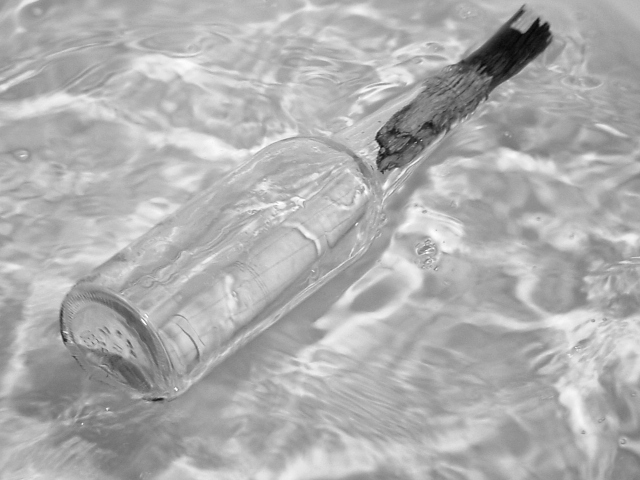
Lisa -- Yes, it was taken in a bath tub... on purpose.
indigo997 -- No, its not cropped too tight. You're looking at the edges of the photograph! Out of 35 shots, this was the only one with the entire bottle in the photograph. In all the others, the bottle kept floating out of view before I could hit the shutter ;)
lisae -- yes, its supposed to be low contrast. Its "transparent". Thanks.
sjgleah -- transparency was the challenge.
|
|
Comments Made During the Challenge  |
|
|
07/07/2002 09:24:00 PM |
|
Very nice photo. I like how the sun light reflects in the water. Maybe a litte lesser DOF would be better. Some parts e.g. the water in the bottom right corner and the top of the bottle are blurred. But that's the opposite of the crystal clearness which the photo shows (as far as I see it). |
|
|
|
07/07/2002 10:07:00 AM |
|
Nicely done. I like the double-application of the theme. |
|
|
|
07/06/2002 10:10:00 PM |
|
Very nice.Lots of water action really makes this shot. |
|
|
|
07/06/2002 12:44:00 PM |
|
I like this in black and white, it helps you to see the simplicity and transparency of the shot, but I also wonder what it would look like in color. Bright vibrant colors. Blue for the water and orange for the stopper, for example. karmat |
|
|
|
07/05/2002 03:18:00 PM |
|
I wish there was more contrast in this picture (btw, how did it look in color? I imagine it would have worked either way). Nevertheless, this is one of my favorites this round. The smoothness of the water and the slight turbulence makes this an appealing shot. Nice job! - 9 |
|
|
|
07/05/2002 12:35:00 AM |
|
I like this transparency... I think it works nicely but I am wondering if there would have been a way to offer some more contrast. I'm also wondering why you chose black and white? Good work :) = 8 - jmsetzler |
|
|
|
07/03/2002 11:56:00 PM |
|
Viewing the water through the bottle doesn't add anything to the image. 3 sjgleah |
|
|
|
07/03/2002 09:07:00 PM |
|
Would have been better with some crisp colors. |
|
|
|
07/03/2002 01:24:00 PM |
|
A good idea and a interesting interpertation of the challange. It might have been nicer if you had had more contrast. It would have given the image more power. |
|
|
|
07/03/2002 09:44:00 AM |
|
Good idea. Seems to need a tad more contrast. This looks more like it was taken in a bathtub than on a beach. I would also allow for more room above the bottle top in the crop. 6 |
|
|
|
07/02/2002 02:20:00 PM |
|
|
|
07/02/2002 02:53:00 AM |
semi-transparent -10
distortion - 10
colors in objects - 0
Be creative - 7
|
|
|
|
07/01/2002 06:42:00 PM |
|
|
|
07/01/2002 06:24:00 PM |
|
|
|
07/01/2002 06:20:00 PM |
|
Very nice shot, well done. Kee |
|
|
|
07/01/2002 03:24:00 PM |
|
I wish there was more contrast here... somewhere. I still like the shot, though. |
|
|
|
07/01/2002 03:18:00 PM |
|
this looks like it would have been fun to do in the back yard pool. |
|
|
|
07/01/2002 02:15:00 PM |
|
Very well shot, low interest value, maybe it's too grey, lacking contrast. Photo 9 Transparency 6 total 8 swash |
|
|
|
07/01/2002 01:08:00 PM |
|
|
|
07/01/2002 12:59:00 PM |
|
I think this needed to be in color to be efective,can't really tell if there is a message in there or not,really have to look hard to see it. |
|
|
|
07/01/2002 12:26:00 PM |
|
Looks good. I like the softness of the water. Yet, maybe could've used a little touch of color - one thing, like a red pebble or something blue - bright - or something in the bottle - Just and Idea. Technically good photo. Great job! |
|
|
|
07/01/2002 12:25:00 PM |
|
IMO.I think the bottle gets lost in B&W. Would of prefered colour. Nice picture tho"7".Dogman. |
|
|
|
07/01/2002 11:46:00 AM |
|
A little bland. I do not like the shade and lack if sharpness in the top of the stick |
|
|
|
07/01/2002 09:46:00 AM |
|
I don't think the black and white works well. It's too low contrast and grey. Some vibrancy in the colours would lift this photo a lot, eg. vivid blue or turquoise. |
|
|
|
07/01/2002 07:54:00 AM |
|
Very nice in black and white! Is that supposed to me a message in a bottle? |
|
|
|
07/01/2002 02:14:00 AM |
|
This one caught my eye instantly, and it's great in b/w because the colors don't spoil the lovely imagery here. Great work, it has my vote! |
|
|
|
07/01/2002 01:41:00 AM |
|
Great shot. Cropped a little too tight. |
|
|
|
07/01/2002 01:31:00 AM |
|
i love this--and although i am usually big on B&W's, I wonder if this might not have looked better in color, to keep the bottle from blending in with the water so much? 9. --amitchell |
|
Home -
Challenges -
Community -
League -
Photos -
Cameras -
Lenses -
Learn -
Help -
Terms of Use -
Privacy -
Top ^
DPChallenge, and website content and design, Copyright © 2001-2026 Challenging Technologies, LLC.
All digital photo copyrights belong to the photographers and may not be used without permission.
Current Server Time: 06/27/2026 12:48:01 PM EDT.