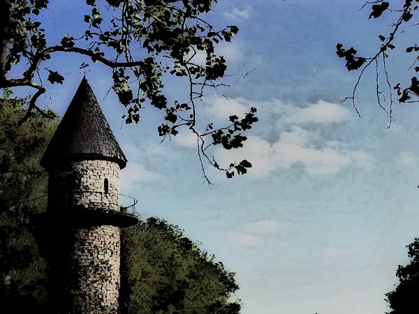
This will probably "Flop" considering the challenge. And considering the talent on this site. I liked the effects of this though, it kind of made me feel like I was looking out of a window, It could be just me.
Statistics
Place: 698 out of 833 Avg (all users): 4.9672 Avg (commenters): 5.4500 Avg (participants): 4.8754 Avg (non-participants): 5.4054 Views since voting: 1081 Views during voting: 539 Votes: 427 Comments: 21 Favorites: 0
I would have liked to have seen the pre-processed photo. It looks like a nice place. For me, this image is more of a Digital Art piece than a photo. JMO.
There's a lot to like in this photo; composition, colors, shadows... I also personally like the editing you've done here, though I suspect it's not going to be found 'mainstream' enough for most voters.
Your image is coming across as pixelated on my screen. I like the composition. The post processing you've chosen makes me think I'm looking at an old-time colorized postcard.
Since this looks like an illustration for a book, I'm assuming it has been, or will be validated. A couple of things lead me to think it's a photo, so I'll say that it's quite interesting with a nice composition. I'm seeing lots of artifacts, though.
This photo has lots of potential ... great composition, colors, contrast, unfortunately it seems it suffered greatly during post-processing. The sky looks very patchy/pixelated, likely due to compression. The overall image is only about 50k, you can use up to 3x as much for your submissions here and that will help the image quality. The stone of the tower looks very smoothed out, as if you've used Neatimage or something similar too much. So, I would get out the original and re-edit it. I bet you'll end up with a fantastic shot. Hope this kind of advice helps. If it doesn't, or you don't agree, feel free to ignore my comment. :)






 Add photograph to your favorites
 Add photographer to your favorites


 Photographer found comment helpful.


