| Author | Thread |
|
|
11/10/2005 07:06:48 PM |
surreal is cool - congrats.
|
|
 Photographer found comment helpful. Photographer found comment helpful. |
|
|
11/09/2005 03:44:44 PM |
Greetings from the Critique Club:
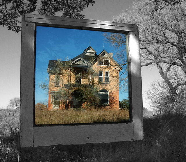
Colour Abandoned was your entry in the Transparency II challenge and it is one serious photo.
Technical:
Good use of the maximum permitted size, beautifully focused and good DOF. The desat works superbly and there is no sign of oversharpening, although there appears to be a hint of noise/grain in the frame, however this adds to the overall effect. I could be really picking and start inspecting ever detail, but I won't because the image stands as it is.
Composition:
I like the positioning, it is not quite central in that big square format which makes it feel even more quirky. The reflections in the glass look ghostly and fit the abandoned house very well. My only criticism is that the bottom of the window frame appears to be resting on the ground. I know it isn't, but that is the impression I get, due to the rising ground behind and the long grass. But it doesn't spoil the image in anyway.
Overall:
A stunning image with great imagination. I can't find any faults, other than my brief mention of the hanging bit, and that isn't a fault. Your past images are well scoring and this 7th place is well deserved. A great image for prints. Well Done and I hope this is helpful and constructive.
Steve |
|
| Photographer found comment helpful. |
|
|
11/07/2005 01:06:05 AM |
|
TOP TEN!! Well deserved. Congrats. |
|
| Photographer found comment helpful. |
|
|
11/07/2005 12:23:54 AM |
|
Another great effort. Congratulations on your top ten finish. |
|
| Photographer found comment helpful. |
|
|
11/07/2005 12:09:40 AM |
|
Congratulations on your top 10 finish! Great shot! |
|
| Photographer found comment helpful. |
Comments Made During the Challenge  |
|
|
11/06/2005 11:04:12 PM |
Returning for comments:
A stroke of genius. |
|
| Photographer found comment helpful. |
|
|
11/06/2005 07:55:46 PM |
|
| Photographer found comment helpful. |
|
|
11/06/2005 02:43:46 PM |
|
| Photographer found comment helpful. |
|
|
11/05/2005 09:41:52 AM |
|
very nice effect -- the frame adds a lot to this. great work! |
|
| Photographer found comment helpful. |
|
|
11/05/2005 12:24:37 AM |
|
Very pretty, but not quite as well done as the other "picture frame" entry in the challenge. Still, it's something to be proud of. Good capture, and I like that the house is in focus, instead of the frame. |
|
| Photographer found comment helpful. |
|
|
11/04/2005 10:52:23 AM |
|
Interesting picture. Nicely done with the color effect. |
|
| Photographer found comment helpful. |
|
|
11/03/2005 04:43:09 PM |
|
a remarkable take on an unremarkable shot - that is without the frame this is really nothing special at all - this is excellent - 8 for now - bumped to 10 |
|
| Photographer found comment helpful. |
|
|
11/03/2005 08:34:56 AM |
|
Great title. I like the desaturation too. That old beat up window is an awesome frame. The slight tilt inward is interesting as well. |
|
| Photographer found comment helpful. |
|
|
11/03/2005 04:33:05 AM |
|
| Photographer found comment helpful. |
|
|
11/01/2005 07:51:33 PM |
|
Creatively done. Having actual glass in the frame (is this a storm window) is nice because you get the reflection which, I think, adds rather than sutracts. I'm usually a fan of selective desat or I guess sectional desat. 7 |
|
| Photographer found comment helpful. |
|
|
11/01/2005 04:17:41 PM |
|
This is awesome.....Fantastic setup! I would love to see inside this houseI...It deserves a 10++++++ |
|
| Photographer found comment helpful. |
|
|
11/01/2005 11:49:05 AM |
|
Excellent idea. I would think this will make the top ten easy. |
|
| Photographer found comment helpful. |
|
|
10/31/2005 07:48:29 PM |
|
nice use of selective desaturation. |
|
| Photographer found comment helpful. |
|
|
10/31/2005 05:30:15 PM |
|
| Photographer found comment helpful. |
|
|
10/31/2005 04:54:49 PM |
|
| Photographer found comment helpful. |
|
|
10/31/2005 02:18:53 PM |
|
I think that this is a brilliant concept, wonderfully executed. The angle you've chosen really sets it off, as the whole effect would be a little staid if the frame were square-on. |
|
| Photographer found comment helpful. |
|
|
10/31/2005 11:05:28 AM |
|
wow, a selctive desaturation pic that I actually like ;o) |
|
| Photographer found comment helpful. |
|
|
10/31/2005 09:07:21 AM |
|
Very creative and nicely done. I like it. |
|
| Photographer found comment helpful. |
|
|
10/31/2005 02:25:30 AM |
|
Crazy... really like this!! You artistic desat'er's .. I will learn.. i will its my chant.. LOL well done!! |
|
| Photographer found comment helpful. |
|
|
10/31/2005 01:02:11 AM |
|
Very creative. i like it. |
|
| Photographer found comment helpful. |
Home -
Challenges -
Community -
League -
Photos -
Cameras -
Lenses -
Learn -
Help -
Terms of Use -
Privacy -
Top ^
DPChallenge, and website content and design, Copyright © 2001-2026 Challenging Technologies, LLC.
All digital photo copyrights belong to the photographers and may not be used without permission.
Current Server Time: 07/01/2026 02:32:38 AM EDT.