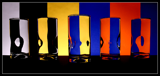
The hardest thing was to line up the glasses. I wanted some more traditional, but didn't have enough so used these which had dimples in them. I liked the distortions so went with it and decided a reference in the title would tie it all together (as a pun for a bad lens).
Lighting is from below the table shining up on the background.
Statistics
Place: 12 out of 155 Avg (all users): 6.3483 Avg (commenters): 7.6000 Avg (participants): 5.7073 Avg (non-participants): 6.7899 Views since voting: 1902 Views during voting: 315 Votes: 201 Comments: 18 Favorites: 2 (view)
Very good optical progression..... I should have scored this one higher. fyi ...5 Some minor distractions for me include: disregard for the full frame, - what ever it was or might have been, ie. the obvious tight crop around the subject (it may be traditional but I usually like fullframe); it has, for me a uninteresting commercial (throw some money at it) quality (Imperfections included), Anchor Hocking might use it as a stock image; it's representative of a slick dpc style that does well, is ment to sell, but usually has no dirt - EddyG is a master of this.
Beautiful, clever, striking, with such wow factor. Why didnt I think of that? I only wish it was bigger, for even more impact. Still, a strong 8, at least.
Cool. Nicely done! Bet thsi took awhile to set up. Only minor comment is, it would have been neat to go with another color on the far right, other than dark blue again.






 Add photograph to your favorites
 Add photographer to your favorites

 Photographer found comment helpful.


