Challenge:On the Road (Classic Editing) Camera:Olympus C-2100UZ Location: Long Grove ,Illinois Date: Jun 6, 2002 Aperture: 3.5 ISO: 100 Shutter: 1/500 Galleries:Rural Date Uploaded: Jun 6, 2002
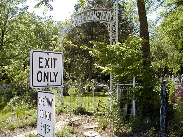
Great combination of signs! :-) Have you tried cropping (if the quality allows) or taking this shot in portrait format to bring out the emphasis on the signs some more? I would probably crop just to the right of the gate to the cemetery and then to the left of the street signs - however far you have to go to follow the DPChallenge photo size rules.
Admittedly, I don't know what the background would do if you shot this way, but I would have been very tempted to shoot the humor of the lower sign straight on so you wouldn't be able to read the "exit only" sign. This reminds me very much of a cemetery my parents were doing some genealogical work at and the sign at the bottom of the road said, "Dead End."
As it stands, the photo just seems a little busy in the background -- and the cemetery sign is a little hard to read -- I think because the left end has light colored leaves directly behind it -- the other end of the sign, with the darker background, is easier to read. Anyway, fun shot.
I really like the storytelling as it fits very well with the theme. However, the photo is a bit cluttered and hard to read. Because of the size, contrast, and position of the signs, my attention was first brought to them and I couldn't quite make a connection with the theme. After searching awhile I noticed the cemetery sign, but was barely able to read it. In this case it may have worked better to keep the photo simple and include only the cemetery sign.
Nice photo, only a few small problems, all nits: Sky was probably cloudy, but appears overexposed (all whited out); the LONG poart of the cemetery name is very difficult to read, maybe a half step to your left; especial nit - isn't this technically off the road? Is the EXIT ONLY supposed to be a reference to death? Nice touch. Photo 9 Creativity 7 Road 8 total 8 (see: these really were NITs)
point made...could this have been taken from a better viewpoint? It's hard to read the cemetary sign and the traffic signs are a little too dominating in this image to me. Great idea.
The sign just says it all. I think maybe moving the camera a little bit more to the right so that the sign is still in, but you catch more of the purple flowers. Other than that, I like it.






 Add photograph to your favorites
 Add photographer to your favorites


 Photographer found comment helpful.


