| Author | Thread |
|
|
05/29/2003 02:44:43 PM |
*Critique Club*
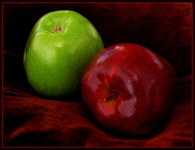
You got a lot of great comments on this one. This almost looks like one of those old victorian paintings of fruit on a table. I think it's the red cloth that imprints that image in my head.
Those are all about shading and color, so that kind of image, I think that the red cloth works very well to create that kind of feeling.
However, I don't think I prefer it. I think that since we're talking about color, I think that the color in the shot should stand out nicely, and it's a bit dark here. Even though the cloth itself fits in with the colors you were working with, it is too dark to scream 'look at me'.
The first thing that popped into my head when I saw this was "why in the world is the green apple upside down". I realize that you were probably trying for some variation, to make the shot something other than '2 apples sitting on a cloth'. But I'm not sure that turning it upside down really helps at all. It confuses me, and even thought it's 'different', I don't think it works for me.
Focus and clarity seem to be good. I like the detail that we get in the apples. The little specks and even the blemishes are nice. Nice and clear.
I like the setup of the red apple in front, and the green apple in the rear at an angle. This does make for a nice composition in my opinion. I like the red apple laying down, but think that maybe the green apple should be stem up.
Overall it's nice, but the background doesn't work for the purpose of the challenge, not quite sure what color would have worked though. maybe a cream color?
~Heather~ |
|
 Photographer found comment helpful. Photographer found comment helpful. |
|
|
05/27/2003 12:53:02 PM |
//www.dpchallenge.com/image.php?IMAGE_ID=13363
This is the shot it made me think of (in case you were wondering why I said it looked like something JJ would do). :) Good finish - happy shooting!
Mav |
|
| Photographer found comment helpful. |
Comments Made During the Challenge  |
|
|
05/25/2003 10:53:19 PM |
|
Great shot! Love the colors! |
|
| Photographer found comment helpful. |
|
|
05/25/2003 10:37:35 PM |
|
One of my favorite shots of the challenge - has a familiar "feel" to it...thinking it's by a "name" - JJBeguin? 9 either way! |
|
| Photographer found comment helpful. |
|
|
05/24/2003 11:18:10 PM |
|
Which is the sweet? Which the sour? I like the background on this image. I kind of wish the light would help to shape these apples better. |
|
| Photographer found comment helpful. |
|
|
05/24/2003 09:15:33 PM |
|
Like this one alot- looks like a painting! Meets the challenge very well. Would like to see this without the red line border out of curiousity (but I didn't deduct for it). Very good composition. Should do very well in the challenge:) |
|
| Photographer found comment helpful. |
|
|
05/23/2003 11:16:51 PM |
|
Nice warm photo. I can see you in the reflection. |
|
| Photographer found comment helpful. |
|
|
05/23/2003 05:29:48 AM |
You did a very good job on the composition of this image. The apples are placed very well, wich results in a nicely balanced image. It shows that you did a big effort to compose this shot with care.
I got a few remarks, though (if you don't mind):
- There is too little distinction between the cloth and the red apple, wich makes the green apple the most prominent element in this picture, while being placed on the background. This gives a kind of strange feel.
- The stem of the red apple has the same colorcast as the apple itself. This gives the impression as if the image was painted over afterwards. It makes the fruit look a bit unnatural to me. On the other hand, it has given it (in combination with the velvet) a kind of 'retro-technicolor' look, which ís nice (although not really my cup of tea ;o)
- The red elements (apple and velvet) are a bit too dark imho.
Regards, Marco.
|
|
| Photographer found comment helpful. |
|
|
05/23/2003 01:12:19 AM |
|
Nice apples, very delicious looking, and a good setup, angle, and lighting. But I'm afraid the use of the very red cloth rather than a more neutral tone (or something containing both colours) didn't please me as much. |
|
| Photographer found comment helpful. |
|
|
05/22/2003 11:30:30 PM |
|
great idea. the choice of burgundy fabric is too close to the colour of the apple though, and the two are blending into each other. A different colour might have complemented both apples a little better. Maybe white? |
|
| Photographer found comment helpful. |
|
|
05/20/2003 03:24:23 AM |
|
Nice and crisp looking apples there. I have the impression the red apple is a little too dark, maybe because the background is the same color and it blends in to it. Maybe a lighter background would have highlighted it more - 7. |
|
| Photographer found comment helpful. |
|
|
05/19/2003 11:54:23 PM |
|
I thought they were both sweet. Granny Smiths a bit less, of course ... Nice picture, love how the apple skin looks painted. Actually, the whole photo looks somewhat "painted". Very nice. |
|
| Photographer found comment helpful. |
|
|
05/19/2003 08:09:15 PM |
|
I like this picture, it's very painterly. I think it's the lack of sharp focus in this picture that helps achieve that effect. That said there are a few small things that stand out... like the lighter spot on the left side of the green apple and the purple spots on the red one. I like the border too. |
|
| Photographer found comment helpful. |
|
|
05/19/2003 07:27:46 PM |
|
meets the challenge and the cloth is more interesting than a black background. the red apple gets a bit lost against it though. |
|
| Photographer found comment helpful. |
|
|
05/19/2003 01:27:13 PM |
|
I like this idea, and the focus is perfect. I think I would have liked a background that contrasted the red apple a little more. Perhaps just white. It sort of disappears into this dark velvet stuff. |
|
| Photographer found comment helpful. |
|
|
05/19/2003 11:05:29 AM |
|
could you make the border look more old fashioned to match? 7 |
|
| Photographer found comment helpful. |
|
|
05/19/2003 07:43:17 AM |
|
This is why I don't vote from my laptop. This looks much much better on my monitor on my PC! This is a great still life. I love the velvet the apples are on. I don't care for the green one being upside down, and the dead center composition. Still a very strong shot! 9 -danny |
|
| Photographer found comment helpful. |
|
|
05/19/2003 05:54:58 AM |
|
That red cloth allows the green to really jump out, but it has a muting effect on the red apple - still think it's a good shot, but did you try other background colours? Like a rich deep blue, almost black is what I'd have tried. Nice shooting |
|
| Photographer found comment helpful. |
|
|
05/19/2003 12:24:16 AM |
|
very nice composition and use of complementary colors... I would have possibly rotated the green apple a little to hide the blemish on the left side of it... = 6 |
|
| Photographer found comment helpful. |
|
|
05/19/2003 12:12:35 AM |
|
Well exposed. Good simple composition. |
|
| Photographer found comment helpful. |
Home -
Challenges -
Community -
League -
Photos -
Cameras -
Lenses -
Learn -
Help -
Terms of Use -
Privacy -
Top ^
DPChallenge, and website content and design, Copyright © 2001-2026 Challenging Technologies, LLC.
All digital photo copyrights belong to the photographers and may not be used without permission.
Current Server Time: 06/29/2026 07:55:42 AM EDT.