| Author | Thread |
Comments Made During the Challenge  |
|
|
05/25/2003 10:38:03 PM |
|
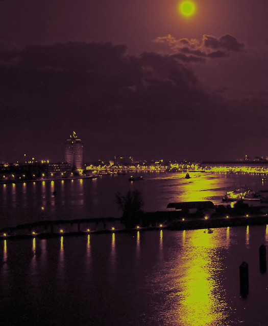
great colours. the moonlight on the water looks a bit fake/over processed, but it works for the challenge. |
|
 Photographer found comment helpful. Photographer found comment helpful. |
|
|
05/24/2003 11:49:38 PM |
|
That streak of sunlight/moonlight really is pleasant! |
|
| Photographer found comment helpful. |
|
|
05/23/2003 02:42:40 PM |
|
nice hue shift, just not for me. 2 |
|
|
|
05/22/2003 07:36:17 PM |
|
This is very lovely but I'm afraid that despite the purple tone it doesn't register as sharply complementary to me. |
|
|
|
05/21/2003 04:23:43 PM |
Interesting colors and details. It creates a nice mood. -T
|
|
| Photographer found comment helpful. |
|
|
05/21/2003 12:55:14 AM |
|
Nice shot. I think if you had been able to capture this when the moon was lower, so that your crop was more panoramic than squarish, it wouldhave been even more effective. |
|
| Photographer found comment helpful. |
|
|
05/20/2003 01:57:44 AM |
|
For some reason, this makes a 16th century impression on me. The purple and also the yellow/gold of the image is very striking. Wonder whether that was in-camera or from photoshop; doesn't really matter to me. It has a very pleasing, mysterious effect. Love that light cloud on the top of the image. The only thing i don't like,and would have cropped it out, is the moon. Would have cropped the image right below. But you will probably get lots of comments raving about this moon. Also see some banding from compression. Very nice. 9 |
|
| Photographer found comment helpful. |
|
|
05/19/2003 06:58:31 PM |
|
while this meets the colour challenge, it seems really forced with the post processing you've done to it. The yellowy/green is quite unpleasant for my eye too, I'm afraid to say. |
|
|
|
05/19/2003 02:25:58 PM |
|
Looks almost ghostly. I like the composition. I bet this looks great in full color, too, huh? In fact, I'd really like to see it before the color processing after the challenge. 9. |
|
| Photographer found comment helpful. |
|
|
05/19/2003 01:07:58 PM |
|
meets the challenge but looks unnatural to the point that I don't care for it... I like a lot of digital manipulations, but I don't care for it in a situation where photography is the primary key... = 4 |
|
Home -
Challenges -
Community -
League -
Photos -
Cameras -
Lenses -
Learn -
Help -
Terms of Use -
Privacy -
Top ^
DPChallenge, and website content and design, Copyright © 2001-2026 Challenging Technologies, LLC.
All digital photo copyrights belong to the photographers and may not be used without permission.
Current Server Time: 06/28/2026 01:09:28 PM EDT.