| Author | Thread |
|
|
05/21/2003 05:54:19 AM |
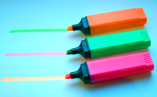
Thanks for the comments.
All appreciated. I'm amazed I did as well as this and agree with all the poor white balance comments, and the pink comments. It was the most purple looking highlighter I could find.
Re the saturation. I didn't change it very much at all from real life. Those things really did glow that much.. |
|
Comments Made During the Challenge  |
|
|
05/20/2003 01:29:14 PM |
|
Your subject is displayed well. |
|
 Photographer found comment helpful. Photographer found comment helpful. |
|
|
05/19/2003 02:53:39 PM |
|
The white balance seems to be a little off, I think. The paper looks blue instead of white to me. Great idea though! |
|
| Photographer found comment helpful. |
|
|
05/19/2003 10:20:59 AM |
|
neat idea, the blue paper helps the image alot, if you had used white paper it may have bleached the image out, good job |
|
|
|
05/18/2003 08:11:58 PM |
|
| Photographer found comment helpful. |
|
|
05/16/2003 03:29:50 PM |
This is an interesting idea, however I don’t find highlighters all that exciting. Clever picture though. I like the composition and technically the photo looks very well done. I just wish there were more going on here to hold my attention. I gave it a 5.
Greg
|
|
| Photographer found comment helpful. |
|
|
05/16/2003 09:07:30 AM |
|
pink isn't a secondary color |
|
| Photographer found comment helpful. |
|
|
05/16/2003 06:49:35 AM |
|
Excellent work, I love it. |
|
| Photographer found comment helpful. |
|
|
05/15/2003 12:04:37 PM |
|
Too much saturation. Eye's hurt. Nice idea though... |
|
| Photographer found comment helpful. |
|
|
05/15/2003 07:55:00 AM |
|
Nice and simple. Good choice of colour for background. Like the twist. 9 |
|
|
|
05/15/2003 06:34:44 AM |
Clever idea. Like it.
Could do with making the whites look less blue, however - different lighting, or alter your camera's white balance before you shoot? I had the same problem with my 'Color' challenge entry. |
|
| Photographer found comment helpful. |
|
|
05/14/2003 04:40:05 PM |
|
Love this idea, but I think it would be more eye-catching with a white background. Just an idea... |
|
| Photographer found comment helpful. |
|
|
05/14/2003 03:01:40 PM |
|
Took me second... and then I laughed. Nice one. |
|
| Photographer found comment helpful. |
|
|
05/14/2003 02:21:31 PM |
|
|
|
05/14/2003 11:46:12 AM |
|
I love the idear but looks a little out of focus to me. still a good picture |
|
| Photographer found comment helpful. |
|
|
05/14/2003 12:39:37 AM |
|
Creative title and placement, making a dull subject (sorry to say that) interesting. 5 |
|
| Photographer found comment helpful. |
Home -
Challenges -
Community -
League -
Photos -
Cameras -
Lenses -
Learn -
Help -
Terms of Use -
Privacy -
Top ^
DPChallenge, and website content and design, Copyright © 2001-2026 Challenging Technologies, LLC.
All digital photo copyrights belong to the photographers and may not be used without permission.
Current Server Time: 06/28/2026 08:38:46 PM EDT.