| Author | Thread |
|
|
11/01/2004 11:31:06 AM |
|
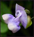
This is gorgeous, and the different colors in the bg are making the shot. They are conveying the impression of other multiple flowers and things being there too, without sharply pointing them out, so that everyone can think of whatever they want. So i completely disagree with e301's comment about that. |
|
 Photographer found comment helpful. Photographer found comment helpful. |
|
|
05/24/2003 10:10:49 PM |
Hi Gordon, your Critique Club moment is at hand ...
I'm not really going to make any technical comments - you're obviously fully in control of your camera and get pretty much the image you chose.
So I get to be artistic. The first thing that struck me was the odd mirror-like feeling with the two flowers bottom right (and this gives the lie slightly to you 'unconventional composition' comment: the TWO of them are right on the thirds line). I find that a quite alluring effect - though it's disturbed by the left of frame flower, which moves into the field rather than existing wholly within or out of it as do the others. That, visually, produces a tension that might otherwise have been missing from the shot.
The in-focus flower does have the fragility you speak about - perhaps most because of the light - that direct sunlight (presumably), emphasises the thinness of the petals, the transparency of them, the fact that they are so breakable - rather than the effect of the 'accepted' diffused light which simply brings out the colour. This i think works well with the previous observation - that movement through the field of focus is contrasted again with the fragility here to make another tension; a friend once said about making radio programmes that one should never produce anything where only one thing is going on.
What there also is here is some sort of evolution of shape: as the flowers come into focus, there's an intersting progression from complete blob to the complex definition of the flower; a little like watching it grow.
Which is enough for now: that's an attempt to be specific about why I like this shot - I didn't vote, and couldn't tell you what I'd have scored it, as I doubt I'd have spent as long looking at it as I have now.
a down-side (there has to be one): the 'other' colours in the background - I think it would have been cleaner, and keot attention more purely to the flowers and those purple shapes, had there been simply green in the background, and not the white and pale purple moments too.
Good luck
Ed
|
|
| Photographer found comment helpful. |
|
|
05/21/2003 06:25:41 PM |
|
I frequent this site not as a photographer (I can't afford the proper equipment) but as an artist. I fell in love with your photograph, and only wish that I could blow it up large enough to cover my living room wall .... you used your lens as a canvas, and regardless of whether it scored well or not, I believe it was a great success. This is art. It was my only 10 this week and I wish it did better. Good job. |
|
| Photographer found comment helpful. |
|
|
05/21/2003 06:20:36 PM |
I prefer these flowers because they emphasise the fragility of the subject matter. Perfect blooms don't always do that for me.
I don't always go for the most perfect flowers, because they don't always suit what I'm trying to achieve. Much in the same way that this doesn't have a textbook composition, because I thought that would be dull too, in this particular case. |
|
|
|
05/21/2003 05:27:15 PM |
I didn't say I don't like the shallow DOF, but i am saying shallow dof don't work too well on DPC. I gave him a 6, that's above average already :) It's definitely better than most other studio flower shots. But, in nature, as in studio, you still go for the best images that you can get. Broken flowers aren't one of them.
It's like this shot (and other shots like it for the Flora entry) which will not do well on DPC and i didn't submit it because of it. Instead I submit a soft (boom, automatic deduction for being soft) waterlilly photo for the FLora challenge.

Message edited by author 2003-05-21 17:29:12. |
|
| Photographer found comment helpful. |
|
|
05/21/2003 04:42:09 PM |
Paganini, it is perfectly acceptable that you don't like this shot or any shot. You don't like the shallow dof, fine. Half your comment though was about the flower being imperfect and hence, according to your thinking, an undesirable model. I like to see nature 'as is' and yes, i realize that once you reduce it to 640px by something px it isn't any longer nature as is because you have already taken it out of its natural context. I just don't like that everything needs to be anti-septically perfect. I see great beauty, and symbolism, in wilted flowers and they used to be one of my favorite subjects.
What i dislike about your comment, and in so many others of dpc voters, is that dwelling on the negative. With this picture i sensed, right or wrong, that someone was looking for a personal vision, beyond shooting things as usual. That, to me, is much more important than a flaw here or there. I detected the same with your Loyal Worker, which is still my all time favorite shot but if you want me to, i can point out a couple of flaws there as well :)
Best of luck finding your Heidi Klum, be it in the flesh or in a flower :) |
|
| Photographer found comment helpful. |
|
|
05/21/2003 03:31:08 PM |
Sure, it is a representation, but i just don't like it myself. That's all :) Maybe I am going for the Heidi Klum of nature, but is there anything wrong with that? I still give it much higher score than other staged studio flower shots :)
I doubt Gordon got this score because of the broken flowers -- that was my only comment, but i am sure people voted it down because of the shallow focus as well. Besides, this IS DPC -- you vote on the highest impact photo in the shortest amount of time you have to look at it. And nature shots in DPC is always the hardest to present.
FYI -- Heidi Klum in nature is also gonna be harder to photograph than Heidi Klum in studio :) She's also going to be harder to find too.
Originally posted by Journey:
Paganini, hope you revisit this picture because i like to say that i radically disagree with your assessment. Of course, just like everyone else you are entirely entitled to your own opinion :) Don't know why i even say that because of all people you don't need reminding of that ;) You object that the focus flower has broken stems (petals?). But you know what? That's NATURE. I like to see nature not an ANTI-SEPTIC man-made 100% perfect rendition of it to suit a photograph glossy. I like to see the 'flaw', the 'oddity' in nature because despite that whatever is real nature always happens to be incredibly harmonious. Nature really is the master artist of all.
Judging from your voting comment, what you are after, paganini, is a Hollywood, Heidi Klum version of nature. (glad i could toss this in :) But real nature is so much more beautiful and interesting than the made-over Heidi Klums. Total perfection ends up being BORING.
The reason i like this image so much is because the focus flower(s) is (are)in focus but just barely, just barely, just barely, and hence it blends in so harmoniously with the shallow dof other flowers. |
Message edited by author 2003-05-21 15:42:54. |
|
| Photographer found comment helpful. |
|
|
05/21/2003 11:47:51 AM |
Paganini, hope you revisit this picture because i like to say that i radically disagree with your assessment. Of course, just like everyone else you are entirely entitled to your own opinion :) Don't know why i even say that because of all people you don't need reminding of that ;) You object that the focus flower has broken stems (petals?). But you know what? That's NATURE. I like to see nature not an ANTI-SEPTIC man-made 100% perfect rendition of it to suit a photograph glossy. I like to see the 'flaw', the 'oddity' in nature because despite that whatever is real nature always happens to be incredibly harmonious. Nature really is the master artist of all.
Judging from your voting comment, what you are after, paganini, is a Hollywood, Heidi Klum version of nature. (glad i could toss this in :) But real nature is so much more beautiful and interesting than the made-over Heidi Klums. Total perfection ends up being BORING.
The reason i like this image so much is because the focus flower(s) is (are)in focus but just barely, just barely, just barely, and hence it blends in so harmoniously with the shallow dof other flowers.
Message edited by author 2003-05-21 11:56:57. |
|
| Photographer found comment helpful. |
|
|
05/21/2003 01:51:08 AM |
|
One of the worst finishes for my 9s...*sad* |
|
| Photographer found comment helpful. |
|
|
05/21/2003 12:34:05 AM |
|
Congrats, Gordon. Thought this image was stunning. It IS stunning! Am getting a little tired of seeing pretty flowers 'documented'. This goes way beyond that. I believe i said something like that in my initial comment but thought it wise to edit it. I believe it was my only 10. |
|
| Photographer found comment helpful. |
Comments Made During the Challenge  |
|
|
05/18/2003 01:15:37 PM |
|
I like this effect. It IS impressionistic. |
|
| Photographer found comment helpful. |
|
|
05/18/2003 07:47:23 AM |
|
I love the shallow depth field (blurred background. The main focal point seems to be the flower on the bottom right, so I'd like to see that one more focused. Still a wonderfull mix of colors. Jacko. 7 |
|
| Photographer found comment helpful. |
|
|
05/17/2003 07:09:03 PM |
|
I love this abstract - a cross between a painting and a photo - perhaps leans towards the painting even more than the photo! Great DOF - love the way it reduces the flowers and grass to mere blurs of colour. Only thing I'd change would be to deadhead that flower at the very bottom left!!! ;) |
|
| Photographer found comment helpful. |
|
|
05/15/2003 10:46:19 PM |
Exquisitely beautiful. There were many flower images in this challenge, some being very good, this is my favorite.
Sure, it reminds me of Monet but also of Odilon Redon of whom i have seen works in pastels that had an other-wordly sensitivity and beauty. 10
Comment revised 5/15 |
|
| Photographer found comment helpful. |
|
|
05/15/2003 10:20:45 PM |
|
|
|
05/15/2003 08:59:25 PM |
|
I really like this. My photo of this week is similiar. i like your use of DOF. Good colors. I think i would prefer the main bloom to face into the photo instead of out and be a touch higher. This is in my top pics. |
|
| Photographer found comment helpful. |
|
|
05/15/2003 01:30:26 PM |
|
This image is not very good in quality, but I do like the idea. I think that the image needs to be more in focus. |
|
|
|
05/15/2003 02:47:10 AM |
|
not a bad attempt, but it'd be better if there were other shallow focuses in front of the flowers. P)lus your focus flower has broken stems.... better subject would yield better photographs. 6 |
|
|
|
05/14/2003 11:48:46 PM |
|
I like this very much. Well done! |
|
|
|
05/14/2003 03:26:31 PM |
|
A lovely photograph. I love the low DOF. |
|
| Photographer found comment helpful. |
|
|
05/14/2003 12:44:02 PM |
|
I like your idea but I still think the photo needs more DOF. For now it is too blurry in my view. |
|
| Photographer found comment helpful. |
Home -
Challenges -
Community -
League -
Photos -
Cameras -
Lenses -
Learn -
Help -
Terms of Use -
Privacy -
Top ^
DPChallenge, and website content and design, Copyright © 2001-2026 Challenging Technologies, LLC.
All digital photo copyrights belong to the photographers and may not be used without permission.
Current Server Time: 06/28/2026 07:50:12 PM EDT.