| Author | Thread |
|
|
05/15/2003 12:32:26 PM |
Greetings from the Critique Club...
Hi Jeremy..
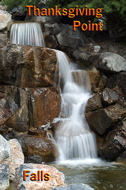
This is a nice water exposure... I love the fuzzy water. This one is perfect. In a lot of cases, the water will get too 'blown out' under long exposure. I like these examples where there is a good amount of water blur but there is also still detail visible.
The composition on this shot is excellent... The water just leads me throught the image from top to bottom with no distractions or other obnixious elements in the image.
Now let me whine a little....
I don't care much for the text layout... The 'falls' should probably be with the rest of the text... I do, however, see that there is not a great place for text on the image :)
Good work...
John Setzler
|
|
|
|
05/12/2003 08:26:13 AM |
Excellent photo! Nice angle and crop. My camera stays on its side, they should come that way. This shot is takes your eye right threw it and back.
Tim |
|
Comments Made During the Challenge  |
|
|
05/11/2003 08:55:45 PM |
I think this has been cropped too tight
Message edited by author 2003-05-12 00:15:02. |
|
 Photographer found comment helpful. Photographer found comment helpful. |
|
|
05/11/2003 02:10:24 PM |
|
Clever idea with the type, but I don't think it quite works. I'd just right-adjust all three words and move them a little to the right from where wou have them. |
|
| Photographer found comment helpful. |
|
|
05/10/2003 10:01:18 PM |
|
Very nice, focus and comp. great |
|
| Photographer found comment helpful. |
|
|
05/10/2003 12:40:56 PM |
|
A wonderful water picture. The wet rocks, the fall of the water - great! I think the font and color of the words could match the feeling of the photo better. |
|
| Photographer found comment helpful. |
|
|
05/09/2003 02:56:52 PM |
|
I'd find the text less distracting if it were all together in the upper right corner |
|
| Photographer found comment helpful. |
|
|
05/09/2003 12:04:58 AM |
|
not as keen on the font as I am on the shot. Lovely composition, I like the choice of portrait! :) |
|
| Photographer found comment helpful. |
|
|
05/08/2003 09:25:23 AM |
|
I think the font is too much, I would not use the inner bevel, plain text works better for my eyes. The shot is great! |
|
| Photographer found comment helpful. |
|
|
05/06/2003 08:06:28 PM |
|
Great slow shutter shots. Somehow the colour of the text seems way off for this type of picture. The falls tels me serenity, but the the bright orange screams out. Try a different, warmer color for the text. Jacko. 9 for the shot minus 1 for the text= 8. |
|
| Photographer found comment helpful. |
|
|
05/06/2003 12:44:33 PM |
|
nice photo - ugly lettering |
|
| Photographer found comment helpful. |
|
|
05/06/2003 12:39:03 PM |
|
I love that effect on the falls... so silky. Your font (choice and color) are a little unusual, though.... But the photo itself is cool! |
|
| Photographer found comment helpful. |
|
|
05/06/2003 09:58:32 AM |
|
This is an excellent image, the effect of the prolonged shutter speed is bang on. Very idyllic and inviting. The kind of photo I would expect to find on a postcard promoting the area you live in. However, I personally find the texting you have chosen doesn't fit to this image. |
|
| Photographer found comment helpful. |
|
|
05/05/2003 10:23:43 PM |
|
Lovely photo of these falls, with which I am quite familiar! The font you used doesn't seem to match the "essence" of the falls, but the composition and tones are wonderful. All in all, a very nice photo! |
|
| Photographer found comment helpful. |
|
|
05/05/2003 07:16:44 PM |
|
The text should say WHERE this is. City and State, etc. |
|
| Photographer found comment helpful. |
|
|
05/05/2003 05:53:16 PM |
|
Text color and font is odd. |
|
| Photographer found comment helpful. |
|
|
05/05/2003 03:34:52 PM |
|
Terrific photo but the text looks a bit odd.8 |
|
| Photographer found comment helpful. |
|
|
05/05/2003 01:25:20 PM |
|
This is an awesome shot. My only suggestion would be for the text to be together. Either all at the top, or all at the bottom. Otherwise, very nicely done! |
|
| Photographer found comment helpful. |
|
|
05/05/2003 12:29:36 PM |
|
I like how you make the running water look like silk, I don't like the color's of the font's, but The photo is great, 9 |
|
| Photographer found comment helpful. |
|
|
05/05/2003 12:12:04 PM |
|
great waterfall shot. bring the text together, I completly overlooked the "Falls" |
|
| Photographer found comment helpful. |
|
|
05/05/2003 11:05:14 AM |
|
pretty shot. i wonder why u a) used such an orange text and b) had Falls separate? |
|
| Photographer found comment helpful. |
Home -
Challenges -
Community -
League -
Photos -
Cameras -
Lenses -
Learn -
Help -
Terms of Use -
Privacy -
Top ^
DPChallenge, and website content and design, Copyright © 2001-2026 Challenging Technologies, LLC.
All digital photo copyrights belong to the photographers and may not be used without permission.
Current Server Time: 06/27/2026 02:07:38 PM EDT.