| Author | Thread |
|
|
08/27/2005 10:35:08 PM |
|
Looks just like a postcard!!!! |
|
Comments Made During the Challenge  |
|
|
05/10/2003 10:40:07 PM |
|
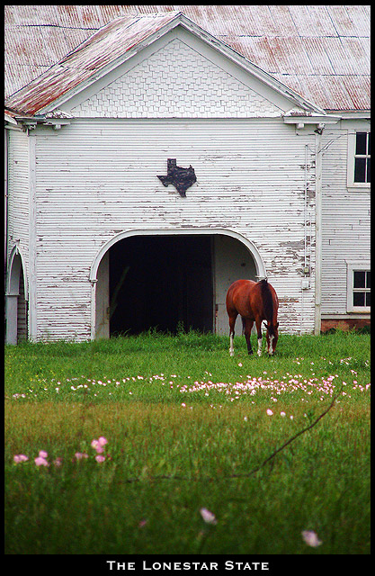
lovely picture, and composition, might of cropped alittle on the bottom, but I love the barn and horse, and little pink flowers. good work. |
|
 Photographer found comment helpful. Photographer found comment helpful. |
|
|
05/10/2003 11:59:52 AM |
|
Other than too much foreground, which centers the horse, this is a lovely scene, and well photographed. |
|
| Photographer found comment helpful. |
|
|
05/09/2003 04:05:34 PM |
|
Great building and horse, not sure about the foreground and that branch in particular |
|
| Photographer found comment helpful. |
|
|
05/09/2003 01:19:57 AM |
|
i like the quaint and quietness of this picture. Shows a different, less "brash" side of texas. :) And the composition and DOF are extremely well done. |
|
| Photographer found comment helpful. |
|
|
05/08/2003 08:37:44 PM |
|
wow! great photo! i love the DOF and the colors. the out of focus foreground is perfect and really adds to the photo. the subject is very interesting and i think it's a perfect postcard. well done! |
|
| Photographer found comment helpful. |
|
|
05/08/2003 02:35:09 PM |
|
Very postcardy, and technically speaking a beautiful shot. The only thing that kept it at 9 and not 10 for me was a lack of a certain spung, that magic 'Wow!' spark. But I have to save 10s for *something*, right? :-> Really cute concept, too; I love the texas shape on the building. Cropped just right. |
|
| Photographer found comment helpful. |
|
|
05/07/2003 01:27:08 PM |
|
Simple, yet effective. Look very professional. - 10 |
|
| Photographer found comment helpful. |
|
|
05/06/2003 12:14:05 PM |
|
Lovely! What a pastoral scene you captured! That plaque of Texas is really dramatic. I'd buy this postcard! |
|
| Photographer found comment helpful. |
|
|
05/06/2003 04:30:59 AM |
|
This photo has a very serene feeling to it. What a coincidence the flowers are the same color as the roof, it adds an effective touch to it. The darker area and the twig at the bottom of the image give me the impression you were shooting out of the woods, or laying on the ground so as not to scare the horse. Sniper tactics! Ummmm - 9. |
|
| Photographer found comment helpful. |
|
|
05/05/2003 07:27:15 PM |
|
YOu make Texas look so peaceful and nostalgic here with your soft lighting and wonderful use of focus and color. |
|
| Photographer found comment helpful. |
|
|
05/05/2003 05:30:59 PM |
|
very nice shot. i think you could have cropped off a little of the bottom as i don't think the picture benefits from having the very close grass/flowers in it (i assume you were trying to make sure the perspective/dof aspects of the photo were included, but in this case i don't think it works). |
|
| Photographer found comment helpful. |
|
|
05/05/2003 01:09:09 PM |
|
excellent image... the only room for improvement I see woudl be to possibly cut off the dark bit at the bottom of the frame... |
|
| Photographer found comment helpful. |
|
|
05/05/2003 08:53:36 AM |
This has a lot of potential. A couple of things bother me though - I wish the horse had been lower in the frame, rather than right in the center of the shot and merging with the background. Second is the branch that is dominating the lower third of the shot.
A Good entry though. |
|
| Photographer found comment helpful. |
|
|
05/05/2003 12:55:30 AM |
|
The horse looks a little too red here to me. Also the branch lying in the grass looks like it oculd be a picture flaw more than just a branch. It might have been better ot move that branch. The text and the border are both very fitting, very postcard like. Overall this image is really good, with very minor nit picky details I'd change. Well done. |
|
| Photographer found comment helpful. |
Home -
Challenges -
Community -
League -
Photos -
Cameras -
Lenses -
Learn -
Help -
Terms of Use -
Privacy -
Top ^
DPChallenge, and website content and design, Copyright © 2001-2026 Challenging Technologies, LLC.
All digital photo copyrights belong to the photographers and may not be used without permission.
Current Server Time: 06/28/2026 11:15:59 AM EDT.