Challenge:People (Classic Editing) Camera:Canon PowerShot G2 Location: My House / Virginia Date: May 24, 2002 Aperture: f2.8 ISO: 50 Shutter: 1/10th sec Date Uploaded: May 25, 2002
I agree with people who mentioned the sharpness of the image. I put this photo through another round of sharpening at 200% and .5 pixels and gained quite a bit of clarity without screwing the egdes up too bad.
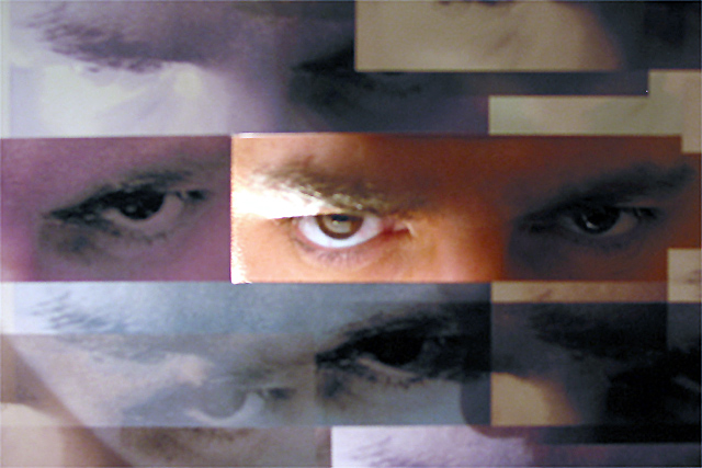
This was an experimentation and the lighting effect coming from behind the photo was a nice surprise. Probably why I got caught offgaurd on the clarity..I was so struck by what the lighting did and liked it so much I didn't want to screw with the photo too much:-)
I wrote a "how did they do that" article for drew and langdon and there is some interesting stuff in there as well regarding architectural inspired art.
I don't get it, since when is there administrative notes, and how did the administrator know that this was not achieved post-process? Isn't this supposed to be non biased. I don't like the way you are steering people to vote this picture high. It just doesn't seem rignt. Pictures should be voted on face-value!
It's funny to me that people assume this has been edited. Don't get me wrong, it's a very clever idea. Bu all I need to see is that glare on the cardstock or whatever you used that's above the right eye to know the basics of how this was done. (Either that or you're good enough to think of that and then fake it.)
Personally, I want a little more light on the left eye and a little less on the eyebrow above the right. I also want that focus to be really sharp -- especially on the right, central eye.
Nice one. Now, if only the eyes were in better focus..... The eyes and the eyebrws seem are blurred. Also, there are washed out highlights over one of the eyes, while the other is too dark. That's a nice effect you have achieved though. Did you use some kind of filter?
I will be waiting to see how you did this. I'm sure if sounds pretty snooty...but it really looks so much like a digitally manipulated photo montage type of thing, that even if it isn't, I'm not sure how much I like it as a photograph. Maybe I'm just sore that I couldn't do this though.
Can't wait to find out how you achieved this, but the photo itself doesn't do "it" for me, the way I interpreted this challenge was 'people' not peoples parts, sorry.
wow, I feel like I am being watched. Interesting colors and textures achieved here. Obviously you put a lot of time and effort into this project. The harsh lighting on the "real" face seems pretty harsh to me.
Very interesting, admin note was helpful, but I was pretty certain this shot was taken as seen. I think I would have liked the lighting move even (but not the same), but a little less harsh on the left and just a little brighter on the right. Next is a nit against several somewhat similar shots: the challenge was people, eyes are a small part of people, so you get a small part of people score. Photo 9 Creativity 10 ++++ (lots of extra credit here) People 2 (you lost the extra credit here) total 7 (most partials got under 5 from me)
Now that the message was posted I can see how this was done not using post-processing, at least I think. You took a picture of a picture except for one area in the middle to the right. While I think this is very creative and I really do like the picture, I feel it is inappropriate for a site that focuses on raw photography.
this is wild, i can't wait to find out how you did it...altho i wish you'd looked directly at the camera instead of up at it, the white showing below the iris makes you look eeeeevil!
no idea how you've achieved this ... definitely one for the 'How'd They Do That' section. Very arty and very Big Brother. Seems to me like the main image isn't quite focused properly.
I'm very curious how you did that - it's way cool. Start writing your contribution to the "How'd they do that???" section. Would there have been a way to improve the focus a little? Everything seems just a little blurred.
Really neat photo. The center eye is over exposed.Try putting a dryer sheet over the flash.Experiment with howmany folds it takes to get the right look.
Look forward to reading your "How do they do that" article :) I like the effect on what I'm taking to be the real face (I assume the others are pictures) but I think the lighting might be a bit _too_ contrasty./ Less highlight and less shadow may have improved it (or may have ruined the shot - I can't decide)
Wow, it's great that this photo was reinstated. I'd love to find out how it was done. It seems out of focus or low resolution, but since my photos are all like that too, I'm aware it could just be a low end camera. It has too much artistic merit to penalise it for that.
Wow, I'm impressed. I think this would fit even better with the challenge if the faces conveyed different emotions. I don't know if that would be possible, but without the administrator note, I don't know how the picture as it is is possible!
This type of photo is not allowed.... OK.. I thought this photo would be disqualified... let me re-comment... I definitely don't understand how it was done and I'm puzzled by the lack of clarity and sharpness. It's possibly from a lower end camera maybe? I would score higher if I really liked the impressoin given by the image but I'm not quite sure that I like the overall impact. Whatever you did here is definitely creative!





 Add photograph to your favorites
 Add photographer to your favorites


