Since you didn't include any of your own thoughts on this image, I can't offer you much. I don't think the photo meets the challenge though. It's a dual subject image where one item is quite larger than the other. It is an interesting photo but probably not so much in the context of this challenge...
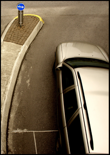
I like this shot. Very cool perspective. I like your treatment of it, the tone works well for me in this case. Interesting shapes, forms and lines. The shot is neat to look at. Nice job.
I like the color of the car, and I guess if there MUST be a car in the picture, at least it's a gray one and blends nicely with the road. It does distract from the little sign, though I think, all things considered, the photo is actually very technically good, with a nice range of values, some awesome textures, and no blownout highlights.
Overall, I see what you're getting at, and I think you did it pretty well. :) 7
Wonderful tones and treatment to this image. The highlights are just held in --- this image is technically flawless. I like the new and fresh experimental type of composition, as well as a very different angle. Great way of working "outside of the box"!
Very creative. Looks like a selective desat., but that could just be the natural colors. Either way, I think it really helps isolate your subject. The form of the car may be a little too strong for the purposes of the challenge, but I think it creates a great balance with the sign.
I know it should be a quibble, but it struck me as a major issue - the yellow curb. I think the blue arrow is fine, given the nature of the challenge; though I strongly believe that the photo would be best without selective desat. Other than this, it's a strong photo.
what an intruiging image..tones nice - almost would prefer just the bottom 1/3 of the image for this challenge but have to vote high because there's something about it that really speaks to my soul 9





 Add photograph to your favorites
 Add photographer to your favorites

 Photographer found comment helpful.


