| Author | Thread |
|
|
05/09/2005 06:07:18 PM |
Greetings from the Critique Club...
Hi AlexMonty...
I read your 'backstory' and still don't really understand, but that's ok :) The image itself doesn't really speak to me very well. I can't see a story or idea in it myself. From a technical standpoint, anything I could say about it would be primarly preference, but it feels 'stark'. I don't really understand the choice for high contrast on this shot. It appears that the average vote thinks this photo is middle of the road. You can usually interpret this as an image that has no significant flaws, but also doesn't strike the viewer is 'great' in many ways.
John Setzler
|
|
 Photographer found comment helpful. Photographer found comment helpful. |
Comments Made During the Challenge  |
|
|
05/03/2005 10:00:26 PM |
|
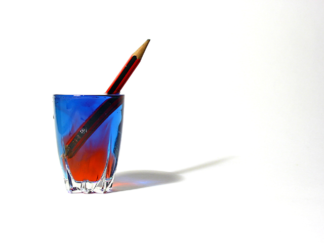
Great colors. Minimal in complexity of background as well as complexity of subject: fits the challenge well. Nice sharp image. Creative, original, I like it a lot. Top ten. |
|
| Photographer found comment helpful. |
|
|
05/02/2005 10:37:00 PM |
|
I like the idea, but there is something about the glass that doesn't fit. Maybe that is just me. 6 |
|
| Photographer found comment helpful. |
|
|
05/01/2005 06:14:43 PM |
|
Great colors, maybe the glass only would do better but still good picture! |
|
| Photographer found comment helpful. |
|
|
05/01/2005 02:36:30 PM |
|
cool, wish the right edge of the photo didnt have a grey gradient on it, but otherwise this is a really good shot. i especially like the blue and red to the glass. |
|
| Photographer found comment helpful. |
|
|
05/01/2005 02:54:58 AM |
|
Like the reflection on the white surface, for a minimalist extreme the glass placed further down and to the edge would have looked better imo.. |
|
| Photographer found comment helpful. |
|
|
04/30/2005 10:51:32 PM |
|
that's awesome. one of the more interesting beverage photos i've seen. |
|
| Photographer found comment helpful. |
|
|
04/30/2005 06:25:35 PM |
great use of light, not sure of the pencil though. I just dont get it.
8 |
|
| Photographer found comment helpful. |
|
|
04/30/2005 11:36:44 AM |
|
All the white does not add. |
|
| Photographer found comment helpful. |
|
|
04/29/2005 04:52:40 PM |
|
I really like those colors in the class, they really make the picture special |
|
| Photographer found comment helpful. |
|
|
04/29/2005 11:25:25 AM |
|
very colourful, the shadow is nice too |
|
| Photographer found comment helpful. |
|
|
04/29/2005 01:36:18 AM |
|
nice refraction. i like the colors of the water. perfect composition. is there a hidden meaning? (10) |
|
| Photographer found comment helpful. |
|
|
04/29/2005 01:02:10 AM |
|
blue and red is wonderful, i wouldve used something other then a pencil though... something more along the lines of barware, or something you'd use to accent drinks |
|
| Photographer found comment helpful. |
|
|
04/29/2005 12:29:00 AM |
|
I somehow always think of minimalism being more stern than this - not so lighthearted. I don't really know why, possibly because it seems such a cery intellectual philosophy. This is great though - image and title. |
|
| Photographer found comment helpful. |
|
|
04/28/2005 04:26:35 PM |
|
Not really understanding this one, but I light the shadow, and the colours, and the lighting, 6 |
|
| Photographer found comment helpful. |
|
|
04/28/2005 03:23:49 PM |
Challenge: 9
Technical: 9
Interest: 9
Overall: 9
Just a nice clean crisp shot. Good Luck |
|
| Photographer found comment helpful. |
|
|
04/27/2005 07:01:47 PM |
|
I normally don't like harsh, white backgrounds, but here it serves well to show the colored shadow. This is minimalist more in the classic sense than in the contest description sense, but I'm not docking points for that. Excellent color contrasts, and the shadow breaks up the background tedium nicely. |
|
| Photographer found comment helpful. |
|
|
04/27/2005 06:36:03 PM |
|
| Photographer found comment helpful. |
|
|
04/27/2005 12:39:25 PM |
|
A bit odd, but well excuted. I like it! |
|
| Photographer found comment helpful. |
|
|
04/27/2005 11:21:05 AM |
|
| Photographer found comment helpful. |
|
|
04/27/2005 10:50:21 AM |
|
Nice representation of minimalism. I would of only used one colour in the glass or the two colours of the pencil, plus I would of not sharpened the pencil to ensure I had the minimum of colours. 8 |
|
| Photographer found comment helpful. |
|
|
04/27/2005 10:42:07 AM |
|
Color works well with the flat white background. No doubt what the subject is. |
|
| Photographer found comment helpful. |
|
|
04/27/2005 10:01:17 AM |
|
I think this needs some sort of background. |
|
| Photographer found comment helpful. |
|
|
04/27/2005 05:15:47 AM |
|
Kewl colors. Even those showing through in the shadow. |
|
| Photographer found comment helpful. |
|
|
04/27/2005 05:08:18 AM |
|
I find myself searching for a deeper meaning... is there one - I am prone to be daft on occasion... Cool colours though... |
|
| Photographer found comment helpful. |
Home -
Challenges -
Community -
League -
Photos -
Cameras -
Lenses -
Learn -
Help -
Terms of Use -
Privacy -
Top ^
DPChallenge, and website content and design, Copyright © 2001-2026 Challenging Technologies, LLC.
All digital photo copyrights belong to the photographers and may not be used without permission.
Current Server Time: 06/29/2026 05:42:59 AM EDT.