| Author | Thread |
|
|
05/06/2003 06:39:45 PM |
Thank you Ellen !
I answered to you personnally but .... your comments/critique is helpfull ( the others were as well ! ) and I am very happy that you like my work. As for the criticism at the end .. it's pretty acurate as well.
Thank you again for your comments on this picture (and the others) and on my work and on me as a photographer.
Lionel
|
|
|
|
05/05/2003 05:41:46 PM |
Hello from the Critique Club - I'm geting back to some of my hostages.
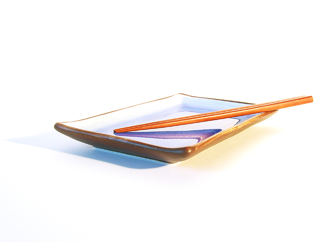
I was going to look up something about japanese esthetics but I never did. I wish Natasha could critique this one. Either that, or I hope she never reads mine. I could be all wrong but it feels to me that besides creating a lovely picture you have made something Eastern as opposed to Western. I suspect that the "rule of thirds" and other ways we have of looking at composition are Western norms. Just as we fill up our houses with decoratives, they keep their homes visually simple. We lines the walls and edges of a room with furniture, they keep the walls clear and put one table in the center of the room. Your picture is so simple and so essential. Just the empty plate waiting for food - It implies hospitality, a meal to be offered to family or guest. The edges are clear and uncluttered. There isn't anything to confine the image, no table top, no horizon, no frame, no reference points, no background at all.
An image that reads from left to right is said to be dynamic, one that reads from right to left is more peaceful. I like how the chopsticks point left, the shadow of the chopsticks point left and the plate (and it's shadow) points left, peace upon peace upon peace. The relaxed feeling is also picked up in your subtle somewhat muted colors and the complimentary color scheme - yellow purple.
All the line, yes, every single one, contribute to a visual follow-the-dots. the chopsticks point to the upturned edge of the plate which swoops up just enough to throw the viewer back into the image and around the plate to the curvey shadow and back up and down the chopsticks. The eyes of the viewer are lead back into the image continuously. Once the eyes get led out of the frame the mind says "Okay, I'm done, click, next picture." With the pattern you have created I came back for a second and third look and give your photo the attention it deserves (especially important in a quick view contest like this one).
I like some of the words used in the comments: Simple, Zen, delicate, elegant, appealing, balanced. Yes, I agree that that bit of shadow anchors the image which would otherwise float. Good comments.
Now the critisism..I think you have absolutely positively mastered the image on white theme. How much more perfect do you have to make it??? Are you challenging yourself? Or has this become too easy?? Are you expanding your style or are you stuck? Surely it gets you great votes. Your images are equisite!! But do you need to take a risk? Are you afraid to try images of people? Where can you take your artistic eye next? Dare I suggest make it more personal? You are one on "our" top photographer/artist. Don't let it get stale or you will outgrow DPchallenge. |
|
 Photographer found comment helpful. Photographer found comment helpful. |
|
|
03/25/2003 09:07:46 AM |
What is going on?? Every time I click the cc computer it gives me one of yours to review. Can't promise that I'll be swift. I'm alternating between watching the war and avoiding all media. My son is a marine who has been trained for months to be on the team that opens and guards the new American embassy in Bagdad. But so far he is still safely in North Carolina.
Preview - i really really like this picture - i gave it a nine because I only give one 10 per challenge which I awarded to the purple spoons. I see sooo much improvemnt in your work. Here you are experimenting with color and yo were very sucessful! |
|
| Photographer found comment helpful. |
Comments Made During the Challenge  |
|
|
03/23/2003 06:10:14 PM |
|
This is a beautiful picture! Even though it looks like it's "floating", the shadow anchors it. |
|
| Photographer found comment helpful. |
|
|
03/19/2003 03:56:16 PM |
|
I like the simplicity of this. Great take on the theme. |
|
| Photographer found comment helpful. |
|
|
03/19/2003 01:11:43 PM |
|
So simple and so effective. Wonderful shot. My top 3 this week. :) |
|
| Photographer found comment helpful. |
|
|
03/19/2003 10:14:07 AM |
|
very nice work with the lighting... I think this composition could possibly be stronger if the subject were lower in the frame and not quite as centered... excellent work :) - setzler |
|
| Photographer found comment helpful. |
|
|
03/19/2003 01:33:42 AM |
|
| Photographer found comment helpful. |
|
|
03/18/2003 11:22:26 PM |
|
Very good in all aspects. The grainy image works very well. |
|
| Photographer found comment helpful. |
|
|
03/17/2003 11:32:07 PM |
Nice photography. I like the colour, including the coloured shadow.
The whiteness does not take away from this photograph as one would think that it might. Good focus, nice and sharp. Good visual impact also. |
|
| Photographer found comment helpful. |
|
|
03/17/2003 06:51:40 PM |
|
How Zen! Very good use of lighting. Good job. |
|
| Photographer found comment helpful. |
|
|
03/17/2003 06:10:15 PM |
|
Very classy shot! It's simple yet very appealing for some reason. GREAT JOB! 8. |
|
| Photographer found comment helpful. |
|
|
03/17/2003 03:07:57 PM |
|
beautiful...i love the simplicity. definitely says asia. well done! |
|
| Photographer found comment helpful. |
|
|
03/17/2003 11:11:31 AM |
|
| Photographer found comment helpful. |
|
|
03/17/2003 07:30:20 AM |
|
| Photographer found comment helpful. |
|
|
03/17/2003 05:23:09 AM |
|
I like this. Simple is good. THe only thing I'd suggest is to take the picture from slightly further up. I believe the angle would still maintain your reflections and it will put a little more of the dish and sticks in the frame. It would also add just a hint more color to this and I think it needs a little more color. Pretty good shot. |
|
| Photographer found comment helpful. |
|
|
03/17/2003 03:23:38 AM |
|
| Photographer found comment helpful. |
|
|
03/17/2003 03:22:16 AM |
|
What can I say? It's wonderful! I like how you've left a lot of room around the plate and didn't crop it too tightly! 9 from me. |
|
| Photographer found comment helpful. |
Home -
Challenges -
Community -
League -
Photos -
Cameras -
Lenses -
Learn -
Help -
Terms of Use -
Privacy -
Top ^
DPChallenge, and website content and design, Copyright © 2001-2026 Challenging Technologies, LLC.
All digital photo copyrights belong to the photographers and may not be used without permission.
Current Server Time: 06/28/2026 06:10:31 PM EDT.