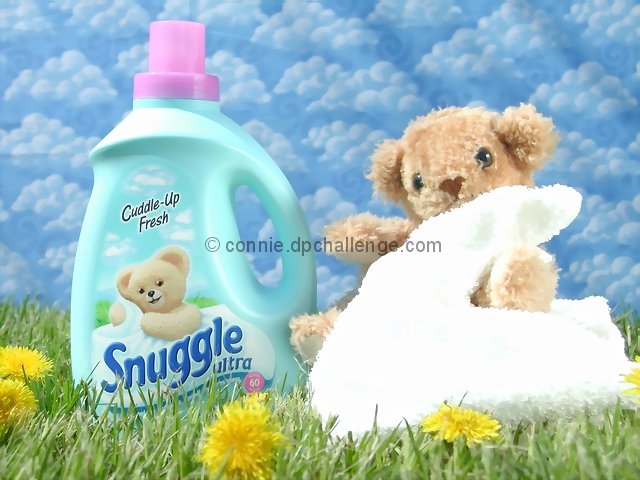
Like the way you used the fabric in the background -- it echoes the clouds on the product label nicely. The only thing I think needs a bit of work is that the towel seems a little bit too bright. I only get texure on it around the edges.
Sure a bright, cheery picture, nice focus, and neat backdrop. The towel is a little blownout though. A tad darker would probably cure that. But, good job.
I think I gave this photo a high score because of the color in it, as well as the nicely in-focus grass. The only aspect of this photo that bugs me is the white blanket. You want really vibrant colors to show off how great the softener is, but here it is so white that it loses its texture. It might have been better to try other colors of blankets, if you had not done so. Maybe even a more "warm" color would have done well. Nice shot, though :)
very very well done. the background is the coup de grace. yeah it's a little overly lit/pushed levels, and i understand you were going for clean and fresh but it's still a bit much. also too much space to the left of the jug. should have gone in tighter.
This is actually a very good shot.. but what kills it for me is that the bear is not the same bear. You've chosen an easily recognizable subject.. and its done well.. but not seeing the bear I'm used to seeing makes this one a tough call.
This is well executed, especially the lighting. The white on the towel seems to have blown out a bit though. I don't really think it's very effective to just reproduce the imagery from the front of the product itself though... it's kinda repetitive.
Wow, it's clear you went to quite some effort to make this shot; cloud background, well placed flowers, props, etc. It would be much better if the lighting was as soft as the the theme. The harsh blown out highlights kinda spoil it.
Did you copy this out of a magazine? That is really good. Is that real grass? Was it shot in sunlight? The only complaint I have is that there is too much light. You can't even see any texture on the front of that towel.






 Add photograph to your favorites
 Add photographer to your favorites


