i don't know anything about portraiture, so i'm using your image as a guinnea pig as to what i think i would or wouldn't do in this situation, as well as what i notice and get out of your image.
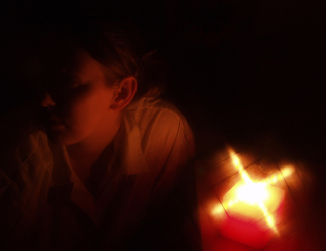
i'm beginning to see portraiture as the quest to capture the essence of someone. in that, i believe you have succeeded, if but just a bit too much. there is not a single thing i would do differently, if this is what you wanted to do. and, along those lines, i think the strength of your light is perfect, as is the negative space in the top right. good work, and good luck!
Returning for comment. The light in the lower right corner overpowers the rest of the image and isn't as visually appealing as you might have intended. Perhaps cropping out the light and brightening up the remainder would have helped. Good pose.






 Add photograph to your favorites
 Add photographer to your favorites


 Photographer found comment helpful.


