| Author | Thread |
|
|
03/05/2003 11:58:09 AM |
|
CONGRATS!!!!! im amazed with the title....quite looooooong... |
|
 Photographer found comment helpful. Photographer found comment helpful. |
|
|
03/03/2003 07:27:23 AM |
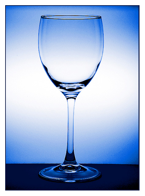
Thanks to all for your votes and, specially, who made comments.
This shot initially was a glass with red wine, but first I took some shots with the empty one and the results were nicer to me. The glass was set up in front of a light box. The camera white balance was set at fluorescent light. Then some adjustments in PS (levels, contrast and a little sharp).There´s no more lighting and, of course, I used a tripod.
Thanks again!
//www.pbase.com/pepventosa |
|
|
|
03/03/2003 01:30:40 AM |
|
Wow!!!! You got 2nd. I didn't think it would. congrats!!! |
|
| Photographer found comment helpful. |
|
|
03/03/2003 12:03:33 AM |
Way to go Pep. Nice image. One of my favorites this week.
Bob |
|
| Photographer found comment helpful. |
Comments Made During the Challenge  |
|
|
03/02/2003 12:11:17 PM |
|
That title is extreme! But the photo is very beautiful. It would definitely work as a stock photo. The colours are just gorgeous. Seems a little bit jaggy along some edges though. I'm giving it 10 nonetheless. |
|
| Photographer found comment helpful. |
|
|
03/02/2003 11:26:27 AM |
|
nice and simple .. it is elegant .... not quite sure on the composition of center of the page ... but it is executed very well |
|
| Photographer found comment helpful. |
|
|
02/28/2003 03:46:52 PM |
|
Well done I love the light |
|
| Photographer found comment helpful. |
|
|
02/27/2003 11:42:16 AM |
|
Good job, like the lighting. The jagged compression lines are distracting, also the stem of the glass is not quite straight. Still could surely see this as a stock shot. Great title too! |
|
| Photographer found comment helpful. |
|
|
02/27/2003 11:20:01 AM |
|
Are you trying to say it is just another Blankety-Blank glass? It looks a little over processed and kind of grainy to me. If it had been very sharp I could go higher but now only a 4. In a situation like this one you have complete control of the outcome, so it should be much better. |
|
| Photographer found comment helpful. |
|
|
02/27/2003 09:40:11 AM |
|
Excellent shot. Perfect stock photo. 10. |
|
| Photographer found comment helpful. |
|
|
02/27/2003 06:21:35 AM |
|
You got one item for 11 different uses here, but I can't give you 11 points for it for some reason :-). I think you did well with this shot, it is nice and sharp and in focus and I could think of many ways to use it in campaigns or presentations. The colour is bang on too. Good one! |
|
| Photographer found comment helpful. |
|
|
02/26/2003 08:26:23 AM |
|
Great job lighting this! I know how hard it can be. I think the photo however suffers slightly from over-sharpening. I can see jaggies on the edge of the glass. This can also be helped by using Bicubic resampling instead of Bilinnear. Great blue tones too. |
|
| Photographer found comment helpful. |
|
|
02/26/2003 12:00:21 AM |
|
nice, good, clear, blue, good-lighting, well-composed |
|
| Photographer found comment helpful. |
|
|
02/25/2003 10:11:37 PM |
|
Good strong, simple image...could be useful in lots of situations. Good stock I think. I like the lighting very much. |
|
| Photographer found comment helpful. |
|
|
02/25/2003 03:40:55 PM |
|
Very profesional. Great lighting. 10 |
|
| Photographer found comment helpful. |
|
|
02/25/2003 11:14:55 AM |
BEAUTIFUL!!!!!!!!! 10
Lose the title. lol
|
|
| Photographer found comment helpful. |
|
|
02/25/2003 10:50:21 AM |
|
Great lighting, IMO would have prefered the glass not to be dead centre. |
|
| Photographer found comment helpful. |
|
|
02/25/2003 05:55:42 AM |
|
technnically a good stock photo, improvements on the "be as original as you can" side would boost your sales though. 7 |
|
| Photographer found comment helpful. |
|
|
02/24/2003 11:13:35 PM |
|
Very simple and very nice. 9 |
|
| Photographer found comment helpful. |
|
|
02/24/2003 08:46:02 PM |
|
Where's the glare???? Wow, I'm impressed. Very nice shot. I love the radiated blue background. |
|
| Photographer found comment helpful. |
|
|
02/24/2003 06:58:17 PM |
|
good choice of colors, really like the simplicity |
|
| Photographer found comment helpful. |
|
|
02/24/2003 03:31:06 PM |
|
A very nice simple and clean image, I like that a lot. You've done an incredible job on the glass, no reflections or blown-out highlights, wonderful. The background behind the glass is very nice also, the surface the glass is standing on is very distracting in my opinion, it introduces a much darker color and a clear straight separation of background vs. surface in an otherwise curvy photo. To my eye, it also looks just a tad rotated, but that may be me not holding my head straight today. :) I would suggest redoing this with a different surface (put the glass on a curved piece of cardboard that serves as background and surface?) and you have a winner in my mind. |
|
| Photographer found comment helpful. |
|
|
02/24/2003 03:10:05 PM |
|
Seems to barely slant. Nice colors. |
|
| Photographer found comment helpful. |
|
|
02/24/2003 11:56:51 AM |
|
Not sure about the funky title, but I love the image! |
|
| Photographer found comment helpful. |
|
|
02/24/2003 11:25:11 AM |
|
| Photographer found comment helpful. |
|
|
02/24/2003 09:28:01 AM |
|
This is a very strong image. I love the blue toning and the centered composition. The background color gradients also work nicely... great shot :) - setzler |
|
| Photographer found comment helpful. |
|
|
02/24/2003 09:03:53 AM |
|
I like the blue color and your overall lighting. You've not only captured the challenge in your photo, you've even followed through with the title! Beautiful job. |
|
| Photographer found comment helpful. |
|
|
02/24/2003 08:40:06 AM |
LOL. I'm voting on this one first because your title indicates that you're someone who spends a LOT of time on corbis (like me). It really did make me laugh outloud!
Oh, yeah...and good shot too. Very simple and I like the blue tint. |
|
| Photographer found comment helpful. |
|
|
02/24/2003 04:38:24 AM |
|
Great subject and composition. The tight center crop works very well. The pic IMO looks like its been oversharpened or taken with a high ISO. It also is a little overexposed for my tastes. The blue is a nice color for the background. |
|
| Photographer found comment helpful. |
|
|
02/24/2003 12:40:31 AM |
|
Seems a little grainy, but I like the blue background. I think I would have been more drawn to a blue base as well. |
|
| Photographer found comment helpful. |
|
|
02/24/2003 12:36:24 AM |
|
8 points for a good, clean stock-type shot + an extra point for the clever keywording title. Made me laugh... Clever. 9 |
|
| Photographer found comment helpful. |
Home -
Challenges -
Community -
League -
Photos -
Cameras -
Lenses -
Learn -
Help -
Terms of Use -
Privacy -
Top ^
DPChallenge, and website content and design, Copyright © 2001-2026 Challenging Technologies, LLC.
All digital photo copyrights belong to the photographers and may not be used without permission.
Current Server Time: 06/30/2026 08:54:00 AM EDT.

 one item, wine, glass, drink, vertical, nobody, close-up, empty, curve, blue, fragile, transparent