| Author | Thread |
Comments Made During the Challenge  |
|
|
11/28/2004 05:02:17 AM |
|
fantastic. creative interpretation and great execution. |
|
 Photographer found comment helpful. Photographer found comment helpful. |
|
|
11/26/2004 05:16:37 AM |
|
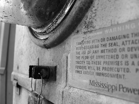
this is one of the more interesting interpretations of the challenge. i think it would be much more powerful with a deeper depth of field, as well as if you'd shifted the focus a little more towards the sign. good luck! |
|
| Photographer found comment helpful. |
|
|
11/25/2004 10:50:55 AM |
nice picture , but I think theres too much cropping..
I think it would be better if the focus would be on an object , just an opinion |
|
| Photographer found comment helpful. |
|
|
11/24/2004 12:42:57 PM |
|
Very nice textures, great depth of field. You met the challenge, too. I feel a tighter crop from the left would have been better. Cropping a bit off the right might have made the words PROSECUTED and IMPRISONMENT come put better. |
|
| Photographer found comment helpful. |
|
|
11/24/2004 11:27:50 AM |
|
I think that this image would've been better if the text was more in focus, even if at the expense of the seal on the meter. |
|
| Photographer found comment helpful. |
|
|
11/24/2004 05:45:39 AM |
|
| Photographer found comment helpful. |
|
|
11/24/2004 01:16:01 AM |
|
Very nice. Good depth-of-field. Nice and gritty. |
|
| Photographer found comment helpful. |
|
|
11/24/2004 12:21:23 AM |
|
Interesting point of view. I like the gritty realism of the photo. I would like a more determined focal point so that the message would come across more powerfully (get it- sorry, couldn't help myself.) Very interesting contrast of line and curve. |
|
| Photographer found comment helpful. |
|
|
11/24/2004 12:08:49 AM |
|
Good concept, but the words seem to be the subject, so more of them should be in focus. |
|
| Photographer found comment helpful. |
Home -
Challenges -
Community -
League -
Photos -
Cameras -
Lenses -
Learn -
Help -
Terms of Use -
Privacy -
Top ^
DPChallenge, and website content and design, Copyright © 2001-2026 Challenging Technologies, LLC.
All digital photo copyrights belong to the photographers and may not be used without permission.
Current Server Time: 06/30/2026 06:51:37 AM EDT.