| Photograph Information |
Photographer's Comments |
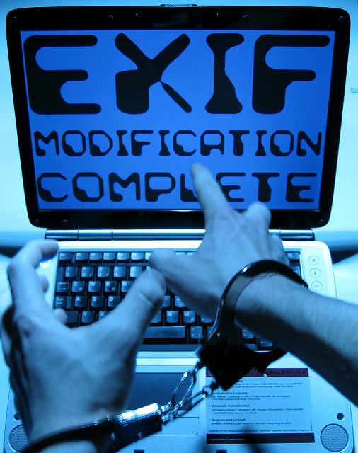
Challenge: Authority (Basic Editing I)
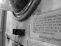
Camera: Canon Digital IXUS 400
Location: My Bedroom, Bascharage, G-D of Luxembourg
Date: Nov 22, 2004
Aperture: F/2,8
ISO: 50
Shutter: 1,00 sec
Galleries: Humorous, Photojournalism
Date Uploaded: Nov 22, 2004
|
After rejecting many other ideas and unsubmitting my last one, I finally decided for this picture.
Setup.
It was taken with a tripod. I used a stroboscope as lightsource. It was the coldest / bluest one I could find. However, this caused the picture to look a bit shaky. I had to hold my hands as still as possible, which turned out to be quite difficult after about 30 shots. As I had to close my arms around the tripod, my back started to hurt, too.
Controversy.
'Rules and regulations are everywhere'. Even right under your nose. I wanted to show the example of authority which is the closest at hand. DPC needs authority like everything else, in order to keep things fair and straight. I DON'T want to annoy anyone who might have been dq'ed because of EXIF editing before.
Post Processing.
Straighten, crop, HSL, brightness/contrast, resize, sharpen. |
| Author | Thread |
|
|
12/02/2004 12:27:54 PM |
Thank you for the many comments! I'm a bit surprised that they are all, in one way or the other, positive. I expected, at a score so close to 5.0, some more people critisizing me. Now I don't know what to change about it.
The blue tone some of you mentioned was wanted indeed. I like blue and it gives it a modern and cold look. Some people asked what I was suggesting. Actually, the image's message is whatever you see in it. I'm not saying whether authority is good or bad. It's just there and it's up to you to judge.
The only thing I'd change now is the blur on the hands. It was not wanted at all, but it was quite diffucult to hold my hands still after 50 shots :). And I'd have liked to clone out a small dot in the upper right I had forgotten to remove.
I'm glad to have gotten the attention of a SC, though. And thanks to kpriest for getting the point and suggesting me for disqualification ;]
(Edit: typos)
Message edited by author 2004-12-02 12:29:23. |
|
Comments Made During the Challenge  |
|
|
11/30/2004 10:50:25 PM |
We will be watching you closely for even suggesting such a thing! =] hehe.
Cool pic. Wish the sticker wasn't on the laptop though. |
|
 Photographer found comment helpful. Photographer found comment helpful. |
|
|
11/30/2004 08:34:26 PM |
returning for comment:
Nice effect. Bumping to 7.
|
|
|
|
11/30/2004 04:12:34 PM |
|
clever. I think the movement is implied by the position of the hands. The blurry part is a bit distracting. Is the overall blue tone intentional? |
|
| Photographer found comment helpful. |
|
|
11/30/2004 12:53:05 PM |
|
|
|
11/30/2004 06:06:32 AM |
|
what are you trying to say? |
|
|
|
11/30/2004 12:11:19 AM |
|
Submitting for disqualification... :-) Funny! |
|
| Photographer found comment helpful. |
|
|
11/28/2004 11:30:45 AM |
|
I know there is a great message here, I am just a bit uncertain what it is. Are you saying you didn't keep your original EXIF tags so you can't submit the original image, or are you saying something more intense like the changing of the individual? Either way it is a striking image. I love the blue cast, very furturistic/sci-fi. I like that the hands are sightly blurred to indicated their movement. The point of view and angle work very well. Captivating image. |
|
| Photographer found comment helpful. |
|
|
11/28/2004 08:06:33 AM |
|
clever take on the challenge. i'm sure you speak for both the formerly dq'd as well as hacker-wannabees. |
|
| Photographer found comment helpful. |
|
|
11/26/2004 08:54:28 PM |
|
|
|
11/26/2004 03:58:20 PM |
way too much time on your hands. spend it feeding the hungry.
I really wasn't too fair the first go-round---
please, don't get me wrong- its just not my style. Maybe a little less blue, slightly more sharpened/ I do like the angle of the shot though- really creates movement.
Message edited by author 2004-12-20 18:11:25. |
|
|
|
11/24/2004 08:02:57 PM |
|
This fits well. Would not be surprised to see this ribbon in the top 3. Best idea for the challenge. Good Luck. |
|
| Photographer found comment helpful. |
|
|
11/24/2004 02:38:27 PM |
|
|
|
11/24/2004 01:01:31 PM |
|
|
|
11/24/2004 11:53:21 AM |
|
|
|
11/24/2004 09:23:04 AM |
|
| Photographer found comment helpful. |
|
|
11/24/2004 01:08:31 AM |
you better not...
good image |
|
|
|
11/24/2004 12:54:51 AM |
|
| Photographer found comment helpful. |
|
|
11/24/2004 12:47:48 AM |
|
LOL! That is so funny. (8) |
|
| Photographer found comment helpful. |
|
|
11/24/2004 12:22:44 AM |
|
Interesting and clever. If the hands had just a bit more motion blur, or just a bit less, It would seem more complete. |
|
| Photographer found comment helpful. |
|
|
11/24/2004 12:08:36 AM |
|
Home -
Challenges -
Community -
League -
Photos -
Cameras -
Lenses -
Learn -
Help -
Terms of Use -
Privacy -
Top ^
DPChallenge, and website content and design, Copyright © 2001-2026 Challenging Technologies, LLC.
All digital photo copyrights belong to the photographers and may not be used without permission.
Current Server Time: 06/28/2026 07:29:58 PM EDT.