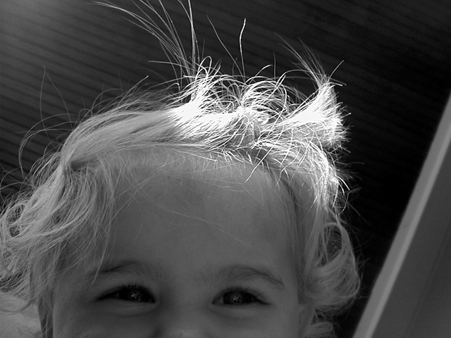
maybe not ground up, but i don't belive in ruling out for that, I mean thats what inspired it right. Very interesting, nice comp. The eyes are so dark, and creepy and there is that hint of a smile, the hair is fun,
Daring, but I don't know if it works. The blown out hair grabs all my attention, and the rest is tonally pretty flat. Good on you for taking a chance. Beautiful baby.
I can't see her eyes, and while her fly-away hair is cool, her eyes are the part I really want to see. Between the dark eyes and the highlight on the hair, I keep getting pulled away from what is, to me, the most important part of a portrait. Would it have been possible to use a reflector or a piece of white card to get some light up on her face?
The light on the hair is VERY cute. The background is nicely non-distracting, and I think it is a good use of black and white. Just showing the eyes actually does work, because they're really very expressive. Nitpick: the top left corner seems a little bit overexposed.
IMO cropping the child's face weakened the photo. I don't get the "feeling" that the child is looking down at you or you're looking up. Without something in the photo to act as a point of reference, I'm left feeling the challenge wasn't met.
Very cute, though it doesn't represent ground up. With the angle, she is looking at you head on... not down. The background does not represent the ceiling either, it looks more like shades.
Beautiful lighting, composition and expression on the childs face make this compelling. I would score it higher if it were obvious the camera is looking up.
This is an interesting photo. I always admire the black and whites. My own tastes tell me that i would have tried to capture more of the face. My other issue is that I have no indication that I'm looking up other than the title of this photo...
The light catching the hair is very nice :). So are the smiling eyes. The composition is really interesting, but somehow not very pleasing to me... It's hard to say why.







 Add photograph to your favorites
 Add photographer to your favorites


 Photographer found comment helpful.


