Some of you might know this is me. Tough. Zoomdak submits his Haystack Rock, and Dr. Jones his muse. this is my favorite photogrpahy place. Deal with it.
So hey, I love my new D70. This is one of the first shots (that wasn't coinciding with reading the manual) that I took with it. Wow. The image quality is so, so, so much better than my 2800Z. 'Cept the 2800Z will still be around, making cameo appearances. Be on a watchful lookout!
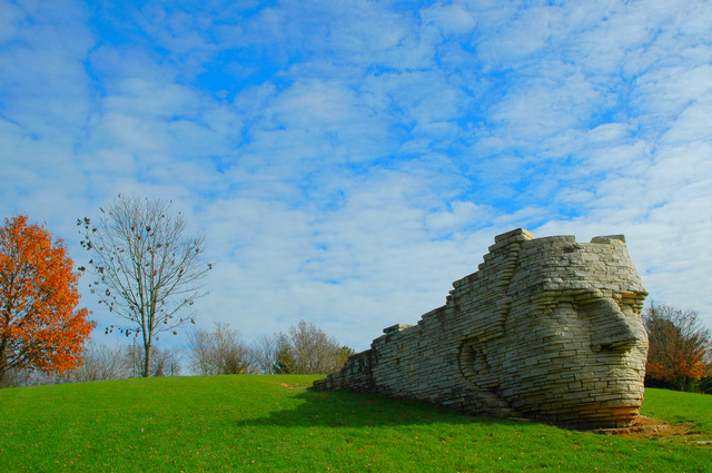
So lets see... Only post processing I did was increase saturation. Not really to be blown out, just so it looks like something Microsoft would have as a background. I think that tree is the last tree with leaves on it in the entire city, too. Everything else is dead. There's leaves all over the ground.
Voted Down on:
1) Unoriginality - I've taken this photo before. Not from this angle! Hah!
2) Shadow on his left face. Well, then you guys are dumb.
Statistics
Place: 21 out of 90 Avg (all users): 5.9043 Avg (commenters): 6.9167 Avg (participants): 5.6000 Avg (non-participants): 6.0242 Views since voting: 1658 Views during voting: 378 Votes: 230 Comments: 14 Favorites: 3 (view)
I really really like this image, with just a couple f minor points that detract from it for me: those are, quickly, that the blue in the sky has gone i think too far in saturation - it's become too unreal for the rest of the image, and has left the clouds looking more like a PS effect than anything real. The second thing is the half presence of that tree to the left - I'd have either tried to include it completely, or to remove it altogether. I just don't see the benefit of including only half of it, even though the colour is nice - but it isn't worth stretching the composition for, to my mind.
But this, overall, has wonderful, precise, different qualities of composition. I love the balance of elements - the low horizon, the face looking out of frame, the curve of green, the one tree with the last leaves hanging (Oh man, you shoudl have got rid of the red tree: it would make it such a strong, simple, and yet different composition). The light, the sense of highlight and shade on the face is fabulous, and wonderfully controlled.
The hidden messages are strong here too - and that's perhaps what i most like about it. The strange-face turned away from the bright colours and the autumn tree, and your composition placing him so that the sense is a deliberate turning of the back on such obvious and cliched things. 'I will not look for the bland, for the bright blues and greens, and those things that all the others find so comforting and compelling; I must look to my own world, and the important things of that.'. Great sense of message, great, and under-rated message.
you score will most probably have been strongly affected by the blinkered, who will have looked only for images of soldiers, firemen and the like, and either do not possess or cannot spare the brain-time to see this as fitting the challenge. You need, I think (and having looked at other images of yours), to be more blunt and srtaightforward with your choice of subject, if you are to break the six barrier. But who cares, with an image like this?
Argh, talk about never breaking out of the 5's! Still, my best finish yet, and I'm proud of myself. Thanks everyone for your comments (and votes, except for the 8 jokers who gave me 2's and 3's). And in response to those who said it was oversaturated:
Great colors here (even if a bit oversaturated). Although real, the composition and colors make this surreal. Not sure about the connection to Heroes, but the shot is great.
Bright and dramatic. I like the proportion of land. sky and sculpture. Seems to find the right balance. Must have looked fabulous a week or two ago when the line of the horizen was red/orange/yellow with fall foliage. The bareness seems to create a more heroic mood. I really enjoy this. 8






 Add photograph to your favorites
 Add photographer to your favorites

 Photographer found comment helpful.


