Author Thread Comments Made During the Challenge
Post actions
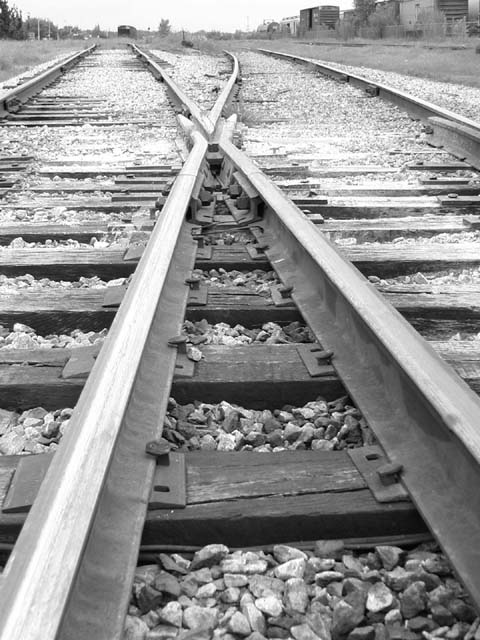
I'm usually a fan of symmetric photos, but I like the way the curves of the tracks bend in the image. Cool shot.
Post actions
i'd like to see a bit more horizon, so the building weren't cropped off.
Post actions
should have cropped it just above the cross over and left out the sky and grass.
Post actions
bit of a dangerous place for a pic!
Post actions
it would've been better if it had been more unsymmetrical
Post actions
This is kinda bleak. Is that the "mood" you meant to convey. It is a very nice shot, and the black and white works well.
Post actions
great photo...i like the black and white...it adds to the feeling of choice and direction with the tracks
Post actions
wish is was slightly more in focus, but at the same time, I like it!
Post actions
I like the idea, which track to go down, transitions in life I guess?
Post actions
Nice Cropping and I like the B&W effect
Post actions
Nice photo, interesting composition.
Post actions
Very clear transition, but the lighting feels flat
Post actions
Well done, but a bit overexposed in places
Post actions
looks a little overexposed. more contrast is needed.
Post actions
Nice composition of the rails.
Post actions
Post actions
okay, good job, black and white works well here, and the transtion is obvious
Post actions
This is a fresh idea on "transition." The highlights seem a bit too bright.
Post actions
I love railroad shots... especially black and white ones... The only improvement I could suggest in this photo is to darken it up just a tad... give that a try and see if you like the difference it would make. Nice shot!
Post actions
nice perspective and focusing, love the black and white, good shot!
Post actions
Post actions
me likem train tracks but whats the transition?
Post actions
I really like this, the b/w makes it in my opinion
Post actions
I like this idea with the black and white - this would make a very nice framed print -
Post actions
I would have liked this better if the shot was centerred between the 2 rails in the bottom
Post actions
Excellent Idea. Greawt Photo.
Post actions
My first impression of this shot was WOW!!!!!
Post actions
Love the leading lines and the 'off-centred symmetry' ... theres a contradiction in terms :)
Post actions
Great use of perspective.
Post actions
if there was a train there this would work..otherwise, the title is the only transition
Post actions
Very nicely done. Great idea, great framing. The image works without the title.
Post actions
The challenge was transition, not train station! :) Good idea, and nicely executed. Think it might be stronger if you'd just got the tracks and lost the background (i.e., tiled downwards a bit more) but this is still good. Look at it with the top cm cropped off - more mysterious, where do the tracks go kind of fell to it. Just a thought.
Post actions
Post actions
This is pretty good, but I prefer more contrast.
Post actions
Good shot, but maybe a little more centered..
Post actions
good job. do you think shooting it from a bit lower and cropping out the background would have made it stronger? I love black & white. Good choice. IMO color would have been distracting.





 Add photograph to your favorites
 Add photographer to your favorites


