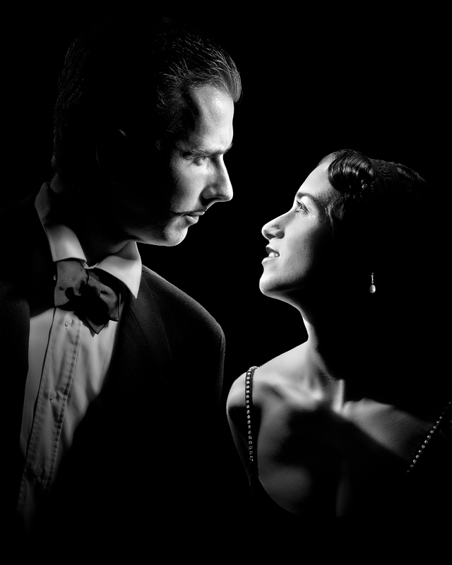
Even though I haven't seen the movie, I decided to try and shoot that little tribute to the recent Oscars winner, featuring my wife and me. It actually was done the day before the ceremony's results. While the original movie poster was obviously created by blending 2 photos together, I thought it would be a good challenge to try and achieve it in 1 shot, 1 exposure. Probably my most elaborated and precise lighting setup to date:
- A snoot from above left and little to the back, pointing down to her face
- A bowl+grid from just above her head and a little to the back, pointing to my face. This one had to be precisely positioned, in order not to light her own face's side (where the earring is)
- A snoot from above us (a little behind), pointing down to our central shoulders to create the rim light effect
- There is a trick for the earring: in fact, it's not in her ear, but in a black piece of cardboard that is attached to her face's side. Then I built a custom snoot attached to my speedlite, pointing exactly on the earring. This allowed to have a luminous earring with no skin appearing at all, without post-processing tricks. She really had to hold the exact position for that to work! Required quite a few tries, as you can imagine.
Thanks all for the great comments and votes, much appreciated.
Statistics
Place: 1 out of 77 Avg (all users): 7.8235 Avg (commenters): 8.9048 Avg (participants): 7.5918 Avg (non-participants): 7.9540 Views since voting: 5710 Views during voting: 347 Votes: 136 Comments: 66 Favorites: 11 (view)
I find it interesting that you went to all that trouble to light the earring that way only to then opt for a high contrast processed look which then makes the earring seem like a product of dodge/burn. Do you just like doing things the hard way? :P
I believe I had no choice there: if there was some visible bright skin next to the earring, it would have been against the rules to make it completely disappear
You're probably right. It may have been risky but I do know there's been other entries that have passed validation while removing more background. It's just one of those fuzzy areas in the rules.
Great result, this was one of my three 10s and it was an obvious winner.
Nitpicking - I thought it would resemble the original a lot more with harsher tones. But, since you cannot match Dejardin's poker face anyway, let's forget the original - this is a beautiful, well balanced b&w with some super-precise lighting I've only seen on pictures by the pros here. Amazing!
Btw I bet this is a serious competition to your wedding photos ;).
I find it interesting that you went to all that trouble to light the earring that way only to then opt for a high contrast processed look which then makes the earring seem like a product of dodge/burn. Do you just like doing things the hard way? :P
I believe I had no choice there: if there was some visible bright skin next to the earring, it would have been against the rules to make it completely disappear.
I find it interesting that you went to all that trouble to light the earring that way only to then opt for a high contrast processed look which then makes the earring seem like a product of dodge/burn. Do you just like doing things the hard way? :P
Since I just keep adding your photos to my favorites I figure it would be easier to just add you .. I study your shots hoping to figure out how to come even close to creating such genius images. Congratulations!
Incredible. Every detail, every touch of light is perfect.
And that you, whom the 10 last pictures were outstanding photoshop works, can also (or again) produce such a simple and pure B&W image says much about your skills.
Congrats !
Now all you have to do is win a Basic and a Minimal Editing challenge...*ducking for cover*
Incredible. Every detail, every touch of light is perfect.
And that you, whom the 10 last pictures were outstanding photoshop works, can also (or again) produce such a simple and pure B&W image says much about your skills.
excellent as always chrisotph, almost a full point above nicky but you have got a few years on the lad :), what strobes do you use? thanks for the description of the lighting. not sure what the comments stating the lighting doesnt do it justice were on about as it fantastically lit :), not sure if its in the film poster but ilove the detail of the straps with the jewels to catch the light.
The lighitng on this is brilliant. However, you forgot to mention the styling of the images as well. You styled this PERFECTLY, for the intended movie. Outstanding image Christophe, well deserved and overall a masterpiece of style, lighting, composition, and story. Can you tell I like this image? LOL
As a creature of the theater/film world, I'm highly entertained by the "cheating" you had to do to achieve the illusion of looking at each other :-) Congrats on your latest blue!
As always your work amazes me! Thanks for sharing your lighting setup. That's another thing you are great at -- you always share how your images were created, and that's much appreciated!
Christophe, this is just such a spectacular photo, so glad it is a single capture and you made an art out of the lighting - not to mention the makeup/hair/outfits on you both. Lovely shot and as usual huge congrats!
Achieving the lighting in one shot is a superb accomplishment. I am very impressed. The shot.itself is so "simple" that at a quick glance that fact might be missed.
But really. Go see the movie, especially since you got the blue representing it!
Well done Christophe, actually probably one of my fave photo by you now, I did not have this picked as you. Well done on making yourself unrecognizable, although the more I look, the more I can see you...good stuff.
I think the concept here was good, just don't think the photo actually does it justice. The look on the guys face is a little odd, and the female looks forced. The lighting isn't doing the picture justice either, in my opinion. Great concept, just don't think it was quite captured.





 The Artist
 Add photograph to your favorites
 Add photographer to your favorites

 Photographer found comment helpful.


