| Author | Thread |
|
|
12/07/2009 10:13:02 PM · #51 |
Originally posted by NikonJeb:
I'm decidedly no expert on B&W shots, and I've all too recently discovered the beauty of its use and applications. I have some images that just don't look right in color.....but I also have the reverse. Each has its place and IMNSHO, they're not automatically interchangeable. |
Originally posted by Louis:
That's a far cry from the claim that flowers "do not translate", to use your words, into black and white. Mapplethorpe's lilies and other flower photographs are considered not just some of his finest work, but the finest work of their kind. |
And as I posted in response to your previous post, Mapplethorpe himself had examples of what he obviously felt would not translate.....which was my point, and what I stated, although obviously not in a manner clear enough manner.
I wish you would have actually quoted the statement intact:
Originally posted by NikonJeb:
There are some things that just won't translate to B&W.
Sunsets, flowers, auroras......there are just some things that won't convey the vibrance and body that color conveys. |
I was speaking of these things relative to colors, nt that you couldn't take a decent flower shot, yet you guys don't seem to be disagreeing that sunsets and auroras would lose something without their color.
Edward did mention that he's seen astounding sunsets in B&W.....super....I sure haven't.
It's also a subjective thing, and you're never going to convince me that you can translate the subtle nuances of color shifts, and shades through B&W as they appear in all too many things in nature.
It was just an opinion.....take it for what it's worth.
Oh, and *DO* see what you can do with that lily......I'd love to see if someone could make that look good in B&W. Let me know if anyone wants the RAW file to play with....
|
|
|
|
12/07/2009 10:54:27 PM · #52 |
|
there is another component that no one has addressed. Every human has their own specific ability to perceive color "correctly" from those of us that are or may be color blind (predominantly males). To those of us that are or maybe more color sensitive or perceptive. Just like the sense of hearing or smell there are varying degrees of light/color perception and therefore varying degrees of adjustment are more or less appealing to certain people. I have a tendency to like or be drawn to B&W or very vivid colors. It stands to reason that my ability to discern a full array of colors may in fact be compromised in the range that others may consider "normal" or "natural" colors. I have learned from comments that I tend to over-saturate when in fact I have not thought that I was over-saturating......This being said, I try to look more importantly at composition and how the capture impacts me emotionally vice it's color. However there are times when the color is the most important aspect of the photo...In either case it is the photographer's decision as to how to present and the viewers judgment as to the quality (in all aspects) of the photo. I think we all, regardless of color, or lack there of, can judge what is pleasing/correct/incorrect/well lit/well composed etc...without a rule to tell us when. |
|
|
|
12/07/2009 11:34:51 PM · #53 |
Originally posted by NikonJeb:
ETA: Someone take this image and make it into a B&W and try and convey lavender....it's a Workshop image here....
 |
Jeb, I don't think this will easily translate into a great black and white, primarily because the background is the same color and tone as the subject. Do you have another? |
|
|
|
12/07/2009 11:45:07 PM · #54 |
Originally posted by NikonJeb:
ETA: Someone take this image and make it into a B&W and try and convey lavender....it's a Workshop image here....
|
Originally posted by bspurgeon:
Jeb, I don't think this will easily translate into a great black and white, primarily because the background is the same color and tone as the subject. Do you have another? |
Umm.....it's a split background with half being more flowers of the same color, and the dark lower....I don't understand what you're saying, I guess.
My point is that this image relies on the soft pastel color, along with the silver sparkles to make its impact......at least as I see it.
|
|
|
|
12/07/2009 11:50:29 PM · #55 |
Originally posted by NikonJeb:
Originally posted by NikonJeb:
ETA: Someone take this image and make it into a B&W and try and convey lavender....it's a Workshop image here....
|
Originally posted by bspurgeon:
Jeb, I don't think this will easily translate into a great black and white, primarily because the background is the same color and tone as the subject. Do you have another? |
Umm.....it's a split background with half being more flowers of the same color, and the dark lower....I don't understand what you're saying, I guess.
My point is that this image relies on the soft pastel color, along with the silver sparkles to make its impact......at least as I see it. |
The bolded is where you're having most of your communication problems. You tend to equate "as you see it" with "that's the way it is, period" :)
It's obvious that you don't fully understand Black and White, just in the things you say. Perhaps it's time to begin learning more about it. |
|
|
|
12/07/2009 11:56:31 PM · #56 |
I think it's time for another minimal editing challenge... =)
|
|
|
|
12/08/2009 12:01:15 AM · #57 |
|
I think it's time for a minimal editing challenge--for BW flowers only. |
|
|
|
12/08/2009 12:07:28 AM · #58 |
Originally posted by K10DGuy:
It's obvious that you don't fully understand Black and White, just in the things you say. Perhaps it's time to begin learning more about it. |
Why don't you give me your breakdown on how poorly I rendered this one, okay?
I eagerly await your vast wisdom and insight on how this is lacking and what it needs to be a good image.
|
|
|
|
12/08/2009 12:10:36 AM · #59 |
Originally posted by NikonJeb:
Originally posted by K10DGuy:
It's obvious that you don't fully understand Black and White, just in the things you say. Perhaps it's time to begin learning more about it. |
Why don't you give me your breakdown on how poorly I rendered this one, okay?
I eagerly await your vast wisdom and insight on how this is lacking and what it needs to be a good image. |
As usual, you over-react and find an opportunity to post one of your own images in a thread. All I'm saying is that it's better not to say things like 'can't be done' when all you mean is, 'I've not seen it done' or whatever.
The learning to understand B&W statement was only a direct reference to your admitting you don't understand certain aspects, nothing more. |
|
|
|
12/08/2009 12:29:06 AM · #60 |
Originally posted by NikonJeb:
Originally posted by NikonJeb:
ETA: Someone take this image and make it into a B&W and try and convey lavender....it's a Workshop image here....
|
Originally posted by bspurgeon:
Jeb, I don't think this will easily translate into a great black and white, primarily because the background is the same color and tone as the subject. Do you have another? |
Umm.....it's a split background with half being more flowers of the same color, and the dark lower....I don't understand what you're saying, I guess.
My point is that this image relies on the soft pastel color, along with the silver sparkles to make its impact......at least as I see it. |
Jeb, you're sort of missing the point.
It ought to go without saying that not all particular *images* translate well into B/W. Your particular lily shot would be one of those. But that's NOT the same as saying "a lily is not a good subject for B/W photography", see?
Basically, when we do B/W we have to accomplish, with light & luminosity only, what a color photographer can convey with the added element of a color palette. In that sense, it's COLOR that is the "crutch", oddly enough. But I digress. My point is, that your particular lily photo doesn't lend itself to a B/W interpretation has no bearing whatsoever on whether flowers are a poor candidate for B/W photography. Of course they are not! There are countless examples of wonderful B/W flower photos out there, sheesh...
To get you started, let's go back to Imogen Cunningham and one of her calla Lilies: Calla Lily
R. |
|
|
|
12/08/2009 12:31:46 AM · #61 |
Originally posted by Bear_Music:
Originally posted by NikonJeb:
Originally posted by NikonJeb:
ETA: Someone take this image and make it into a B&W and try and convey lavender....it's a Workshop image here....
|
Originally posted by bspurgeon:
Jeb, I don't think this will easily translate into a great black and white, primarily because the background is the same color and tone as the subject. Do you have another? |
Umm.....it's a split background with half being more flowers of the same color, and the dark lower....I don't understand what you're saying, I guess.
My point is that this image relies on the soft pastel color, along with the silver sparkles to make its impact......at least as I see it. |
Jeb, you're sort of missing the point.
It ought to go without saying that not all particular *images* translate well into B/W. Your particular lily shot would be one of those. But that's NOT the same as saying "a lily is not a good subject for B/W photography", see?
Basically, when we do B/W we have to accomplish, with light & luminosity only, what a color photographer can convey with the added element of a color palette. In that sense, it's COLOR that is the "crutch", oddly enough. But I digress. My point is, that your particular lily photo doesn't lend itself to a B/W interpretation has no bearing whatsoever on whether flowers are a poor candidate for B/W photography. Of course they are not! There are countless examples of wonderful B/W flower photos out there, sheesh...
To get you started, let's go back to Imogen Cunningham and one of her calla Lilies: Calla Lily
R. |
You know what?
I really do need to get a life and go somewhere that perhaps someone *might* consider some little bit of what I offer.
I really do give up.
All I want is to try and become a better photographer......this isn't helping.
|
|
|
|
12/08/2009 01:10:02 AM · #62 |
All of my photographs are great imperfections, which I may just convert to gray, thanks to the astonishing insight of the OP.
(Magnolia, not calla).
|
|
|
|
12/08/2009 01:55:12 AM · #63 |
|
Well heck, someone else has to speak out against those infernal B&Ws. I always vote lower on B&W’s, because they don’t fully utilize the capabilities of modern technology. It DOES seem like they are for people who can’t handle the extra challenges associated with color. Or maybe they’re just for nostalgia freaks who long for the olden days and simpler times. Sure, B&Ws are trendy and maybe even a fad, but YUK… they just don’t have any wow factor for me. Never did, never will. So I’m with you, Stewz. We’re now an army of two. |
|
|
|
12/08/2009 02:00:07 AM · #64 |
Originally posted by Scholten:
Well heck, someone else has to speak out against those infernal B&Ws. I always vote lower on B&W’s, because they don’t fully utilize the capabilities of modern technology. It DOES seem like they are for people who can’t handle the extra challenges associated with color. Or maybe they’re just for nostalgia freaks who long for the olden days and simpler times. Sure, B&Ws are trendy and maybe even a fad, but YUK… they just don’t have any wow factor for me. Never did, never will. So I’m with you, Stewz. We’re now an army of two. |
Well that is an opinion. Some feel differently as I did on my recent FS entry. Here it is in both color and B/W. I felt it offered more drama in B/W. Just an opinion.
  |
|
|
|
12/08/2009 02:35:51 AM · #65 |
Originally posted by Louis:
Robert Mapplethorpe. |
It would sure knock the piss out of his "Piss Christ". :) |
|
|
|
12/08/2009 03:15:22 AM · #66 |
because i'm a man on the mission.
|
|
|
|
12/08/2009 03:16:17 AM · #67 |
So, umm, 6 of my last 10 challenge entries in B&W is too much then? :-)
Jeb, can't see your links. Not sure why. And Robert is not picking on you - he's extending the educational discussion which is kinda what DPC is here for in my opinion. I'd like to see the image being discussed that you posted, since I do believe folks are agreeing that it DOES work better in color and is an image NOT suited to B&W. |
|
|
|
12/08/2009 08:17:27 AM · #68 |
Originally posted by Melethia:
So, umm, 6 of my last 10 challenge entries in B&W is too much then? :-) |
Not for me Deb, I'm a fan of B&W. But I like colour too.
|
|
|
|
12/08/2009 08:25:27 AM · #69 |
Originally posted by FireBird:
Originally posted by Louis:
Robert Mapplethorpe. |
It would sure knock the piss out of his "Piss Christ". :) |
"Piss Christ" was Andres Serrano. :P Maybe it would do so for one of his "golden shower" pics. *shudder* |
|
|
|
12/08/2009 10:03:43 AM · #70 |
Originally posted by Melethia:
So, umm, 6 of my last 10 challenge entries in B&W is too much then? :-)
Jeb, can't see your links. Not sure why. And Robert is not picking on you - he's extending the educational discussion which is kinda what DPC is here for in my opinion. I'd like to see the image being discussed that you posted, since I do believe folks are agreeing that it DOES work better in color and is an image NOT suited to B&W. |
There is no "too much" the choice rests with the photographer. One must just be willing to accept the outcome. Not to mention...do we only take pictures to satisfy DPC participants and voters? I though this was an expression of self not someone else. Who gives a rats ass what anyone else thinks as long as YOU like it. It is a good thing that people like Rosa Parks didn't worry about the validation of others....DO what feels right to you. P.S. Usually controversy rocks! do B&W flowers all you want.
Message edited by author 2009-12-08 10:09:36. |
|
|
|
12/08/2009 10:52:39 AM · #71 |
Originally posted by unbreakable:
"...do we only take pictures to satisfy DPC participants and voters? I though this was an expression of self not someone else. Who gives a rats ass what anyone else thinks as long as YOU like it."
"...DO what feels right to you." |

I have a confession to make...
Yes, I've been drifting towards B&W imagery to hide my...
eta: I don't think I added enough grain and my timing was a little off so the images is lacking the right amount of distractions...
Definitely needs more grain though...right? Could be more centered too. What do you guys think?
Message edited by author 2009-12-08 11:14:34. |
|
|
|
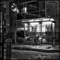
12/08/2009 11:05:51 AM · #72 |
Originally posted by pawdrix:
Definitely needs more grain though...right? What do you guys think? |
More grain, and the pole sticking out from her head is not prominent enough. Needs more clutter for sure. |
|
|
|
12/08/2009 11:16:43 AM · #73 |
Originally posted by pawdrix:
eta: I don't think I added enough grain and my timing was a little off so the images is lacking the right amount of distractions...
Definitely needs more grain though...right? What do you guys think? |
A bit more grain would be cool. Also, perhaps if you can get the model back to re-sit the shoot you could get another of them wheelie things to place on the other side of her. The symmetry would look cool. The sign is a bit distracting though and some of the lighting is a bit harsh. Perhaps do it in a studio next time? |
|
|
|
12/08/2009 11:17:13 AM · #74 |
|
|
|
12/08/2009 11:19:32 AM · #75 |
|
Home -
Challenges -
Community -
League -
Photos -
Cameras -
Lenses -
Learn -
Help -
Terms of Use -
Privacy -
Top ^
DPChallenge, and website content and design, Copyright © 2001-2026 Challenging Technologies, LLC.
All digital photo copyrights belong to the photographers and may not be used without permission.
Current Server Time: 06/11/2026 12:11:04 PM EDT.


