| Author | Thread |
|
|
01/08/2010 05:56:34 PM · #26 |
We all at times think we have a winner, but the hordes on DPC disagee, thats a democracy like it or not.If all that one enters is simply to win then from time to time disapointment will creepin. Maybe this is one of those times. maybe different PP would have helped who knows, the only thing battered is the Ego. It happens to me each challenge. Shrug it off and start again. I rarely keep my challenge entries as they tend to be sub 5 or about there. for me its simply to compete and enjoy my photographs good or bad .
|
|
|
|
01/08/2010 11:03:30 PM · #27 |
Here's another take on it:
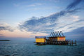
A little different that Neil's edit, taking it in a different direction. Details of the edits on the image. |
|
|
|
01/09/2010 03:07:30 AM · #28 |
Originally posted by nshapiro:
ETA: Forgot to mention...I also did a multiply layer with a copy of the image in BW from one of the color channels. |
I just tried this on another image from the same shoot. Wow, what a difference! This step produces amazing results in the sky and clouds.
Thanks for this very valuable tip. |
|
|
|
01/09/2010 04:09:44 AM · #29 |
Originally posted by yakatme:
Originally posted by nshapiro:
ETA: Forgot to mention...I also did a multiply layer with a copy of the image in BW from one of the color channels. |
I just tried this on another image from the same shoot. Wow, what a difference! This step produces amazing results in the sky and clouds.
Thanks for this very valuable tip. |
So please make that tip more clear. Which color channel? Do you play with opacity too? |
|
|
|
01/09/2010 04:37:24 AM · #30 |
Originally posted by yakatme:
Originally posted by nshapiro:
ETA: Forgot to mention...I also did a multiply layer with a copy of the image in BW from one of the color channels. |
I just tried this on another image from the same shoot. Wow, what a difference! This step produces amazing results in the sky and clouds.
Thanks for this very valuable tip. |
I would like to add that this also works well (maybe even better sometimes) with PS's tool under Image > Adjustments > Black & White .. Which has the advantage of allowing you to balance the image much better. |
|
|
|
01/09/2010 12:29:14 PM · #31 |
Originally posted by ikopanas:
Originally posted by yakatme:
Originally posted by nshapiro:
ETA: Forgot to mention...I also did a multiply layer with a copy of the image in BW from one of the color channels. |
I just tried this on another image from the same shoot. Wow, what a difference! This step produces amazing results in the sky and clouds.
Thanks for this very valuable tip. |
So please make that tip more clear. Which color channel? Do you play with opacity too? |
I didn't fiddle much with the process...I just kept it simple. I duplicated the layer from background, went to the channel mixer, clicked on monochrome, and after playing with the sliders I left them where I found them: Red 100%, and the other channels at 0%. I then reduced the opacity of this layer to around 34% (I think) and used a mask to remove most of it from everything but the clouds.
I was amazed at how this simple process turned the sky deep blue and brought major contrast to the clouds as if I had still had the polarizer on. |
|
|
|
01/09/2010 12:38:14 PM · #32 |
|
This has been a most useful thread - thanks to all who've constructively contributed! |
|
|
|
01/09/2010 12:56:17 PM · #33 |
Originally posted by ikopanas:
Originally posted by yakatme:
Originally posted by nshapiro:
ETA: Forgot to mention...I also did a multiply layer with a copy of the image in BW from one of the color channels. |
I just tried this on another image from the same shoot. Wow, what a difference! This step produces amazing results in the sky and clouds.
Thanks for this very valuable tip. |
So please make that tip more clear. Which color channel? Do you play with opacity too? |
It depends on the image. The one that shows the most contrast in the area you are interested in.
|
|
|
|
01/09/2010 02:25:59 PM · #34 |
Did you consider this "edit": 
Always good for a 6+.
(Please note this is only tongue in cheek and in no way would I ever intentionally poke fun at the use of a specific program)
|
|
|
|
01/09/2010 03:23:08 PM · #35 |
Originally posted by Phil:
Did you consider this "edit":
Always good for a 6+.
(Please note this is only tongue in cheek and in no way would I ever intentionally poke fun at the use of a specific program)
|
THAT'S AN AMAZING EDIT! I LOVE IT! (gag me) |
|
|
|
01/09/2010 04:10:19 PM · #36 |
I too had high hopes. This is what I have to say to this month's Freestudy...
 |
|
|
|
01/09/2010 04:31:38 PM · #37 |
Originally posted by aliqui:
I too had high hopes. This is what I have to say to this month's Freestudy...
|
Want me to Topaz it for you? |
|
|
|
01/09/2010 04:36:39 PM · #38 |
Originally posted by Phil:
Did you consider this "edit":
Always good for a 6+.
(Please note this is only tongue in cheek and in no way would I ever intentionally poke fun at the use of a specific program)
|
That probably would get a 6+ too. |
|
|
|
01/09/2010 04:48:58 PM · #39 |
Originally posted by Phil:
Originally posted by aliqui:
I too had high hopes. This is what I have to say to this month's Freestudy...
|
Want me to Topaz it for you? |
It's already Topazeled! |
|
|
|
01/09/2010 04:51:39 PM · #40 |
Originally posted by aliqui:
Originally posted by Phil:
Originally posted by aliqui:
I too had high hopes. This is what I have to say to this month's Freestudy...
|
Want me to Topaz it for you? |
It's already Topazeled! |
pfft, unless there are halos and oversharpenings and wildly out-of-place colors, you haven't done your job. |
|
|
|
01/09/2010 04:54:28 PM · #41 |
Originally posted by K10DGuy:
Originally posted by aliqui:
Originally posted by Phil:
Originally posted by aliqui:
I too had high hopes. This is what I have to say to this month's Freestudy...
|
Want me to Topaz it for you? |
It's already Topazeled! |
pfft, unless there are halos and oversharpenings and wildly out-of-place colors, you haven't done your job. |
To that I say, "Good day, sir!"
|
|
|
|
01/09/2010 04:54:49 PM · #42 |
Originally posted by aliqui:
Originally posted by Phil:
Originally posted by aliqui:
I too had high hopes. This is what I have to say to this month's Freestudy...
|
Want me to Topaz it for you? |
It's already Topazeled! |
Oh, well there's your problem. What ever you did, multiply it by around 650. That should do it. |
|
|
|
01/09/2010 07:26:32 PM · #43 |
My version.... 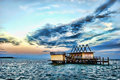
|
|
|
|
01/29/2010 08:37:39 AM · #44 |
Update - - - Here's the result of what I learned from a lot of the feedback in this thread
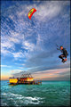
I cut and pasted the details of my Best of 2009 entry below
This was not my best shot of 2009. I entered it because I wanted to see the difference in how voters judge this image compared to the abysmal results from an image from a previous challenge.
The post processing of this image was greatly influenced from what I learned after starting this thread in which I asked for honest critique on my second worst score here at DPC. Here's that shot which scored onlyl a 5.1: 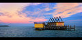
I asked for and received honest feedback which was a little brutal at times. I responded with more questions and the thread ended up being very helpful for me. Others also mentioned that they were watching this thread and also learned a lot.
One of the most helpful tips came from  nshapiro who suggested that I create a duplicate layer that was converted to black and white and apply it in multiply mode. WOW, what a difference in the sky! Others, like nshapiro who suggested that I create a duplicate layer that was converted to black and white and apply it in multiply mode. WOW, what a difference in the sky! Others, like  Bear_Music also submitted their renditions which gave me a lot of ideas about how else to edit them. Bear_Music also submitted their renditions which gave me a lot of ideas about how else to edit them.
Here's the original of this entry: 
I still pushed the editing on this image further than what I would like for prints. I still think that DPC expects a little too much saturation, contrast, pop, and processing in general and that is what I did for this entry.
Some of the post processing steps were the above described multiply layer, multiple exposures masked, overlay layer masked, numerous control points in Nikon Capture NX2 (I love this program!), messed around with luminance and chrominance in overlay mode in NX2, dodge and burn, noise reduction and sharpening.
Some people don't seem to understand just what is going on here. I am standing on the bow of a boat that is anchored from the stern, so the wake in the water is from the kiteboarder (Tommy) and not from the boat. I am using a Tokina 12-24 for that wide angle feeling of being there and to have a deep DOF. I instructed Tommy to travel directly toward me and to jump within 6 feet of me. The wind at my back immediately sends him flying away from me so that I don't get hit (I've had some really close calls) and I take shot after shot trying to keep the kite within the top of the frame. He can easily launch himself more than twice as high as this but once the horizon is out of the picture you have no reference to judge how high he is.
Thanks again to all who gave me their honest critiques and suggestions |
|
Home -
Challenges -
Community -
League -
Photos -
Cameras -
Lenses -
Learn -
Help -
Terms of Use -
Privacy -
Top ^
DPChallenge, and website content and design, Copyright © 2001-2026 Challenging Technologies, LLC.
All digital photo copyrights belong to the photographers and may not be used without permission.
Current Server Time: 07/23/2026 06:47:18 AM EDT.


