| Author | Thread |
|
|
08/27/2008 06:10:33 PM · #1 |
Ive a lot to learn :)
Is this bad because of technical reasons or was it just a poor idea without enough purple?
Be brutal (yet kind).
Thanks.
 |
|
|
|
08/27/2008 06:18:12 PM · #2 |
I think it was the foil wrapper. You need to stay away from foil.
Ok, I had to get that in. Sorry.
It didn't come up for me in voting, though I would have probably given it no more than a 5. Good colors and overall sharpness. I like the humor. Depth of field could probably have been a bit better to get more of the lettuce and wrapper in focus. I see you shot it at F3.5. that's wide open or close to it. For something like this that does not move, you can stop down the lens to a narrower aperture, say F7.1, and use a longer shutter speed in order to get a broader DOF. Composition is ok, but not great. The subject (the wrapper) is at the bottom in the middle and that is where the eye is drawn. I think a rule of thirds placement of the wrapper would have worked better.
Hope that was of some help. (And less smart-alecky than my first response)
Message edited by author 2008-08-27 18:31:01. |
|
|
|
08/27/2008 06:20:36 PM · #3 |
Originally posted by yospiff:
I think it was the foil wrapper. |
Smart alec ;) |
|
|
|
08/27/2008 06:26:12 PM · #4 |
 LydiaToo said it best! Brutal yet honest! ....sending kindness now! :D LydiaToo said it best! Brutal yet honest! ....sending kindness now! :D |
|
|
|
08/27/2008 06:27:22 PM · #5 |

Ok I am glad that there is this thread... cause I am really not sure why my score on this wasn't better...it actually ranked 3 lower then my ducky pic which I got a lot of rap about.. So could I get some ideas to what went wrong or what to change ... cause I didn't get a lot of comments to help me during the challenge. ~D~ You can also Private message me any ideas or questions.!! which I got a lot of rap about.. So could I get some ideas to what went wrong or what to change ... cause I didn't get a lot of comments to help me during the challenge. ~D~ You can also Private message me any ideas or questions.!! |
|
|
|
08/27/2008 06:37:59 PM · #6 |
Originally posted by Damzel:
Ok I am glad that there is this thread... cause I am really not sure why my score on this wasn't better...it actually ranked 3 lower then my ducky pic
So could I get some ideas to what went wrong or what to change ... cause I didn't get a lot of comments to help me during the challenge. ~D~ You can also Private message me any ideas or questions.!! |
A good effort to try and duplicate the look of previous winning images. A good way to learn. First thing that struck me was a lot of graininess in the image. I looking at the file size, it is only 78k, which is 1/2 of what is allowed. JPEG compression took away a lot of detail form your image and induced some artifacts. There may also be some image noise. It's hard for me to tell what is image noise and what is artifacting in this one. What software do you use for editing? Your file save dialog should have a fucntion somewhere to adjust the JPEG compression. For challenges, always save as close to the limit as you can. (for this challenge that was 150k)
|
|
|
|
08/27/2008 06:40:20 PM · #7 |
Originally posted by yospiff:
I think it was the foil wrapper. You need to stay away from foil.
Ok, I had to get that in. Sorry.
It didn't come up for me in voting, though I would have probably given it no more than a 5. Good colors and overall sharpness. I like the humor. Depth of field could probably have been a bit better to get more of the lettuce and wrapper in focus. I see you shot it at F3.5. that's wide open or close to it. For something like this that does not move, you can stop down the lens to a narrower aperture, say F7.1, and use a longer shutter speed in order to get a broader DOF. Composition is ok, but not great. The subject (the wrapper) is at the bottom in the middle and that is where the eye is drawn. I think a rule of thirds placement of the wrapper would have worked better.
Hope that was of some help. (And less smart-alecky than my first response) |
Ha ha I like smart alecs.
Yeah in hindsight I wish I had a tripod that day and wasn't hanging off my fridge door.
I think it would have made a good image if done correctly and obviously not enough purple for the puprle challenge. But the critique Ive gotten has been excellent. |
|
|
|
08/27/2008 06:46:15 PM · #8 |
I can't seem to work out how to post a thumbnail pic in the forums, anyone enlighten me please?
|
|
|
|
08/27/2008 06:48:58 PM · #9 |
Liam, I think it just was a bad subject. Something more purple would have been better. But, you're just now getting used to DPC. You'll figure out what works with the voters. We all go through this at first. But, even after you figure out the voters, still shoot what YOU like.
 Damzel, I agree with Yospiff. I think even at that lower JPG, it could have been fixed with some (free) Neat Image and some sharpening. The lighting and composition were really, really good. Damzel, I agree with Yospiff. I think even at that lower JPG, it could have been fixed with some (free) Neat Image and some sharpening. The lighting and composition were really, really good.
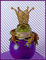
Now that this thread is brought up, I'd really like to know why my frog who sat still with a crown on his head did not score higher. Be brutal. It's fine with me. :)
Besides, I deserve it after my original comment to Liam. :)
Message edited by author 2008-08-27 18:50:24.
|
|
|
|
08/27/2008 06:50:08 PM · #10 |
Originally posted by LadyTara:
I can't seem to work out how to post a thumbnail pic in the forums, anyone enlighten me please? |
When you have your text box up there, the second little square icon from the right will open up a thumbnail box. Enter your photo number in that box.
|
|
|
|
08/27/2008 06:55:45 PM · #11 |
Originally posted by LydiaToo:
Originally posted by LadyTara:
I can't seem to work out how to post a thumbnail pic in the forums, anyone enlighten me please? |
When you have your text box up there, the second little square icon from the right will open up a thumbnail box. Enter your photo number in that box. |
Thank you :)
|
|
|
|
08/27/2008 07:23:11 PM · #12 |
Quirky - and quirky doesn't always do well with the punters here.
My other thought was that many people may not immediately realise that it was a chocolate bar. Not sure if Cadbury's is a worldwide thing - I got it, as we have that brand here in Australia - but many people may have been confused by what that thing was sticking out of the salad.
Keep 'em coming - it's a particular image that people vote high for here - don't feel you have too loose your quirkiness - there are some that appreciate it - it just may not bring you the glory your looking for - SMILE! |
|
|
|
08/27/2008 09:34:46 PM · #13 |
Originally posted by LydiaToo:
Now that this thread is brought up, I'd really like to know why my frog who sat still with a crown on his head did not score higher. Be brutal. It's fine with me. |
My impression is that the background is too busy and draws ones eye away from the frog. I found myself looking at the detailed background patterns. Also the pool ball being cut off at the bottom. Other wise it's pretty good and I see you did just under a 6. That's pretty darn good, but a high five for you is like a low 4 for me.
Boy I can really lay down some authoritative critiques on a challenge in which I did not have an entry! I might want to do this more often... |
|
|
|
08/27/2008 09:36:49 PM · #14 |
Thanks bunches,  yospiff. yospiff.
That's what I wanted. I got only 'nice' comments during voting. Always fun, but not as helpful as the 'truth' sometimes. *grin*
Thanks again.
|
|
|
|
08/27/2008 10:15:57 PM · #15 |
Comments left for Liam, Damzel, and Lydia. So why post here?
Because what I really want to say is that all 3 of your entries showed one sparkling characteristic: creativity. They're all unusual in their own way.
Some will grump that DPC hates creativity. Not true, and I can show some images that will blow you away they're so different from anything you've seen before.
But it has to be spot-on perfect. Not just as an image, but also in meeting the challenge.
Look, purple/blue/green/whatever colors of beautiful skies will always do well here. Always.
But you three seem to want to try things that are different. And for that, I commend you!
|
|
|
|
08/27/2008 10:18:13 PM · #16 |
Originally posted by LiamD2005:
Ive a lot to learn :)
Is this bad because of technical reasons or was it just a poor idea without enough purple?
Be brutal (yet kind).
Thanks.
|
It's okay, mine did pretty awful too :) Just keep your chin up and keep on shooting! You will learn a lot! |
|
|
|
08/27/2008 10:19:27 PM · #17 |
Mine managed to scoot over 5 at rollover though was hanging in the 4s the rest of the time.

|
|
|
|
08/27/2008 10:53:46 PM · #18 |
Originally posted by iamwoman:
Quirky - and quirky doesn't always do well with the punters here.
My other thought was that many people may not immediately realise that it was a chocolate bar. Not sure if Cadbury's is a worldwide thing - I got it, as we have that brand here in Australia - but many people may have been confused by what that thing was sticking out of the salad.
Keep 'em coming - it's a particular image that people vote high for here - don't feel you have too loose your quirkiness - there are some that appreciate it - it just may not bring you the glory your looking for - SMILE! |
Much appreciated. I tried going for something different and glad someone realized.
next week Im going collecting water drops ;) |
|
|
|
08/27/2008 11:14:39 PM · #19 |
Originally posted by levyj413:
Comments left for Liam, Damzel, and Lydia. So why post here?
Because what I really want to say is that all 3 of your entries showed one sparkling characteristic: creativity. They're all unusual in their own way.
Some will grump that DPC hates creativity. Not true, and I can show some images that will blow you away they're so different from anything you've seen before.
But it has to be spot-on perfect. Not just as an image, but also in meeting the challenge.
Look, purple/blue/green/whatever colors of beautiful skies will always do well here. Always.
But you three seem to want to try things that are different. And for that, I commend you! |
thank you for that! my goal was not to just take a picture then change the color in saturation.. I produced all those colors in my set up with no filters, and no professional things... I was happy with it. I just don't know how to fix some of the other stated problems I didn't compress the picture at all, some of the graininess on the background is the textures tag board that I used. That's why I am asking so I can learn. Plus the camera I am using is far from what others are, I don't have as much play in it. So all help is welcome!!
~~ADD ON~~~
Ok I didn't see that you had commented after challenge. I am not schooled on apertures and things, and how to get them to do what I want...so ALL HELP IS GOOD!!
Message edited by author 2008-08-27 23:18:28. |
|
|
|
08/27/2008 11:27:34 PM · #20 |
|
|
|
08/28/2008 12:04:57 AM · #21 |
Good advice, yospiff.
I had the same problem in my Abstract B&W entry. The surface itself was mottled, but because of what's in the image and how I processed it, the mottling only showed up in the dark spaces, which usually means image noise.
|
|
|
|
08/28/2008 12:33:36 AM · #22 |
Originally posted by Damzel:
I am not schooled on apertures and things, and how to get them to do what I want...so ALL HELP IS GOOD!! |
Here's a great page I literally stumbled into a few minutes ago. You can change sliders for focal length and aperture and see the effect it has on depth of field. Below that, two images show the selected focal length fully open (lowest possible F-number) and closed down as far as possible (largest possible F-number).
|
|
|
|
08/28/2008 01:27:11 AM · #23 |
Originally posted by LydiaToo:
Besides, I deserve it after my original comment to Liam. :)
|
Ok Lydia I finally got to comment on your photo. Please read below.
I didnt get to vote on this in the challenge but I actually like it.
Its centered which some people do not like but I do.
the purple is nice and strong and the chequered background is out of focus so gives a good DOF.
This photo is however let down by the frog.
There are a lot of frogs out there who would love the modelling work yet this one just sits there with a bored laissez faire expression.
So, either the frog is a complete Diva or stoned from the glue used to glue the crown to its head.
Either way I would have given this photo 7/10 marks.
:) |
|
|
|
08/28/2008 08:38:02 AM · #24 |
Thanks for the help, folks. I really appreciate the honest comments. That's what I was looking for.
Liam, I didn't glue the crown to the frog's head... Just gently put it there and he sat with it. I was so surprised I almost forgot to click! :)
The frogs are actually all different ones for my shots (at least I think they are!). I rescue them from the pool skimmer, make them model for me, and then let them go in my watergarden. So, unless they find their way back into the pool, they're different frogs.
It's odd how once I turn on the lights, they just sit there. Try it! You'll love it! :)
|
|
|
|
08/28/2008 08:58:27 AM · #25 |
Originally posted by LydiaToo:
Thanks for the help, folks. I really appreciate the honest comments. That's what I was looking for.
Liam, I didn't glue the crown to the frog's head... Just gently put it there and he sat with it. I was so surprised I almost forgot to click! :)
The frogs are actually all different ones for my shots (at least I think they are!). I rescue them from the pool skimmer, make them model for me, and then let them go in my watergarden. So, unless they find their way back into the pool, they're different frogs.
It's odd how once I turn on the lights, they just sit there. Try it! You'll love it! :) |
I try not to vote these images down because I love animals but it's hard to sometimes. Sorry if it seems radical but that's just who I am. An animal lover and protector. I'm sure if you put your energy to photographing other subjects Lydia, you would do just as well and maybe score a bit higher too. Your techniques are very well tuned I find and I feel that you're using these little guys because you think they help your image scores but in reality it is your skills that score well, not the subject matter.
Please don't be mad at me now. :\ Like I said, I'm an animal lover and hate to see any animals used in ads, TV shows, circuses, zoos, safari parks, etc. So my view may be biased towards images of little cute frogs and for that I apologize.
|
|
Home -
Challenges -
Community -
League -
Photos -
Cameras -
Lenses -
Learn -
Help -
Terms of Use -
Privacy -
Top ^
DPChallenge, and website content and design, Copyright © 2001-2025 Challenging Technologies, LLC.
All digital photo copyrights belong to the photographers and may not be used without permission.
Current Server Time: 10/13/2025 10:41:23 AM EDT.