| Author | Thread |
|
|
11/21/2007 02:56:34 PM · #26 |
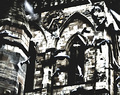
I was fond of this one - I'm not sure if it was misunderstood or just generally loathed but it's still my favourite challenge entry and my lowest scorer as well. (To date - i'm sure i'll go lower.)
Message edited by author 2007-11-21 14:57:00. |
|
|
|
11/21/2007 03:23:39 PM · #27 |
Originally posted by metatate:
I'd like to see if anyone has a photo that people misunderstood ... and hear more explanation... |
Well, it ain't quantum theory or Urdu. We're talking photographs, aren't we. God forbid, anyone comes to it with an obligation to 'understand' it. Do we need to understand trees, rocks, chairs? The thing just is, after all.
Can we misunderstand an apple or the light caressing her thigh?
Pity the poor photographer pressed to 'explain' what to him is only an esoteric document of an arcane attraction, a phenomenon that prompted the shot. |
|
|
|
11/21/2007 03:25:38 PM · #28 |
| Somewhere amidst the barrage of extraneous adjectives your point simply disappeared. |
|
|
|
11/21/2007 03:29:30 PM · #29 |

Don't know what went wrong here. I can't figure out the score, maybe the concept was too challenging (?) |
|
|
|
11/21/2007 03:39:09 PM · #30 |
Originally posted by routerguy666:
Somewhere amidst the barrage of extraneous adjectives your point simply disappeared. |
Seven sentences, three adjectives, two of which essential to retain the sense, one, perhaps, "extraneous" (I feel generous today) - not exactly 'diction'. |
|
|
|
11/21/2007 03:40:49 PM · #31 |
| Sure, follow up the initial assault of verbosity with a blitzkrieg of abusive punctuation use. |
|
|
|
11/21/2007 03:45:10 PM · #32 |
Originally posted by routerguy666:
Sure, follow up the initial assault of verbosity with a blitzkrieg of abusive punctuation use. |
And there I thought I had said sometin. |
|
|
|
11/21/2007 03:46:42 PM · #33 |
I'm on snarky overdrive.
Seriously though, are you saying it's pointless to explain the intent of a shot or pointless to expect people to draw the same conclusion from it that the photographer did? |
|
|
|
11/21/2007 03:57:47 PM · #34 |
Originally posted by routerguy666:
I'm on snarky overdrive.
Seriously though, are you saying it's pointless to explain the intent of a shot or pointless to expect people to draw the same conclusion from it that the photographer did? |
What I'm trying to show is that a photographer is usually not a sage who can explain something he doesn't himself understand, but merely someone who makes pictures.
Message edited by author 2007-11-21 16:01:35. |
|
|
|
11/21/2007 03:58:27 PM · #35 |
1/10000, above my all-time worst score. This was not a shoehorn and was shot specifically for the challenge (Adulthood without adults).
I was trying to give a visual analogy for the sacrifice adults give to raise children. I think the dead nurse log was not obvious enough in the picture. It was also VERY title dependent. (Heck, even with the title most people didn't get it.)

Message edited by author 2007-11-21 15:58:50. |
|
|
|
11/23/2007 12:18:06 PM · #36 |
Originally posted by LanndonKane:
Don't know what went wrong here. I can't figure out the score, maybe the concept was too challenging (?) |
I think most people couldn't see how it was done legally and voted it lower because of that?
Definitely deserved a higher score.
|
|
|
|
11/23/2007 12:26:09 PM · #37 |
Originally posted by Bujanx:
Originally posted by LanndonKane:
Don't know what went wrong here. I can't figure out the score, maybe the concept was too challenging (?) |
I think most people couldn't see how it was done legally and voted it lower because of that?
Definitely deserved a higher score. |
when I saw it, i thought, "an apple with the top lighter than the bottom." didn't really wonder "how" it was done, but definitely didn't get that the top was "removed" and left the ghost behind. Perhaps if it had shown some "motion" while being removed it may have been more obvious |
|
|
|
11/23/2007 03:19:10 PM · #38 |
I was actually going for the idea that the apple was "almost" topless.
I thought the title clarified that. Maybe not... |
|
|
|
11/23/2007 08:28:33 PM · #39 |

I first saw this priest peeking into a window with some woman's garments from the front, and then took a photo of him from behind. So I called it "Aren't we all human?" assuming that it would be pretty obvious that it was a priest. Turned out, not so! And without the comic effect, what's left was just a mediocre snapshot which didn't manage to climb above 5 :) |
|
|
|
11/23/2007 09:29:34 PM · #40 |

This one...because well, I guess it makes sense people didn't get it, but I still get it, and just felt like going there.
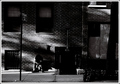
The shot was not embraced by the crowds, but found a home. I wanted to mention this one to point out that you can find your audience if you keep shooting what you like. This comment from an expat was my ribbon...
"Stands out from the crowd for several reasons. It's not overtly about grand architecture, but it sure is all about man's relationship with his (man-made) city habitat, and I'll prefer that every time. The use of light is masterful, and there are plenty of small but important details to add spice to the pot; the No Standing sign, the portentous number over the doorway, the harsh steel grille on the window, the descending entry steps, the papered-up display window, and of course the despairing and lost human figure. Fabulous composition. Beautifully processed too (although I'd very probably have still admired it even if the post-processing was crap). 9." |
|
|
|
11/25/2007 11:09:01 PM · #41 |
Originally posted by LanndonKane:
Don't know what went wrong here. I can't figure out the score, maybe the concept was too challenging (?) |
I think it would have scored a lot higher if the cut face was towards the camera instead of perpendicular to the cut. Nice concept nonetheless.. |
|
|
|
11/25/2007 11:37:20 PM · #42 |

I really liked this picture but apprently not many other people did |
|
|
|
11/26/2007 12:56:45 AM · #43 |
Was mine just too gross for some people, not funny? While it may have not deserved more than a 6, I thought it was funny enough to get past a 5.

|
|
|
|
11/26/2007 01:57:21 PM · #44 |
Originally posted by bucket:
This one...because well, I guess it makes sense people didn't get it, but I still get it, and just felt like going there.
The shot was not embraced by the crowds, but found a home. I wanted to mention this one to point out that you can find your audience if you keep shooting what you like. This comment from an expat was my ribbon...
"Stands out from the crowd for several reasons. It's not overtly about grand architecture, but it sure is all about man's relationship with his (man-made) city habitat, and I'll prefer that every time. The use of light is masterful, and there are plenty of small but important details to add spice to the pot; the No Standing sign, the portentous number over the doorway, the harsh steel grille on the window, the descending entry steps, the papered-up display window, and of course the despairing and lost human figure. Fabulous composition. Beautifully processed too (although I'd very probably have still admired it even if the post-processing was crap). 9." |
I love the architecture shot, although it's risky going with Black and White...Ansel Adams probably would average a 5 with the DPC crowd :P |
|
|
|
11/30/2007 11:34:09 PM · #45 |
Originally posted by Sachlichkeit:
...Ansel Adams probably would average a 5 with the DPC crowd :P |
While sometimes I feel that way, I kind-a doubt it. Adams had that whatever it takes to make a photo great.
|
|
Home -
Challenges -
Community -
League -
Photos -
Cameras -
Lenses -
Learn -
Help -
Terms of Use -
Privacy -
Top ^
DPChallenge, and website content and design, Copyright © 2001-2025 Challenging Technologies, LLC.
All digital photo copyrights belong to the photographers and may not be used without permission.
Current Server Time: 10/14/2025 01:25:50 AM EDT.


