| Image |
Comment |
| 12/04/2003 07:55:42 PM |
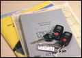
Buying Powerby HRoxasComment: Technical: Fits the challenge, though a purchase agreeement for more than $17,517.31 would be more compelling ;-). Exposure and composition good, focus feels a little soft- not sure why. Lighting is even.
Personal: Relatively creative, but not "wow".
My vote: 5 |
 Photographer found comment helpful. Photographer found comment helpful. |
| 12/04/2003 07:53:51 PM |
Promises! promises!by sulamkComment: Technical: Fits the challenge. Exposure composition focus lighting all good.
Personal: Somewhat more interesting than the other piggy bank shots, and technically well done. I find her bracelet and the arm through the border thing distracting, though.
My vote: 6 |
| Photographer found comment helpful. |
| 12/04/2003 07:51:31 PM |
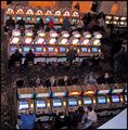
Bandits at Workby DiamondPeteComment: Technical: Fits the challenge. Exposure pretty good (tough with those machines) Composition is extremely interesting, but the bottom right corner is distrcting. Focus is good. Lighting is even.
Personal: Creativity is visible mainly in the angle. Not exactly a new idea though!
My vote: 5 |
| Photographer found comment helpful. |
| 12/04/2003 07:49:52 PM |
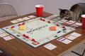
Catopolyby Ram21Comment: Technical: Monopoly fits the challenge. The cat, while cute, actually detracts from the theme. Exposure is good, composition is okay, focus good, lighting is even.
Personal: Creativity wasn't stretched here, the game itself could have yielded some strong on theme shots without resorting to cat votes! :-)
My vote: 4 |
| 12/04/2003 07:46:58 PM |
Venetian Fruit Marketby ChiquiComment: Technical: Fits the challenge. Exposure pretty good. Composition a little uninteresting. Focus good. Lighting flat.
Personal: Not overly creative, doesn't strike me as really interesting.
My vote: 4 |
| 12/04/2003 07:45:23 PM |
Lack of....by tfaustComment: Technical: Fits the challenge. Exposure composition focus lighting all good. I'm assuming the mid-face crop is to protect his identity.
Personal: S'ok. Doesn't make me go "wow".
My vote: 5 |
| Photographer found comment helpful. |
| 12/04/2003 07:43:59 PM |
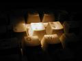
Business and Money symbol in this generation !by akulkarniComment: Technical: Fits the challenge, but only because of the title. Exposure/lighting is too hot on the single key. Composition isn't very interesting. Focus good.
Personal: Could have been better executed. Is there a reason you chose the "2" key?
My vote: 2 |
| Photographer found comment helpful. |
| 12/04/2003 07:41:56 PM |
pennilessby peeceeComment: Technical: Fits the challenge. Exposure/lighting- you used a flash, didn't you? Yuck.... Composition looks too cropped- this could have been done without making it that narrow. Focus is good.
Personal: Good idea, definitely could have been more creatively executed.
My vote: 2 |
| Photographer found comment helpful. |
| 12/04/2003 07:35:48 PM |
Saving for the real thingby GinaRothfelsComment: Technical: Fits the challenge. Exposure/lighting looks good but maybe a little hot on the pages. Composition is nice, but the spotting on the background is a little distracting. I hate not being able to spot edit! :-) Focus good.
Personal: I like it!
My vote: 6 |
| Photographer found comment helpful. |
| 12/04/2003 07:33:53 PM |
The House Always Winsby unikornComment: Technical: Fits the challenge. Exposure is tough with neon- you're a little underdone on the room itself and a little hot on the machines and the neon. I like the composition. Not sure where the focus is. Lighting is so so.
Personal: Not overly creative. I'm surprised by the lack of people! Some "ghosts" in the extended exposure might have made this more interesting.
My vote: 4 |
| Photographer found comment helpful. |
Home -
Challenges -
Community -
League -
Photos -
Cameras -
Lenses -
Learn -
Help -
Terms of Use -
Privacy -
Top ^
DPChallenge, and website content and design, Copyright © 2001-2025 Challenging Technologies, LLC.
All digital photo copyrights belong to the photographers and may not be used without permission.
Current Server Time: 08/23/2025 04:19:50 PM EDT.