| Image |
Comment |
| 03/08/2006 12:29:57 AM |
|
 Photographer found comment helpful. Photographer found comment helpful. |
| 03/08/2006 12:28:52 AM |
|
| Photographer found comment helpful. |
| 03/07/2006 11:30:08 PM |
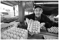
Harry The Egg Manby hotpastaComment: From the Critique Club:
I wanna start off by saying that this is my favorite type of shot to critique and I'm glad I pulled it from the queue. What do I mean by this? It may not be the most excellent shot, but there is so much potential there that I have to stop and look again!
This critique begs for my what I like and what I don't like format...
What I like! You captured an incredible moment in time. The look on the gentlemans face is priceless! He has an incredible pride in what he does and it shows in his expression and your capture. He also has incredible character. I love the taped together glasses and his wonderful grin. There are layers of great texture and leading lines in this shot. The texture is in the eggs and egg crating. The lines are there both in the eggs and the space that they are displayed. You obviously used a wide angle lens. This is apparent in the overall feel of the shot. Not having seen the original, I would say that your choice to go b/w is a good one but I can't be 100 percent on that point.
What I don't like. This is a bit harder. Everything in the crop left of the post on the left third line is unneeded. It distracts and detracts from the shot. A lot of that portion of the shot is blown out which doesn't help anything... You shot is a touch skewed. It's not level. A little more skewed and it would look artsy. The way it is now looks like you didn't take time to straighten the shot in camera. Looks a little sloppy. You are a touch soft here. Most times I like soft focus, but this looks more like it is OOF or your focal point is in the wrong place. I may be wrong on this issue but without seeing a full sized original I can't tell. You lose your subjects left (right in image) elbow in the shadows of the background. The subjects dark clothing against the dark background is a bit of a distraction.
I truly like this shot. I like the overall compostion minus the left side of the frame. I love the character of the subject. I love the textures. If I was you, I would see if he would let me shoot him again. It may take a couple of tries, but I see an potential award winning shot here. Please, keep shooting! If you go back and shoot this subject again, PLEASE post your results here! I will be watching for it.
Yours
TC |
| Photographer found comment helpful. |
| 03/07/2006 09:32:53 PM |
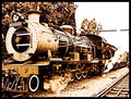
Maureenby zetosComment: From the Critique Club:
First thing I would like to say is that this is very nicely composed. I love how your lines lead you out of frame. This is something that is very powerful when done right and you did it pretty good here. I my only compositional complaint is the cutting off of the front of the train. I would have liked to see the whole train and a little breathing room in the front of it.
Now the hard part. The first thing I thought when I saw this is 'Damn that's harsh!' It appears that you took this shot during mid day in bright sunlight. This is a very hard time of day to make shots including sky come out nice without filters. Later in the evening or early morning are of course the best times to shoot but that may have been impossible with this subject...
The shot is extremely contrasty. This is a side effect of shooting this time of day. A side effect of being to high in contrast is that it looks oversharpened. Looking closely, I don't believe that this shot really is oversharpened but it has that appearance...
I believe that the time of day that you shot this is probably why it only scored a very low 5.xxxx. Unfortunately because of the subject matter, you may not have had a choice!
Keep on shooting!
TC |
| Photographer found comment helpful. |
| 03/05/2006 02:02:26 PM |
Playing the Bluesby kteachComment: Love the idea. Needs a boost in levels though to bring out the light painted...
TC |
| Photographer found comment helpful. |
| 03/05/2006 01:31:08 PM |
Naomiby Charlotte annComment: From the Critique Club:
Your lack of photographers comments make it difficult to see if you achieved your goals with this shot. Let's see what we can come up with anyways...
Very pretty model! I like your overall composition and the choice of tonality for the duotone challenge but there are several things that you could do to improve this shot.
I am normally a big fan of soft focus shots. This shot however doesn't look soft focus it looks slightly out of focus. This is something that will get you seriously scored down in this forum called DPC.
Your models pose is very nice but the way the blanket lays around her takes away from the pose. The big bunch of blanket that is so dark in front of her pulls the eye away from her with her dark top. The dark part of the blanket to the right of the frame does the same.
I like how you included the teddy bear in the shot. The tag on it's ear really bothers me though. It looks like an oversight. This is also something that voters don't like here.
You need a bit of fill lighting coming in from the left of the frame. This would not only help brighten up the shot a touch it would help to soften the shadow behind your model. I think a catch light in her eyes would also help to improve the shot by making your model look more 'alive' for lack of a better word.
The last thing that bothers me about the shot is the placement of model and camera with the shape of the room and the bed. If you moved the model a bit to the left and/or the camera a bit to the right, you would hide the bed post behind her. This is an unneeded element in the shot. Hiding/removing it would make for a much simpler and more powerful composition.
I know that I have pointed out a lot of negative things about this shot. This doesn't mean I don't like the shot rather they are things that could take a shot that has much potential and move it up much higher in the rankings...
TC |
| Photographer found comment helpful. |
| 03/05/2006 01:08:38 PM |
The Color Purple on CDby banmornComment: From the Critique Club:
First of all I have to qualify that I'm not a big fan of water drop shots but let's see what I can come up with...
Your overall composition is very nice. I also love the colors scheme that you achieved using the computer screen to create the reflection.
My first impression of this shot is that it is very dark. It looks like it could use a good bit of light. This is kind of a conundrum though because increasing the overall lighting would wash out the reflection on the disc. The few times that I've tried to photograph water drops or ice, I've had a difficult time getting nicely defined edges. I see you have that issue in this shot. I'm not 100% on this, but I think a boost in lighting should help with this definition of edges. Overall, I think the shot is a little soft. You can see this not only in the water drops (which could be an illusion caused by the lighting as mentioned above) and also on the CD itself.
The only other problem I have with this shot is in the inconsistant shape of the water drops themselves. Some of them are nice and round, but some of them are not. I know that in past water drop shots the photographers have used a product called (I believe) RainX. This product is a very good water repellent that you would spray on the disc before dropping the water on it. It makes nice perfect round drops.
I think the reason that this shot didn't score as highly as many in the past is because of the shape of the drops, the indistinct edges of the drops and the softness of the shot. If you like this kind of shot I would recommend trying different lighting schemes and the RainX trick and I bet you could come up with a very nice image! Keep shooting.
TC |
| Photographer found comment helpful. |
| 03/01/2006 07:43:56 PM |
|
| Photographer found comment helpful. |
| 03/01/2006 06:52:29 PM |
"Kiss" by JudiComment: From the Critique Club
I hate drawing a shot to critique that has won a ribbon. What can I say that the voters haven't said already? I could go even more in depth into the history of the band, but that isn't really the purpose of a critique now is it?
This shot is simply stunning! Great choice of going with the centered subject! Doesn't always work, but this time it's perfect. Awesome lighting. Love the shadow on the right side of the subject's face (Left in photo). Focus is spot on. Everything is nice and sharp, but not to the point of hurting your eyes. Only thing I can think of to improve the image would be to have a light near the camera to put a little sparkle in his eyes. Not sure that would really help in this instance though because after all Gene was supposed to be the 'King of the Night Time World' and you captured that essence!
Keep up the good work. Let's see more ribbons.
Yours
TC |
| Photographer found comment helpful. |
| 03/01/2006 06:39:46 PM |
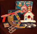
Playthings of the Eightiesby olddjComment: From the Critique Club
Your photographers comments don't give me much to go on as far as your intentions for this shot. Let's see what we can come up with anyways...
I believe I can see what you are trying to do with this shot. I'm assuming you wanted to highlight toys and games of an era. In using this theme you definately fit the challenge however...
There are several things that just don't seem to work in this shot. Number one it is very busy. Studio type set up shots tend to do best when they are as simple as possible. In your example you have 4 or 5 major elements and several of those have 3 or 4 elements of their own. This makes your shot look cluttered. If you want to play around with it (and I recomend this often in my critiques) try taking one of the major elements like the Trivial Pursuit or the video game stuff and create a simpler composition. You could set up the board as if a game of trivia was in process maybe with the focus being on a hand holding one card... This would be a cleaner, simpler composition.
Another thing that detracts from this shot is the lighting. The lighting here is very flat and unimaginative. Lighting is everything in studio shots. It appears that your lighting was all from in front of the shot. If you used two lights, one close to the subjects and off to one side (let's say the right) and then put another light on the other side and twice as far away, you would end up with an appearance of depth. You would have highlights and shadows that would make the shot look like it has dimension from front to back. The way it is lit here makes the shot look like a picture... flat!
The last thing that I can see wrong in this shot is that (to be quite blunt) it is not perfect. It's a touch out of focus. It looks like it was just thrown together and snapped... Things don't seem to have a reason for being where they are placed. The snow cone box flap is very distracting. A piece of tape to square up the flap would help a lot. You see in set up shots like this you have control over every aspect of the shot. You place every element in the shot. You position the lighting. You have forever to get the focus just right. You have ALL the control. If you enter a shot like this into a challenge in the DPC community, most voters will look for things like this. Maybe not conciously, but they will see the flaws and vote accordingly.
My advice? Try shooting this again. Shoot it over and over again. Move things around. Try to keep it as simple as possible. Play with the lights. This is the perfect opportunity to practice! And as they say, practice makes perfect! If you decide to take my advice, please post your best shots here for us to see!
Hope something here helps...
Yours
TC |
| Photographer found comment helpful. |
Home -
Challenges -
Community -
League -
Photos -
Cameras -
Lenses -
Learn -
Help -
Terms of Use -
Privacy -
Top ^
DPChallenge, and website content and design, Copyright © 2001-2025 Challenging Technologies, LLC.
All digital photo copyrights belong to the photographers and may not be used without permission.
Current Server Time: 08/26/2025 07:29:36 PM EDT.