| Author | Thread |
|
|
03/01/2006 06:39:46 PM |
From the Critique Club
Your photographers comments don't give me much to go on as far as your intentions for this shot. Let's see what we can come up with anyways...
I believe I can see what you are trying to do with this shot. I'm assuming you wanted to highlight toys and games of an era. In using this theme you definately fit the challenge however...
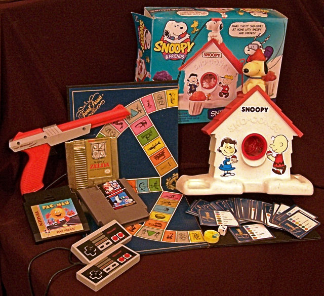
There are several things that just don't seem to work in this shot. Number one it is very busy. Studio type set up shots tend to do best when they are as simple as possible. In your example you have 4 or 5 major elements and several of those have 3 or 4 elements of their own. This makes your shot look cluttered. If you want to play around with it (and I recomend this often in my critiques) try taking one of the major elements like the Trivial Pursuit or the video game stuff and create a simpler composition. You could set up the board as if a game of trivia was in process maybe with the focus being on a hand holding one card... This would be a cleaner, simpler composition.
Another thing that detracts from this shot is the lighting. The lighting here is very flat and unimaginative. Lighting is everything in studio shots. It appears that your lighting was all from in front of the shot. If you used two lights, one close to the subjects and off to one side (let's say the right) and then put another light on the other side and twice as far away, you would end up with an appearance of depth. You would have highlights and shadows that would make the shot look like it has dimension from front to back. The way it is lit here makes the shot look like a picture... flat!
The last thing that I can see wrong in this shot is that (to be quite blunt) it is not perfect. It's a touch out of focus. It looks like it was just thrown together and snapped... Things don't seem to have a reason for being where they are placed. The snow cone box flap is very distracting. A piece of tape to square up the flap would help a lot. You see in set up shots like this you have control over every aspect of the shot. You place every element in the shot. You position the lighting. You have forever to get the focus just right. You have ALL the control. If you enter a shot like this into a challenge in the DPC community, most voters will look for things like this. Maybe not conciously, but they will see the flaws and vote accordingly.
My advice? Try shooting this again. Shoot it over and over again. Move things around. Try to keep it as simple as possible. Play with the lights. This is the perfect opportunity to practice! And as they say, practice makes perfect! If you decide to take my advice, please post your best shots here for us to see!
Hope something here helps...
Yours
TC |
|
 Photographer found comment helpful. Photographer found comment helpful. |
Comments Made During the Challenge  |
|
|
02/26/2006 08:14:30 PM |
|
Image is a little noisy, better lighting would help. |
|
| Photographer found comment helpful. |
|
|
02/25/2006 11:33:31 AM |
|
Wow do those bring back memories. I like the idea behind the image. The colors seem a bit muted as does the lighting - maybe it needed a different white balance mode? Its got a brownish hue to everything. There are many points of interest to examine which is nice but I'm finding the composition - how they have been laid out to be a bit lacking. There's no drama to the image, mostly a flatness that doesn't draw me in. It feels more like an image I'd use if I were trying to sell the items on eBay than as an art image I'd put on a wall. That said, I DO think if there was an adjustment to how the lighting was used (maybe complete darkness with a number of small lights spotlighting each individual item) or if they were arranged in a different manner to give it less of a static feeling then this image could have a greater impact. I voted a 4. |
|
| Photographer found comment helpful. |
|
|
02/23/2006 08:26:00 PM |
|
Wow, the Snoopy sno-cone machine. That's hillarious. I think you captured the era well. The picture itself seems kind of flat and dark. |
|
| Photographer found comment helpful. |
|
|
02/22/2006 06:33:48 PM |
|
To my recollection, they had Snoopy Sno-Cone makers in the 70's. Anyway, this isn't too great a photo, sadly. It appears very grainy and the lighting lacks any sort of drama or interest. Everything in the arrangement appears flat because of this. It's kind of like an eBay photo...all I can say is keep at it. |
|
| Photographer found comment helpful. |
|
|
02/22/2006 10:16:38 AM |
|
SNOOPY SNOW CONE MACHINE!!! (Yeah, I know this isn't a helpful comment but I just got excited, lol) |
|
| Photographer found comment helpful. |
|
|
02/22/2006 08:03:02 AM |
|
Neat images. The background is a little distracting and the focus is a little soft. |
|
| Photographer found comment helpful. |
|
|
02/21/2006 05:36:02 PM |
|
just too grainy this one, the leading lines help a bit but isn't very pleasing to the eye |
|
| Photographer found comment helpful. |
|
|
02/21/2006 03:27:29 PM |
|
I had a snoopy snow cone machine!!!!!!! I had completely forgotten about it until I saw this picture. |
|
| Photographer found comment helpful. |
|
|
02/21/2006 06:14:00 AM |
|
If you would have set the items up closer together you could have cropped out the edge of the table in the left and the upper left corner above the cloth. :) |
|
| Photographer found comment helpful. |
|
|
02/20/2006 01:00:49 PM |
|
| Photographer found comment helpful. |
|
|
02/20/2006 09:32:39 AM |
/
Message edited by author 2006-03-05 19:40:58. |
|
| Photographer found comment helpful. |
Home -
Challenges -
Community -
League -
Photos -
Cameras -
Lenses -
Learn -
Help -
Terms of Use -
Privacy -
Top ^
DPChallenge, and website content and design, Copyright © 2001-2026 Challenging Technologies, LLC.
All digital photo copyrights belong to the photographers and may not be used without permission.
Current Server Time: 06/28/2026 10:20:29 PM EDT.