| Image |
Comment |
| 08/18/2003 07:56:08 AM |
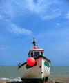
The Boatby Geo_GriffinComment: The center-haters will rate you down a notch or two for the boat's position. But I think it is visually pleasing that way. It's not my kind of beach, but the boat makes it look good to me. |
 Photographer found comment helpful. Photographer found comment helpful. |
| 08/18/2003 07:53:06 AM |
|
| Photographer found comment helpful. |
| 08/18/2003 07:09:48 AM |
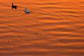
Follow the Debrisby paganiniComment: Personally, I would have wanted to see a little more space on the top right. As it is, the ducks seem to be squeezed out-of-centre too much. But overall, the picture is pleasant, and the brilliant rust color is one of the most appealing colors for me. |
| Photographer found comment helpful. |
| 08/18/2003 06:08:34 AM |
10,000,000 litresby hortopthComment: I tried looking at this picture upside down, and the result is pretty interesting. It looks like a schematic diagram for some funky do-it-yourself furniture. Really nice, interesting pic - viewed sideways, upside down, or as it is. How many pictures can look that good when viewed from all sides :) ? |
| Photographer found comment helpful. |
| 08/18/2003 05:56:55 AM |
Mt Rainierby timj351Comment: I like this style, but it is overdone. This is one of the more interesting ones, though. |
| 08/18/2003 05:55:47 AM |
Half Empty or Not fullby TurbotechComment: Clever. I prefer the glass to be not tilted, though. Or, to have at least the surface of the liquid to be horizontal (parallel to the real ground). Also, there's a sticker on the glass that's a little annoying once you notice it. |
| Photographer found comment helpful. |
| 08/18/2003 05:47:55 AM |
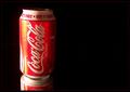
Coca Cola Classic Canby joannadivaComment: Personally, I think I would have shot this at a different angle, perhaps a higher or a lower vantage point. In that way, a complete reflection would have shown. Also, the black background is not too perfect. There is a faint red line that shows up right in the middle. |
| Photographer found comment helpful. |
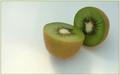
| 08/18/2003 05:19:18 AM |
Food For Thoughtby MitonskiComment: Nice. Boosting the saturation a bit to get greener slices would improve this pic to really appetizing levels. |
| Photographer found comment helpful. |
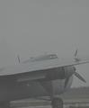
| 08/18/2003 05:17:55 AM |
Groundedby spillerComment: This has an understated elegance, as it plays around nicely with just a very limited palette of grays. I would have rated it really high were it not forprocessing artifacts, such as the jaggies on the wing. It is still a 7 to me. |
| Photographer found comment helpful. |
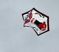
| 08/18/2003 05:14:40 AM |
Kite Attack!!by RefractedComment: Nice. The faint kite thread however is neither here nor there. I'd rather have it completely disappear, or made completely obvious. |
| Photographer found comment helpful. |
Home -
Challenges -
Community -
League -
Photos -
Cameras -
Lenses -
Learn -
Help -
Terms of Use -
Privacy -
Top ^
DPChallenge, and website content and design, Copyright © 2001-2025 Challenging Technologies, LLC.
All digital photo copyrights belong to the photographers and may not be used without permission.
Current Server Time: 08/05/2025 09:32:08 AM EDT.