|
|
|
Showing 511 - 520 of ~1255 |
| Image |
Comment |
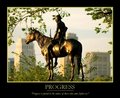
| 05/18/2009 09:29:20 PM | Progressby dahlinComment: An interesting image. I find it interesting that you chose to photograph this from slightly behind, looking at the back of the rider, and not from the front, looking at the face and front. This is even more interesting seeing the angle of the sun makes the back very dark.
The crop at the bottom is a slight problem. You have attempted to remove the base the horse is standing on, I am not sure of the reason for this, hawever this crop highlights that the photo is not straight, and the front feet are higher than the rear. You cropped off the very bottom of the rear holves, but the base is visible o the front. The tree around the base I like, even the tree in the corners, but was there a way to not have the tree branch directly behinfd the heads, as I find this distracting.
Also, an interesting contrast, the buildings in the background and the statue of a native.....it does highlight progress, for better or for worse......
Overall presentation, postert layout etc is very good. Text is great as is the title and phrase,. I might have gone with a different text/border colour though..... |  Photographer found comment helpful. Photographer found comment helpful. |
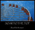
| 05/18/2009 09:01:44 PM | Soar to the Topby DCrest01Comment: An interesting image, made by the geometric patterns created by the structure and the angle that we are viewing it from. The criss cross of structure provides all these shapes and patterns that draws attention.......
The blue sky is brilliant, maybe the red could have been adjusted slightly to also make it more vibrant, which would have added to this overall image.
The presentationoverall is good, without being exceptional. The title and phrases probably could ahve been tailored a little more, and more traditional (ie Title: Soar, Phrase: Have the Courage to Reach for the Stars) A little more traditional motivational poster, and with different text fonts it could have been mistaken then for one from the shops | | Photographer found comment helpful. |
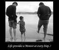
| 05/18/2009 08:56:38 PM | Life Provides a Mentor at Every Stepby mailbiswasComment: A very interesting image. However I feel it is very contrained by the tight drop. I feel this image needed more negative space all around it to make it feel complete, rather than the tight crop you have applied on all sides. I also find it interesting that you have chosen to process this to Blacka nd White. I feel this image really needed the splash of colour, rather than the grey tones is currently provides. | | Photographer found comment helpful. |
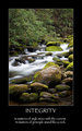
| 05/18/2009 03:03:18 AM | Integrityby brimacComment: Stunning........
The words are brilliant, fit both the challenge and the photograph completely.......
The image is perfect for a motivational poster. Compliments the words exactly, well executed and the type of photo that is often seen on these.
A great submission | | Photographer found comment helpful. |
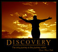
| 05/18/2009 03:03:02 AM | D I S C O V E R Yby GIS_boyComment: A great submission, in the true motivational poster style, and fitting of being a poster. The image is interesting, without being overpowering, colourful without needing to be studied. Exactly what these posters should be. The choice of text colour and border is spot on, the size of text, the fonts, everything for this works and looks professional. The placement of the person on the line of third is very good and helps this image work. An excellent submission | | Photographer found comment helpful. |
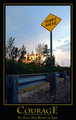
| 05/18/2009 03:02:22 AM | Life's Challengesby SirashleyComment: Nice, a great picture with a humour aspect to it as well. The entire shot is well composed and works really well.
Not sure about the colour of the writing and border. I feel it should have been the yellow from the sign, whereas this is a different yellow. The brighter yellow would have tied it in a lot better. | | Photographer found comment helpful. |
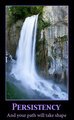
| 05/18/2009 03:00:46 AM | Persistencyby MistyMuckyComment: A nice photo, but it seems to me like I am missing the rest of the scene. I feel I need more from this, on both sides, and even top and bottom. I just seem to have a small piece of a great location, yet I am restricted in what I can see....... | | Photographer found comment helpful. |
| 05/18/2009 02:58:58 AM | Know Thyselfby inshaalaComment: A different idea. I am really not sure about the black side borders. To me they seem to make the rest of the picture look even lighter. As a result, my first impression was overexposed, yet as you look closer, it is very high key, but the details for the most part are still, to an extent, preserved.
The writing looks awkward by its positioning. The right choice of colour, but it just doesn't look right in that position, not that I can see a better spot though....... |
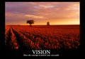
| 05/18/2009 01:46:24 AM | Visionby FrozenMomentsComment: A great image for a poster, with some great colours in there. That there is no strong subject in this image works very well, and ties in exceptionally well with the title and phrase. This poster lacks the border that is common to these posters, and the choice of text colour doesn't tie in well to the picture. Adding these would then have made this look like one you could buy from a shop. |
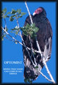
| 05/17/2009 11:53:04 PM | OPTOMISTby stfleckComment: A very wierd looking animal.......The colours in this are uninspiring, and could have been vastly improved in post processing, which could have made this a much stronger submission | | Photographer found comment helpful. |
|
Showing 511 - 520 of ~1255 |
Home -
Challenges -
Community -
League -
Photos -
Cameras -
Lenses -
Learn -
Help -
Terms of Use -
Privacy -
Top ^
DPChallenge, and website content and design, Copyright © 2001-2025 Challenging Technologies, LLC.
All digital photo copyrights belong to the photographers and may not be used without permission.
Current Server Time: 08/13/2025 11:38:07 AM EDT.
|