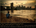
I would agree with paynekj that the text color isn't very appealing. I also don't really see any visual connection to persistency in the subject matter. For me, these posters generally have a small correlation to subject matter, but I see very little in this.
A more interesting font would have helped as well.
It also sorta feels like the waterfall is cropped a bit close for my taste.
I'm not sure persistency is a word. In fact, Firefox underlined it as a possible misspelling. I'm probably not the first to point it out. In fact, you are probably screaming inside at another comment about it.
A nice photo, but it seems to me like I am missing the rest of the scene. I feel I need more from this, on both sides, and even top and bottom. I just seem to have a small piece of a great location, yet I am restricted in what I can see.......
In my belief there are more things that contribute for a great motivational/de-motivational poster:
Idea/creativity:9
Quality of the photo:9
Artistic viewpoint:8
Frame/borders:8
Appealence of the font:8
Average: 8.4 (8)






 Add photograph to your favorites
 Add photographer to your favorites


 Photographer found comment helpful.


