| Image |
Comment |
| 01/02/2006 09:25:51 PM |
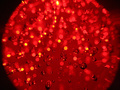
Red Burstby wolfenstein43Comment: interesting abstract, like the colors and exposure...not much blow out. Not much of a pattern though...I do like it as an abstract enough to let that go a bit. |
| 01/02/2006 09:25:48 PM |
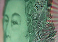
From A Five Dollar Noteby paully2k1Comment: I this were a full crop, and depending on your glass, it may well be, you might have cropped the face and left the pattern...the lines of the pattern lead my eye right to the face....really like the pattern part. |
 Photographer found comment helpful. Photographer found comment helpful. |
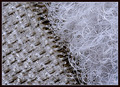
| 01/02/2006 09:25:45 PM |
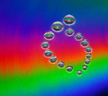
Colorby stare_at_the_sunComment: I like the background colors and the drops are in a very nice pattern though I wish the focus on them were better. Having tried this, I know how hard that can be:  ....wish those were all in focus too. |
| Photographer found comment helpful. |
| 01/02/2006 09:25:42 PM |
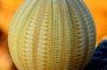
Natures Designby John WhiteComment: Great pattern on the subject. While I really like the bacground colors, that golden orange is quite nice, BTW, I wish they were not there at all. The subjects pattern is so fine I would have liked to have seen more of it close up. |
| Photographer found comment helpful. |
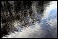
| 01/02/2006 09:25:39 PM |
Trees in Waterby e301Comment: looks like you did some desat on this and in so doing may have lost the detail of what the dark area is...I like the desat and I like this as an abstract, but if you had any green in the trees, it might have been better. |
| Photographer found comment helpful. |
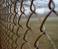
| 01/02/2006 09:25:37 PM |
keep outby nlghttrainComment: The fence pattern and detail is very nice in this. I might have tried to do what I could to make the bacground as consistent as possible. You might have been able to that but only have the field or lawn in the background in this and in this you almost did in the bottom two thirds withe the exception of the tree root(?) on the lower right. A shooting the fence up to down might have worked. |
| Photographer found comment helpful. |
| 01/02/2006 09:25:35 PM |
sliced orange ?by focus57Comment: Nice...like the complementary color idea, though I wish the orange color were richer...the blue is excellent. What did you use for your medium, I wonder? A glass or something. Well seen, shot and composed. |
| Photographer found comment helpful. |
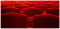
| 01/02/2006 09:25:32 PM |
Red Seaby EvanHComment: I did something like this in a church recently....like your perspective and the wonderful glow at the tops of the seats. Nice pattern as well. |
| 01/02/2006 09:09:18 PM |
|
| Photographer found comment helpful. |
| 12/30/2005 10:56:17 PM |
|
| Photographer found comment helpful. |
Home -
Challenges -
Community -
League -
Photos -
Cameras -
Lenses -
Learn -
Help -
Terms of Use -
Privacy -
Top ^
DPChallenge, and website content and design, Copyright © 2001-2025 Challenging Technologies, LLC.
All digital photo copyrights belong to the photographers and may not be used without permission.
Current Server Time: 08/15/2025 03:30:37 AM EDT.