| Author | Thread |
|
|
01/10/2006 02:47:43 PM |
*Critique Club*
In response to your request, here if your in depth critique from the Critique Club.
I'm not sure if you just don't use the 'this critique is helpful' feature, or if you really dodn't find these critiques helpful, but if it's the latter, I'm sure my critique wont be of much help to you either, but I can certainly try.
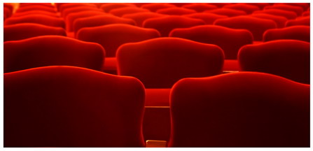
The very first thing I notice is the size. 447x216. That's a good 200 pixels short of typical DPC challenge entry viewing size. The small size (while it may help hide defects) makes it difficult to really appreciate the image. You placed really well in the challenge, but I'd like to bet you could have gotten 20 places higher with a larger image.
Now, from what I do see of the image, the colors are stunning. Very nice reds. Ranging from a darker red to a bright red. I love the way it sort of fades from front to back. Very nice depth in the photo.
Focus appears good, but maybe a tad soft, but again hard to really determine with the size.
I like the positioning of the chairs within the photo. Your first chairs start about 1/2 way up in the photo, and usually that doesn't appeal well to me, however, it works very nicely here because of the fade I think.
Overall the image has a lot of visual appeal, but suffers from size. ~Heather~ |
|
Comments Made During the Challenge  |
|
|
01/03/2006 11:54:10 AM |
|
Very nice colors and shades. The simplicity is great and very effective. |
|
|
|
01/02/2006 09:37:54 PM |
|
That's way cool. Love that red hot RED. Great shot and I think a 10. |
|
|
|
01/02/2006 09:25:32 PM |
|
I did something like this in a church recently....like your perspective and the wonderful glow at the tops of the seats. Nice pattern as well. |
|
|
|
01/02/2006 09:19:48 PM |
|
|
|
01/01/2006 03:19:54 PM |
|
I like this a lot, wish it were bigger. |
|
|
|
01/01/2006 02:10:11 AM |
|
I really wish this would have been larger, and I know I would have rated it higher than an 7 if it were. |
|
|
|
01/01/2006 01:21:24 AM |
|
Interesting lighting and colors in this shot. I like it's abstract feel. I only wish the shot was much closer to 640 pixels in width. |
|
|
|
12/31/2005 06:40:45 PM |
|
one of my favorites this challenge - punch color and perfect cropping |
|
|
|
12/31/2005 12:08:14 AM |
|
I love the color and shape. Wish it were bigger but bumped to 8. Good luck. |
|
|
|
12/30/2005 08:54:56 PM |
|
I wish this was bigger so I could have a better look. At first glance it is rich and really wonderful, but I tend to think there are some flaws that I can't see and that is why it is so small. I guess what I can't see won't hurt me, but next time a little larger please. 8 |
|
|
|
12/30/2005 07:57:13 PM |
|
why so small? very nice colors and contrast though. more detail in a larger size would have been lovely. |
|
|
|
12/30/2005 07:14:16 PM |
|
|
|
12/30/2005 11:15:59 AM |
|
It's a pity this is so small. But it's a good idea and well executed. |
|
|
|
12/29/2005 10:31:57 PM |
|
Very cool picture! I think you may lose a point or two because of the size, should have been bigger. Great idea though! |
|
|
|
12/29/2005 10:00:58 PM |
|
I love this shot I just wish it was a bit larger. |
|
|
|
12/29/2005 08:18:42 PM |
|
Nice interpretation of the challenge, but might have been even better had you had someone sitting in one chair. |
|
|
|
12/29/2005 08:11:05 PM |
|
The size of the picture loses impact ... but is lovely in what is shown. |
|
|
|
12/29/2005 01:47:39 PM |
|
Good colors and lighting, interesting pattern. Why so small? |
|
|
|
12/29/2005 05:53:09 AM |
|
Nice. If you could make it bigger size, it would be great (6) |
|
|
|
12/29/2005 04:47:13 AM |
|
|
|
12/29/2005 12:02:53 AM |
|
such a nice image, wish it were larger as to see more of it, the coloring looks nice as well as the use of soft focus :) |
|
|
|
12/28/2005 11:06:45 PM |
|
4 - Good concept and looks like very good potential. Criticism; needs to be 640 width. Hard to discern at this size, and could be due to resizing issues, but seems some gamma issues, but could be jpeg loss/etc, who knows. Not sure on the frame, again, difficult to 'tell' at this size how it would work larger. A little more attention to symmetry (ie; looks like it needs a nudge rotation up on the right, top/back left seats/chairs, etc), would also have likely made this even better in my opinion. Up to 4 from 3, mainly for the potential and seemingly good and unusual 'pattern capture'. |
|
|
|
12/28/2005 09:01:06 AM |
|
I expected the actual sea. Nice twist! |
|
Home -
Challenges -
Community -
League -
Photos -
Cameras -
Lenses -
Learn -
Help -
Terms of Use -
Privacy -
Top ^
DPChallenge, and website content and design, Copyright © 2001-2026 Challenging Technologies, LLC.
All digital photo copyrights belong to the photographers and may not be used without permission.
Current Server Time: 07/01/2026 04:36:56 PM EDT.