| Image |
Comment |
| 05/16/2004 09:20:24 PM |
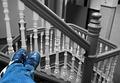
Sent Out of Classby darcyComment: That is some old school building...the railings and landing are very nice in BW and I like thecomposition of the blue jeans and sneaks. my only concern here is the non-leveled look of the ralling in the right third....I assume those are your jeans and shoes so I think if you had taken this with you more on angle the leveling might not appear as off....interesting idea and fine execution. |
 Photographer found comment helpful. Photographer found comment helpful. |
| 05/16/2004 09:16:39 PM |
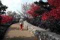
Road to paradiseby pitsamanComment: I like the clever use of the select desat in this...I only wish you had desated the shoe...it looks a bit orange and out of place. Very nice composition. |
| Photographer found comment helpful. |
| 05/16/2004 09:14:03 PM |
|
| Photographer found comment helpful. |
| 05/16/2004 09:10:52 PM |
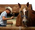
Grooming Timeby MWittComment: Great big old horse, clydsdale? nice detail and the subjects are finely focused and the exposure is spot on (hate that expression but it works here: the exposure is really good!). Nice DOF and I like the parallels of the post in front and the edifice in the background...nice touch. and since those parallels are so well presented I do not mind the static composition of the subjects as they work well in against the parallels....only nit...wish the sky was blue...cain't have everything and I think this is great! |
| Photographer found comment helpful. |
| 05/16/2004 09:06:21 PM |
Motown Magnoliaby scrum8Comment: the subject is a bit too centered for my tastes (looks like I can't say that next week so I have to get in now!LOL!). the detail, focus and colors are nice as is the DOF. |
| 05/16/2004 09:04:53 PM |
Ride Meby rickhd13Comment: equisite...lovely color, nice shades, great exposure and composition. excellent abstract....like it very much! |
| 05/16/2004 09:03:40 PM |
clock museumby suemackComment: I really do not know what to see about the colors in this....I like the architecture and the mural, but the colors are too cast in blue. It's a hard image to take and I fail frequently....in post if you had tried to play with levels you might have been able to do something....not sure. |
| Photographer found comment helpful. |
| 05/16/2004 09:01:37 PM |
Alone in the desertby dimitriiComment: the subject's centering would have been apt for the new challenge, but it does not work for me here with him during around too look. And for goodness sake if you are going to be nude take your glasses off....anyway...I t woul have been a much more effective image without the turned head and still walking down the road. |
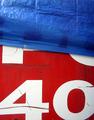
| 05/16/2004 08:58:42 PM |
40by melismaticaComment: the colors are very good in this and there are some nice texture constrasts...but what is your subject, 40, painted numbers, well what is it on....The blue appears to be a tarp of some sort...I think it might have been better pulling back so the '40' was not chooped off and leave some more room at the bottom. Interesting patriotic color scheme but not much else going for it for me. |
| Photographer found comment helpful. |
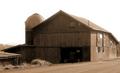
| 05/16/2004 08:55:25 PM |
My First Barnby NeuferlandComment: very nice in sepia...this angle is OK but I would have move just a bit more to either side and pulled back just a little so that the right side of the barn does not seem so crowed in the frame. |
| Photographer found comment helpful. |
Home -
Challenges -
Community -
League -
Photos -
Cameras -
Lenses -
Learn -
Help -
Terms of Use -
Privacy -
Top ^
DPChallenge, and website content and design, Copyright © 2001-2025 Challenging Technologies, LLC.
All digital photo copyrights belong to the photographers and may not be used without permission.
Current Server Time: 08/15/2025 02:27:26 AM EDT.