| Image |
Comment |
| 05/03/2005 10:56:29 PM |
Alone up there.by visual28Comment: Perhaps a bit busy in the sky, but the exposure is excellent and I love the great colors and composition. 10. |
 Photographer found comment helpful. Photographer found comment helpful. |
| 05/01/2005 10:34:51 PM |
Waiting for the playby jeffzoetComment: Tried this at a Phillies game last week, just had a lousy POV....you had a much better vantage point than I and the result is much what I was trying for....aaaacch! I hate you!.....not really....Love the patterning of the field and the subject is well placed compositionally. Still jealous but I like the shot. 9 |
| 05/01/2005 11:03:10 AM |
|
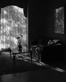
| 04/30/2005 01:22:00 PM |
Graceby gudbjargarsonComment: nice composition but the subject appears too dark and a bit ill defined (eg. there are jewels in the center line of the earrings (?) but I cannot see them all and some look like they are missing and the background appears through the center of the subjects.) . the reflections do not add to this for me. |
| Photographer found comment helpful. |
| 04/30/2005 01:18:34 PM |
Swatchby jeffzoetComment: nice collection of swatches, like the composition and copy placement as well. would have preferred a rich/darker bacground color. |
| 04/30/2005 01:17:17 PM |
|
| Photographer found comment helpful. |
| 04/30/2005 01:15:58 PM |
History In The Makingby RedOakComment: great shot, good detail and exposure. the copy and font just get in the way of this. perhaps simplifying the copy to a portion and using a smaller font somewhere in the body of the image might have been a way to go though the crop would have needed to be less tight for that to work. Like the image very much. |
| Photographer found comment helpful. |
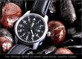
| 04/30/2005 01:12:31 PM |
Gruenby graphicfunkComment: The detail on the watch is very good and I like the choice of background color very much. the composition could be better as could the placement and font of the ad copy. |
| Photographer found comment helpful. |
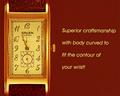
| 04/30/2005 01:10:57 PM |
A Lifetime Together Deserves The Best...by NobodyComment: composition is static and the the crop is too tight. The detail on the subject is ok and I like the flare a bit, but the background color is too close to that of the rings. |
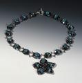
| 04/30/2005 01:09:12 PM |
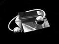
New Age Braceletsby WildpurpleComment: a few blowouts and the focus appears a bit off. Like the composition and the geometry of the subjects. |
| Photographer found comment helpful. |
Home -
Challenges -
Community -
League -
Photos -
Cameras -
Lenses -
Learn -
Help -
Terms of Use -
Privacy -
Top ^
DPChallenge, and website content and design, Copyright © 2001-2025 Challenging Technologies, LLC.
All digital photo copyrights belong to the photographers and may not be used without permission.
Current Server Time: 08/23/2025 09:21:02 AM EDT.