Thank you for submitting your photo the DPChallenge, Jewelry Advertisement.
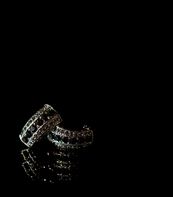
A good capture of two rings or two earrings. Good use of the frame and negative space. The background in black works in many ways, for and against you. The placing of the jewelry on the glass is a good touch. Mounting the jewelry on each other is a classic retail store type of display. The image does show it self in a mysterious way. Dark, moody, and ambiquous.
The jewelry does not show its natural beauty. The diamonds are visable but the stones are too dark. The shot is hindered by its lack of detail. The dark shadows and lighting are masking the subject of this shot. It also looks like the jewelry has been placed on a glass table, good idea, but the mirror reflections are coming up too dark again.
It looks like your light source is only coming from one side of the frame. The oppposite side, or left side of the frame, as you look at it, is underexposed. This makes the subject a bit unappealing, with lighting preference only on one side.
The reason I said earings or finger rings, is because you can't really tell right off. The rear portion of the jewelry is too dark to exact details.
Technically I see that you used ISO 800. And, of course the higher the ISO the more noise, or grain you will get.
I am assuming that you shot without a flash. Yeah, sometimes jewelry shots, tend to be too bright off the flash lighting. This is one of the hardest shots to do, without making the jewelry appear too shiny.
Great composition idea's. Good use of frame space. Work on your lighting.
Interesting reflection. Unfortunatly, the fact that the reflection is almost as 'crisp' as the actual jewel makes it hard to distinguish which is which. Lighting is not strong enought and makes the picture suffer from poor sharpness. a tighter composition or some text would've helped. 6
nice composition but the subject appears too dark and a bit ill defined (eg. there are jewels in the center line of the earrings (?) but I cannot see them all and some look like they are missing and the background appears through the center of the subjects.) . the reflections do not add to this for me.
Seems a little dark to me. If I was an advertiser I would want the actual jewelry to be visible to my customer. I do really like how they are set in the photo and the reflection. 6
Not enough lit; hard to see what it is (earrings?) and details. Good composition, placing the earrings the way you did is more dynamic. I suspect you placed the earrings on a glass or mirror, which creates a double reflection that is not attractive.
i like the composition, and the amount of detial in such a small space. i wish the reflection was a bit more solid, if that makes any sense... but nice photo.
i love the layout and the reflections...the only thing that i feel could have been different was the backround being made a bit lighter....again as always this is my opinion...good luck




 Add photograph to your favorites
 Add photographer to your favorites


 Photographer found comment helpful.


