| Image |
Comment |
| 05/01/2002 08:56:00 AM |
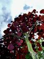
Red Headby albapeteComment: The red looks very dark to me, but that could be my monitor playing tricks on me. I like the vertical framing and the strong green trunk as a diagonal. |
| 04/30/2002 11:55:00 AM |
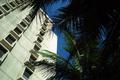
Tropicalityby elliottwhitleyComment: Really dark blue polarizer sky. I like the contrast between the lighter colored building and the darker palm bush. Definitely fits the title, and belongs in a travel brochure. Wish I could go there. |
| 04/29/2002 10:46:00 AM |
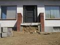
building from the ground upby laurelComment: Interesting with the entranceway without the steps. I think maybe a different angle than straight-on would have made it a bit more visually interesting, though. Perhaps you could have played up the blocks on the left in contrast to the built part... |
| 04/30/2002 07:09:00 AM |
Oversized Mushroomby SonifoComment: I love the texture in this photo. It's not really a mushroom, though, is it? It seems like it would have to have those little gill-like things...but I don't know. The framing is good, I like it a lot better than if you had included the whole top. I do wish though, that the background could have been a little more consistent. |
 Photographer found comment helpful. Photographer found comment helpful. |
| 04/30/2002 10:17:00 AM |
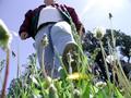
Hay, Watch Where You're Walkingby bruster54Comment: One of the few pictures where cropping off the head of the main subject actually works :-) The foot doesn't seem to be 'about to' step on the camera though. |
| 04/30/2002 10:35:00 AM |
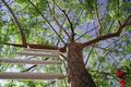
Nick's Placeby rcrawfordComment: Couldn't you have gotten Nick to sit up there and pose? ;-) The red flowers on the right draw my eye away from the tree... |
| 04/29/2002 02:25:00 PM |
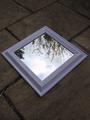
Mirror, Mirror on the floor....by cbonsallComment: Original interpretation. I like the repetition of the diagonals, and it is well-exposed. It gives just enough hint of trees to not be blank, but mostly sky so that we know where that mirror is pointing. It's clever, but I'm not sure that there's enough going on (not enough color?) that it would grab me enough to take a closer look outside of the challenge. |
| Photographer found comment helpful. |
| 04/29/2002 07:10:00 AM |
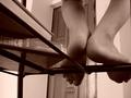
Homeworkby Crystal StreamsComment: Oh, I very much like this picture. Nice sepia tones, I like the lines of the rungs of the stool/chair. Not as sure about the door in the background, as the perspective makes it and the corner of the wall to the right tilt, which may be a bit distracting. |
| 05/01/2002 09:22:00 AM |
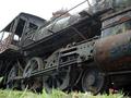
Old Timerby timj351Comment: Good subject. I'm fond of old rusty things :-) The white sky isn't doing you any favors..more direct light on a less cloudy day might make it 'pop' a little more. |
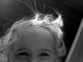
| 04/30/2002 11:32:00 AM |
looking down at daddyby jbruno1397Comment: The light on the hair is VERY cute. The background is nicely non-distracting, and I think it is a good use of black and white. Just showing the eyes actually does work, because they're really very expressive. Nitpick: the top left corner seems a little bit overexposed. |
| Photographer found comment helpful. |
Home -
Challenges -
Community -
League -
Photos -
Cameras -
Lenses -
Learn -
Help -
Terms of Use -
Privacy -
Top ^
DPChallenge, and website content and design, Copyright © 2001-2025 Challenging Technologies, LLC.
All digital photo copyrights belong to the photographers and may not be used without permission.
Current Server Time: 08/25/2025 02:45:36 PM EDT.