DPChallenge: A Digital Photography Contest You are not logged in. (log in or register
 
Browse Settings
Currently viewing:
Registered UserSpanish_Grease

Show comments:

Per page:

Order:

Comments:


Comments Made by Spanish_Grease
Pages:   ...
Showing 21 - 30 of ~249
Image Comment
A Wish
07/27/2004 07:03:58 PM
A Wish
by vaguilo

Comment:
Greetings from the Critique Club!

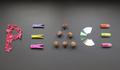
Let me start off by saying that your image supports a noble cause, if only everyone would work towards the same wish!

This image is one that falls into the category of not having that one eye-catching element that really grabs someones attention. While the concept is strong, their are a few things you could due to spice up the image a bit.

At the moment the word 'peace' is located almost dead center in the image, which is very unnatural to the human eye. This is an excellent place to introduce the rule of thirds, moving the word slightly up or down. Also, the angle you've taken the picture at provides no depth to the subject. Perhaps taking the picture from an angle would provide a more interesting viewpoint of the word.

While I enjoy the combination of elements you've used to create the word, I can't say I see a pattern in your choices. As someone commented below, maybe objects that in some way represent peace could be used, and in that way support the statement you're making in the image.

Lastly, you've done a very good job of lighting the word. Each object is clearly visible, and none are blown out. Even the CD (which can be hard to light) is well lit. However, your background distracts from your word. I think a plain flat black background might have served your purpose well, as it would have focused attention on the word. Unfortunatly that can be hard to achieve in a 'basic' editing challenge, especially with a composition such as this. Perhaps an angled shot would have allowed you to have a flat black background, or as someone mentioned below cropping the shadowed area at the top would even out the background some. In general, I think a clean background would serve this picture very well!

Overall, this is a strong idea! It fits the challenge well, is original, creative and shows an individual interest, but with a few adjustments this could be a great image!

Good Luck!

Lee
Photographer found comment helpful.
Desperate Phone Call
07/26/2004 12:38:16 AM
Desperate Phone Call
by melismatica

Comment:
I love the vintage feel to this photo. You managed to pull it off so well! 9
Photographer found comment helpful.
Dead Poet's Club
07/26/2004 12:36:42 AM
Dead Poet's Club
by BrennanOB

Comment:
This is a very interesting image. I can't tell if this was done in photoshop, or if it was painted with light. It looks a tad unnatural.. but impressive nonetheless. I just hope it's painted with light, and not dodged and burned. 8
Photographer found comment helpful.
lift
07/24/2004 09:50:03 PM
lift
by sixmacs

Comment:
An awesome subject, but the noise in the background distracts greatly from the overall image. A tighter crop would have served this image very well.

Lee
Photographer found comment helpful.
two become one
07/22/2004 04:02:45 PM
two become one3rd Place
by grigrigirl

Comment:
I think what could solve the feeling of the image being slightly unnatural is using a straight b&w instead of a sepia tone. I love the artistry of this image, and the spectacular background you managed to capture it on, but in an image such as this believability is a must, and I have trouble visualizing this in real life. 8
Photographer found comment helpful.
The Greatest Show on Earth
07/22/2004 04:05:03 AM
The Greatest Show on Earth
by mffnqueen

Comment:
the calgary stampede!?!
Photographer found comment helpful.
Love, Balance, and Harmony
07/22/2004 03:56:37 AM
Love, Balance, and Harmony
by Tranquil

Comment:
WOW, this is sure original...
Abstract in Chocolate
07/21/2004 06:59:52 PM
Abstract in Chocolate
by DianaB

Comment:
I would say that this is a very well composed abstract. My favourite abstracts are the ones where the subject appears to be something completely different then what it actually is due to the angle and composition of the image. This looks like a keyboard or something! Well taken. DOF is good, as is exposure - you could have very easily over-exposed the image! 8
Photographer found comment helpful.
These Stupid Things are Never Right!
07/14/2004 01:48:59 AM
These Stupid Things are Never Right!
by C-town driver

Comment:
I find this very tacky. I don't think the purple background helps that. The lighting is very good though. 4
Photographer found comment helpful.
Purple Gaze
07/12/2004 08:08:18 PM
Purple Gaze
by melismatica

Comment:
I think what this photo is missing is a clear subject - my eyes lack anything clear to be looking at. While a convincing, interesting subject, with a little more though it could have been fantastic.

Lee

Message edited by author 2004-07-14 02:44:11.
Photographer found comment helpful.
Pages:   ...
Showing 21 - 30 of ~249


Home - Challenges - Community - League - Photos - Cameras - Lenses - Learn - Help - Terms of Use - Privacy - Top ^
DPChallenge, and website content and design, Copyright © 2001-2025 Challenging Technologies, LLC.
All digital photo copyrights belong to the photographers and may not be used without permission.
Current Server Time: 08/23/2025 01:52:06 PM EDT.