| Image |
Comment |
| 05/29/2008 05:02:00 AM |
|
 Photographer found comment helpful. Photographer found comment helpful. |
| 05/29/2008 05:01:26 AM |
|
| Photographer found comment helpful. |
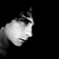
| 05/29/2008 05:00:23 AM |
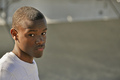
Nicholasby bvyComment: I like the stark simplicity of this. I'm wondering whether B&W was the way to go as there's not much towards the white end of things (perhaps a contrast boost) but the great control of light and blank expression gives us quite an insight here. Well done. |
| Photographer found comment helpful. |
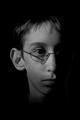
| 05/29/2008 04:59:08 AM |
Cardiologist Self Potraitby brayburnComment: It looks like you've focused on the heart rather than the subject - a smaller aperture would fix this one. I do like the concept but the lighting is harsh on the subject (See the shadow from the nose) and would benefit from a reflector on the other side. |
| Photographer found comment helpful. |
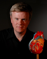
| 05/29/2008 04:57:17 AM |
Kyle (me)by RegoComment: I really like this. The harshness of the lighting is very well controlled and the effect is a good gritty, contrasty B&W with a great expression captured. Good work. |
| 05/29/2008 04:56:04 AM |
Down by the Riverby citymarsComment: I think you've fallen into the trap of oversharpening this one a little - but the lighting is oddly effective. It's a pity the background is dull, it doesn't really vindicate your off-centre composition. |
| Photographer found comment helpful. |
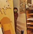
| 05/29/2008 04:53:25 AM |
|
| Photographer found comment helpful. |
| 05/29/2008 04:52:54 AM |
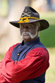
Pow Wowby kleskiComment: I'm guessing you've heard this ten times already, but the border has to go. You've captured an interesting subject but the slightly odd expression plus the sunglasses prevents us identifying with him and as such it doesn't work as a portrait. |
| Photographer found comment helpful. |
| 05/29/2008 04:51:47 AM |
|
| Photographer found comment helpful. |
| 05/29/2008 04:51:19 AM |
Peaceful Sleepby jnr1985xComment: Some constructive criticism: Firstly, the crop isn't doing you any favours. It's just too narrow to score highly. Secondly, the image doesn't do well as a black and white as the lighting is very flat. The black cloth is clumsily arranged, meaning you have a knee floating in mid air and half a hand has been cut off. Most importantly, I don't feel a connection with the subject - it's for these reasons you're scoring badly at the moment. I'm saying this to be helpful, not harsh - hope I have been. |
| Photographer found comment helpful. |
Home -
Challenges -
Community -
League -
Photos -
Cameras -
Lenses -
Learn -
Help -
Terms of Use -
Privacy -
Top ^
DPChallenge, and website content and design, Copyright © 2001-2025 Challenging Technologies, LLC.
All digital photo copyrights belong to the photographers and may not be used without permission.
Current Server Time: 08/26/2025 04:55:04 PM EDT.