| Image |
Comment |
| 02/24/2008 06:18:29 PM |
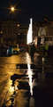
uplightby bimbleComment: *** Critique Club ***
First Impressions: Good use of leading line
Exposure: Though the bright light in the reflection forms a good leading line, the actual lights are a big distraction. Bright areas always draw the eye. In this case, being overly bright, keeps the viewer from exploring the rest of the photo.
This is a tough situation to remedy straight from the camera. If you expose for the lights then the rest of the image will probably be black or close to it. Use of a highlight/shadow type adjustment in post processing may help remedy the situation somewhat.
Composition: As stated before, good use of a leading line.
Impact: If the actual lights weren't so bright this image could have more impact. Just need to bring out more detail in the shadows.
Cheers!
Keep shooting.
Colette |
 Photographer found comment helpful. Photographer found comment helpful. |
| 02/22/2008 04:54:11 PM |
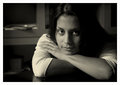
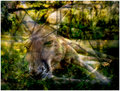
C L A U D I Aby pawdrixComment: The lighting here and your choice of exposure I think sets the mood. The hair on the right side of the image maybe needs to be lightened a bit, just enough to show a bare minimum of detail. Other than that I think the exposure makes for a very relaxing image. |
| Photographer found comment helpful. |
| 02/22/2008 02:33:26 PM |
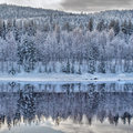
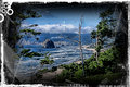
Kilverby korpenComment: *** Critique Club ***
First impressions: I like the layering effect from the trees to the hills to the sky.
Composition: The transition from reflection to 'real' is in a position that makes me think the positioning is a mistake. It feels off balance. To me there are two images here. The reflection and the real landscape. It could work including both if the transition were deliberately placed in the middle.
On the other hand, concentration could be made more on the landscape or more on the reflection. This would allow the transition line to be very high or very low in the composition. Both aspects of the image have their strengths. I just think a better image is hiding here.
Good contrast and detail.
Cheers!
Colette |
| Photographer found comment helpful. |
| 02/22/2008 02:24:06 PM |
ocular reflexby shamerComment: *** Critique Club ***
First impressions: I like the simplistic feel of the image. The border works well with the image.
Composition: The object is placed nicely off center and the shadows form a curve leading the eye through the image. However I can't help feeling that it should be sharper.
Lighting: Subtle. This works well with the simple composition.
Impact: I think the image is a bit flat and could use a boost in contrast. To me, the colour version has much more impact. But I'm partial to warm tones.
Cheers!
Keep shooting.
Colette |
| Photographer found comment helpful. |
| 02/18/2008 11:36:07 AM |
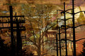
the tree of knowldege.jpgby electrolostComment: Great colours in the overlay. Like the angle and the silhouette of the poles. Maybe try to darken the tree into full silhouette as well. |
| Photographer found comment helpful. |
| 02/18/2008 11:09:42 AM |
|
| Photographer found comment helpful. |
| 02/17/2008 12:33:13 PM |
|
| Photographer found comment helpful. |
| 02/16/2008 01:39:39 PM |
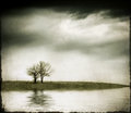
Remoteby SJCarterComment: I like this. The flood and the overlays really help set the mood of the image. |
| Photographer found comment helpful. |
| 02/12/2008 09:36:00 PM |
- - -by krnodilComment: I like the woven effect. I've been looking for the instructions on how to create a denim look in photoshop - it's in a book or magazine that I have. This reminds me of that. |
| Photographer found comment helpful. |
| 02/11/2008 10:59:44 AM |
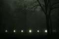
midnight driveby ErinMComment: Really gloomy feel here. It may be just a tad too dark. I think having more definition to the trees in the background would give the image more depth. |
| Photographer found comment helpful. |
Home -
Challenges -
Community -
League -
Photos -
Cameras -
Lenses -
Learn -
Help -
Terms of Use -
Privacy -
Top ^
DPChallenge, and website content and design, Copyright © 2001-2025 Challenging Technologies, LLC.
All digital photo copyrights belong to the photographers and may not be used without permission.
Current Server Time: 08/08/2025 05:11:09 AM EDT.