| Author | Thread |
|
|
03/07/2008 11:33:29 PM |
|
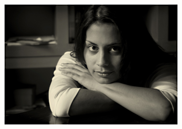
I like this direct gaze/pose, but find the extreme tonal difference between both her forearms to be jarring - this coming from a non-expert: perhaps some fill flash for that area? I don't at all mind the background "clutter" - it makes the image seem more genuinely of the moment and not as set up. |
|
 Photographer found comment helpful. Photographer found comment helpful. |
|
|
02/24/2008 12:31:21 AM |
|
Very well done -- the soft focus, the lighting, the pose, the crop. Are my eyes tricking me or do I see a very faint sepia tone in this one? |
|
| Photographer found comment helpful. |
|
|
02/23/2008 10:45:36 AM |
Nice pose, she has beautiful eyes. Right side (her left) seems a tad dark, but that could just be this monitor. Also what ever that is in the window sill is sort of distracting, perhaps trying to clone it or burn it out would help.
|
|
| Photographer found comment helpful. |
|
|
02/22/2008 05:33:35 PM |
Oh this is superb in every respect.
Moody, calm, casual, so relaxed, the shift of light & shadows and the perfect tone.
Then there are the eyes - strong communication there.
Very nice!
|
|
| Photographer found comment helpful. |
|
|
02/22/2008 04:54:11 PM |
|
The lighting here and your choice of exposure I think sets the mood. The hair on the right side of the image maybe needs to be lightened a bit, just enough to show a bare minimum of detail. Other than that I think the exposure makes for a very relaxing image. |
|
| Photographer found comment helpful. |
|
|
02/22/2008 04:50:32 PM |
|
This one is my favorite. I'm a fan of darker shots and this one fits the bill well. I like the lighting to the left side and the slight yellow cast. At least on my monitor. |
|
| Photographer found comment helpful. |
|
|
02/21/2008 10:50:35 PM |
Originally posted by Prof_Fate:
No technical comments? Hmm...seems a bit underexposed. The hair is too dark - a black hole that distracts, and the shelf in the BG left has the papers on it - also pulling my eye. I understand your use of DOF, but her fingers not being in focus annoy me for some reason.
I do like the what the head is framed in the bookcase behind, the overall tone of the image, cropping is pretty good also, but maybe take just a tad off the top - you've cropped some of her head but not much - a bit more will put her eyes more in the 1/3 point of the image. |
rules... rules... rules... Let's all follow them so all our photographs look the same! :)
DOF is good and keeps focus where it should be, and your play with the lights and shadows works well for this.
BUT I would have to agree, instead of keeping your backdrop and setting natural and realistic you should have stopped and organized those papers in the background! How could you not?? ;) ;)
Sorry, if you are able to take Prof_Fate's condescending "critique" I applaud you :). I do think if you pick through there is a small bit of helpful critique in there. |
|
| Photographer found comment helpful. |
|
|
02/21/2008 08:19:14 PM |
No technical comments? Hmm...seems a bit underexposed. The hair is too dark - a black hole that distracts, and the shelf in the BG left has the papers on it - also pulling my eye. I understand your use of DOF, but her fingers not being in focus annoy me for some reason.
I do like the what the head is framed in the bookcase behind, the overall tone of the image, cropping is pretty good also, but maybe take just a tad off the top - you've cropped some of her head but not much - a bit more will put her eyes more in the 1/3 point of the image. |
|
| Photographer found comment helpful. |
|
|
02/21/2008 02:46:47 PM |
A shot of two halves for me. Only in this case the two halves aren't literal so much as metaphorical.
At first glance it's a nice shot of an attractive model. I like the crop, i'm good with the lighting and I think the border finishes it off well. There is also potentially an interesting tension between the soft curves of the model and the fixed geometric shapes behind her.
But on further inspection, there are some elements I'm not so sure of. I find the background a little distracting as it is neither quite in, or out, of focus, and on the left of the picture looks a little untidy. I'm also a little unsure of only having one of her arms illuminated. This wouldn't necessarily be a problem, but I think becomes one due to her white sleeves leading the eye down to find one light arm and one dark one.
Certainly a pleasing picture though.
Message edited by author 2008-02-21 15:16:49. |
|
| Photographer found comment helpful. |
|
|
02/21/2008 02:11:29 PM |
|
I would like to see the difference with her wearing a darker shirt. |
|
| Photographer found comment helpful. |
|
|
02/21/2008 02:00:32 PM |
ahhh... serene... it's funny because it has a very natural feel to it but on second thought she would never pose that way unless she were having her picture taken. So that makes it a portrait, but it doesn't dawn on me right away. Nice composition. Because so much is dark, the parts nondark parts form the composition, and you've got some nice lines and shapes going on.
Every time I look at this, I get the same sense of vertigo as it shimmers between candid and portrait. I doubt other people will have that reaction, though. |
|
| Photographer found comment helpful. |
|
|
02/21/2008 01:48:25 PM |
|
I really like this image--beautifully done! Were I to change a thing, which I probably would not anyway, it might be to burn down the little triangular highlight in the back, on the left, maybe also the shelf/ledge just a smidge, or a tad (whichever is less). Those "bright" areas in the back could tend to draw the eye away. |
|
| Photographer found comment helpful. |
|
|
02/21/2008 01:48:17 PM |
Nice image ... couple of points though.
I don't really like the way that her eye drops into the shadow ... a little selective dodging here might have worked.
As well as some dodging on the hair on the shadow side to bring up just a bit of detail
The positioning of her to the right of the frame invites a glance over her shoulder from the viewer. So the folders there to me are a bit disappointing.
|
|
| Photographer found comment helpful. |
|
|
02/21/2008 01:47:27 PM |
my monitor here is frankly crap, so take this with a cellar of salt.
I like the connection with her, from her gaze and comfortable, forward position. Engaged with the camera, the photographer.
It feels really, really heavy on her left side, in the dark space. So much negative and black space and that semi-rectangular shape that plays off the other black spaces. Perhaps having her slightly more towards the light would have opened up that area. It might have got a bit more catchlight into her left eye which is drowning now too, slipping into that dark chasm.
Her arms appear to belong to a different person, one significantly different colour to the other - again the angle of the light and shadow, interacting with her body.
Message edited by author 2008-02-21 13:48:08. |
|
| Photographer found comment helpful. |
|
|
02/19/2008 02:31:40 PM |
|
Awesome.....with her coloration, this darkish lighting really works for a mysterious and elegant look. VERY nice!!! |
|
| Photographer found comment helpful. |
|
|
02/18/2008 09:09:42 PM |
|
| Photographer found comment helpful. |
Home -
Challenges -
Community -
League -
Photos -
Cameras -
Lenses -
Learn -
Help -
Terms of Use -
Privacy -
Top ^
DPChallenge, and website content and design, Copyright © 2001-2026 Challenging Technologies, LLC.
All digital photo copyrights belong to the photographers and may not be used without permission.
Current Server Time: 07/07/2026 01:51:21 AM EDT.