| Image |
Comment |
| 04/23/2003 10:01:28 AM |
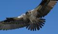
Attackby jnevittComment: The hawk's(?) wings seem to be out of focus. More depth of field or a faster shutter speed may add impact to this type of photo. |
 Photographer found comment helpful. Photographer found comment helpful. |
| 04/23/2003 09:56:19 AM |
|
| 04/23/2003 09:54:53 AM |
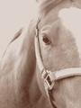
Horse - Duotoneby jdavisComment: I like the idea of using sepia for this image though it appears not to have enough contrast. The horse's nect at the top of the image is either overexposed or out of focus. This might be a question of depth of field. |
| 04/23/2003 09:53:02 AM |
|
| Photographer found comment helpful. |
| 04/23/2003 09:46:30 AM |
|
| Photographer found comment helpful. |
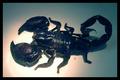
| 04/23/2003 09:45:22 AM |
Emperor Scorpionby inspzilComment: The light source appears to have overexposed part of the picture while leaving some of the picture underexposed. Also, depth of field seems to be a little too shallow, the legs at the top of the picture and the tail (stinger?) are out of focus. |
| Photographer found comment helpful. |
| 04/23/2003 09:41:16 AM |
|
| Photographer found comment helpful. |
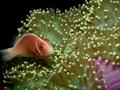
| 04/23/2003 09:38:46 AM |
All You Can Eatby MitonskiComment: Good positioning of the subject within the picture. It appears that there is too much depth of field. A sharper subject and blurry background would make the butterfly pop. |
| Photographer found comment helpful. |
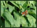
| 04/23/2003 09:36:51 AM |
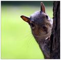
On the Prowlby firstduchessComment: This little critter needs a bit more space to look into. Not much just a little. Otherwise well composed and good use of depth of field. |
| 04/23/2003 09:31:20 AM |
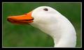
calmsetby abbi2bComment: This is a good idea for a picture. There are a few things that would make it better. The horizon could be more level, the subject (crane, heron, duck?) could be less central and larger.
If possible I would have moved more to the left, keeping the glare on the water in about the same position but this would shift the bird to the right. |
Home -
Challenges -
Community -
League -
Photos -
Cameras -
Lenses -
Learn -
Help -
Terms of Use -
Privacy -
Top ^
DPChallenge, and website content and design, Copyright © 2001-2025 Challenging Technologies, LLC.
All digital photo copyrights belong to the photographers and may not be used without permission.
Current Server Time: 08/02/2025 01:35:32 AM EDT.