| Image |
Comment |
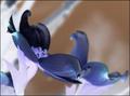
| 05/17/2004 09:07:02 PM |
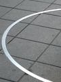
Not At Allby GPComment: ** Critique Club **
by cpanaioti
The curve of the metal is what catches the eye first, however the line of the curve leads the viewer out of the image. The exposure seems a little over done with the extremities of the curve blown out.
Diagonal lines can add tension and interest to an image however in this image they are fairly static since they are over powered by the bright metal.
Cropping to adjust the composition may have helped with the appeal of this image.
Keep shooting.
(remember photography is subjective and these are only my opinions)
Colette |
 Photographer found comment helpful. Photographer found comment helpful. |
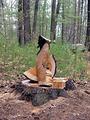
| 05/17/2004 08:57:39 PM |
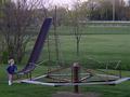
Natalie's Rusty Playlandby IronworkerComment: ** Critique Club **
by cpanaioti
The motion in the little girl is what catches my eye first. Compositionally she is in the right place with respect to her motion, however the background beyond the central tree is distracting. Cropping this image at about the fifth rung of the slide's ladder but keeping the width would probably give it more impact and would isolate the subject better.
It looks like it was a grey day giving flat light. The image also seems slightly under exposed.
Keep shooting.
Colette |
| 05/08/2004 09:10:55 PM |
Primary Colorsby cardinalmomComment: The colours are wonderful and the ripples in the foreground add interest, however the bright spots at the top are distracting. The eye is always drawn to the brightest part of an image. 6 |
| 05/08/2004 03:50:28 PM |
Separate Realityby flip89Comment: I love warped reflections like this. There are a few bright spots that are a bit distracting, however the overall composition is well done and the exposure seems right. 7 |
| Photographer found comment helpful. |
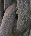
| 05/07/2004 08:28:24 PM |
The Missing Linkby browntComment: You've captured the texture quite well, however the lighting seems a little flat. 6 |
| Photographer found comment helpful. |
| 05/07/2004 08:27:32 PM |
|
| Photographer found comment helpful. |
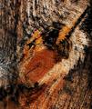
| 05/07/2004 07:50:26 PM |
Knotby SMW409Comment: Lovely textture and colour, however the knot seems a little too close to the center and the focus seems a little soft. 6
edit: spelling Message edited by author 2004-05-10 08:16:10. |
| Photographer found comment helpful. |
| 05/07/2004 07:42:42 PM |
Flightby goinskiingComment: Good use of DOF. Nice and sharp . Lines lead the viewer right into the image, however the lighting seems a little flat. 6 |
| Photographer found comment helpful. |
| 05/07/2004 07:39:59 PM |
Abstract Foundby amsmythComment: The cut wood has some nice texture. Move in, zoom in, take advantage of it. The trees in the background are distracting. 4 |
| Photographer found comment helpful. |
| 05/07/2004 07:38:13 PM |
Shall We Dance?by OneSweetSinComment: The colours are nice and blend together well, however the negative effect does nothing for me. Also, the bright area on the left is a bit distracting though you may not have had a choice on the position for your shot. 4 |
Home -
Challenges -
Community -
League -
Photos -
Cameras -
Lenses -
Learn -
Help -
Terms of Use -
Privacy -
Top ^
DPChallenge, and website content and design, Copyright © 2001-2025 Challenging Technologies, LLC.
All digital photo copyrights belong to the photographers and may not be used without permission.
Current Server Time: 08/08/2025 03:40:58 AM EDT.